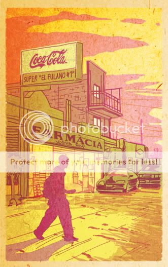
Color's a very powerful thing, and I hate to see it squandered. I think there should be more black-and-white books, not only because they can work very well, but if you don't use color for a purpose, why waste the ink?
- Frank Miller
I believe color is used essentially as a packaging device, rather than as an integral storytelling device.I'm not much of a draftsman. When it came time to design "Feeding Ground" I had to consider the tools in my belt and how I could best communicate the narrative visually. I've needed to hone my drawing ability to the task but the skill that came most naturally, the implement that I felt I could wield most expressively, was color.
- Will Eisner

For a horror story taking place in the heart of the Mexican desert, I needed colors that would bleed and vibrate off of the page as if the ink had spoiled. Colors that are lurid and garish and feel a little sick. There are colors that describe what a thing is, be it skin, a sky, or hair. Then there are colors that convey a quality of light, from the artificial to the changing mood of the sun. Those are the colors of reality. My goal has been to combine those qualities with the emotional weight of color to create a world that feels simultaneously unreal and a more realized version of the place itself .
Coloring in mainstream comics has never looked more professional. Digital colorists can now create highly rendered forms and special effects akin to a summer blockbuster. But, at its best, this sort of coloring is an invisible art in that it conveys only what is on the surface.
Narrative color has been used recently by David Mazzuchelli in his Graphic Novel "Asterios Polyp." He follows a clinical formula with a limited palette of primaries and secondaries to convey emotions and mental states as directly as the time of day. He combines them to visualize invisible connections between characters in a visual language that is as stark as thought balloons or the written word.
For my tastes, Val Staples color work on "Criminal" by Ed Brubaker and Sean Phillips is even more inspiring for using bastard colors like mustard, mint green, and violet to elicit feelings from the reader. They aren't the "right" colors for, say, the restaurant setting of a scene, but they perfectly conjure the acrid ozone smell of electric violence in the air.

The color work in my book feels risky. I'm often doubting myself and arriving at solutions through accidents but that's what makes it art to me. The trick is that I need to know when to reign it in. I'm using color hold outlines, and overlays, and unnatural hues and it could all turn out to be a chore on the eyes if I'm not successful.
There was a point when my final black and white inked work looked like enough to me. With a little local color, it read fine and looked right. It was a safe option. But, we sold our pitch book with color that didn't compromise. I had to follow our initial impulse and chase colors that not only felt "right" but might cause the reader to see something new.


Note: the entire story is not told in silhouette. I had to pick images that didn't give up too much information and just noticed the common thread in all of these panels.
Thanks to cartoonist Donal Delay for bringing the featured quotes to my attention.

Thanks Michael! :-)
ReplyDeleteI appreciate the kind words about my colors.
Your colors above are REALLY nice!
That Extra Page 01 really speaks to me.
...Val...
http://valstaples.deviantart.com/
Thanks, Val!
ReplyDeleteYour color work raised the bar for me and is evidence that color can be an equal partner in telling a story.