Although FEEDING GROUND has been gestating for around 2 years, it was 2010 where it became a reality and an all-consuming part of my life. Below are some of the ways the book defined 2010 for me:
THE WORK ITSELF:
Given the nature of drawing comics, I have easily drawn more in this past year than I have in the previous 10 years combined. And, I don't love drawing. I like designing and the act of rendering surfaces and textures in ink but it's been a long while since I've doodled for pleasure.

That's the work of it but the real thrill for me has been arriving at color combinations to communicate the feel of our story. More than a single drawing or paint-by-numbers reality I'm looking to bring something new to the table and a finished product that is more evocative than illustrative.

And, even more than executing the art, I was stoked by the opportunity to collaborate with Swifty and Chris on creating the problems and solutions, the imagery and arcs, of our story. It has fired up another part of my brain that I need to keep exercising.
THE BOOK ON THE SHELF:
It's humbling to finally be on a shelf next to work by peers that I enjoy and influence me as well as those legendary creators that built the comic language. The medium is both young enough to see the beginning and small enough to gain a foothold and yet old enough to contain depth and broad enough to include an ever-widening expanse of talent and material.
Now, we're somewhere in that too.
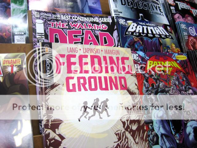
The landmarks for me were our launch party at Bergen Comics in Brooklyn (a well-appointed and managed store/ salon I very much see as the future of comic retail), our release at Vector Books in Bayonne, NJ (my local comic shop of 20+ years), and the book selling out multiple times at Forbidden Planet in NYC (my first NY comic shop). Issue 3 should be out soon, and the rush of seeing our work in stores hasn't gotten tired yet.
THE OTHER SIDE OF THE TABLE:

The thought and time that we've put into every panel and every page has its own value but really pays off when strangers are reading it and offering their feedback. Of course, the most gratifying ones let us know that we've struck with the reader and our intent was communicated on multiple levels. Others have pushed us to work out kinks in our craft. Reactions take the form of comments on message boards to articles and blog posts and interviews but it's been the face-to-face conversations at Conventions like San Diego, NYCC, and King Con that stand out for me. I've always dug meeting strangers and it's been cool to connect with people if only for a few minutes.
As a fan and newbie, the Con moment that made the greatest impression on me was meeting SCALPED artist, RM Guera. He came off as a mellow guru when I showed him FEEDING GROUND and he encouraged me to loosen up and "Let it flow." His own linework is alive and his compositions are consistently inventive. When he penciled a sketch of one of the lead characters for me, it was so spontaneous and lively that I thought… "Don't ink it…don't ink it." As if on cue, he asked "Do you mind if I don't ink this? I like it as it is."
SOME LOWLIGHTS:
I can't leave the office without having to put a tissue box on my laptop to prevent my cat from turning it into a bed and overheating it… It's also been frustrating to not be able to trust release dates and the shipping schedule, mainly due to issues with the overseas printer although I suspect my cat is responsible for that too… I hunch when I'm on the computer and unless I start doing yoga or running again I'm sure my neck will disappear and I'll be a few inches shorter... All said, mostly positive although I definitely did not plan on spending my first year as a married man working with such an irregular lifestyle.
SOME INSPIRING COMICS OF 2010:
This is by no means a comprehensive list as I haven't even been able to pick up much of what has been topping other year-end picks. I just wanted the chance to shout out the work of artists who made me take note this year. I keep their work close by and they're my current yardstick of the level of quality and energy I need to be hitting.
- For big, bold, superheroics John Romita Jr./ Klaus Janson/ Dean White on Bendis' AVENGERS and Jerome Opeña and Dean White for their uncluttered detailing and fresh staging on UNCANNY X-FORCE. Archangel's knife wings never looked cooler, and, as knife wings, they were pretty cool to begin with. Notice Dean White as the equal collaborator and common denominator on both books as an action colorist that finishes the art with the right amount of texture and punch.


- I've admired the work of David Aja for a few years now and this year I discovered Jason Latour working in a similar school. Both use gestural brushwork to convey an impressionistic reality and make really strong choices in their page design and pure visual storytelling.

- Jaimie Hernandez on LOVE & ROCKETS New Stories #3. Never has such a raw story looked so pretty. His first tale in the book is one that hits you in the gut but then lingers and demands multiple readings to appreciate his pacing and structure. The ending tale then has an uplift that rewards both the lived years of the characters and the years spent reading them.

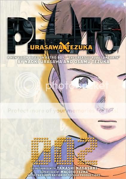
- Urasawa on PLUTO, can do it all. Massive battles, majestic architectural layouts, and intensely human moments portrayed by robots. I became invested in it this year and it's some of the best Comics have to offer.
2011:
We've delivered Issue 4 to the printer and I'll be wrapping up work on FEEDING GROUND in the Spring. From there, I look forward to the chance to experiment with new styles and tell new stories in 2011. There's still work to be done and skills to be learned but I aim to trust my instincts, doodle more, and "Let it flow." You'll see the first signs of this in Issue 4 whenever it finds its way to the shelf.