Since the first two issues of FEEDING GROUND have hit the stands we've have the great fortune of complete strangers reading our work and offering their feedback. In Generation "i" and especially in the comic field, there are many fan critics and criticism on every level. We've gotten glowing five star reviews like this one at COVERLESS, some constructive criticism like this one on THE OUTHOUSE, and some, who will remain nameless, that trashed us. Swifty has said, and I agree, that in reading every review there's the duel risk of inflating or crashing one's ego and that it's ultimately the doing of the work that matters. We just delivered Issue 4 to the printer (!) and we've already learned volumes since Issue 1. But, I'll detail below one area where the constructive criticism reflected our learning curve.
I'd be the first to say that we bit off a lot for our first long-form comic mini-series. We crafted a story that transitions between three related plot-lines, features a leading family of five characters, and walks a delicate balance between real-world horrors and myth. One common piece of feedback to the first two issues is the degree to which we reveal the goings on of our world - does our goal to build mystery and disorient the reader succeed or simply confuse? Now, a few responses showed some issues in reading comprehension on the part of the reader but the lesson that Klaus Janson drilled home for me was that as artist, I need to take full responsibility for the success or failure of a page. This leads me to the central issue in my education as a comic artist - film language vs. comic language in clear visual communication.
This means presenting visual information in each panel and in the transition between panels and pages in a way that is cognitively and emotionally resonant for the reader. Characters need to be staged in space and in relationship to each other and their actions need to proceed in a manner that is consistent with the understanding of the scene.
I mentioned in another post that comic artist Eddie Campbell has his own set of rules on his blog "The Fate of the Artist," the first being:
The entire drama of a given situation must be contained within each panel of the sequence of that situation.
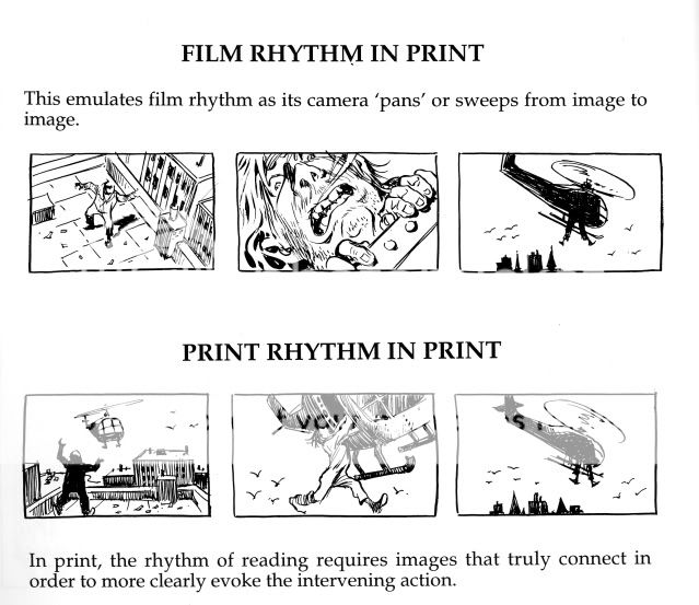
The key is context. Film transitions provide cuts and movement and all of the context that a viewer needs in digesting a film. Part of my instinct has been to focus on isolated moments and close-ups as a film would. This is due in part to a desire to heighten emotion and, in part, to the feeling that my drawings would be too small and cluttered otherwise. But, the solutions of a comic artist require more context in each panel that ideally delivers on the information of the previous panel and points ahead to the next. A close-up of a gun may be an emotional beat that's not pulling it's weight on a given page.
Rather than go on in text I'd rather share some examples from Will Eisner's "Comics & Sequential Art" that continue to make an impression on me as I digest their craft and meaning. This and its companion book are essential reading for comic artists.


I will include more examples from my own work in future posts. Keep in mind that my sequence at the top of the post was intended to play out as staccato beats of accumulated information in order to intensify drama of that scene in Issue 2. Whether or not that succeeded is up to the reader...

It takes a real pro to hear constructive criticism, (not to mention a real trashing), and use it to motivate him or herself to learn more and improve. Thanks for sharing what you've learned!
ReplyDeleteThanks man, much-appreciated!
ReplyDelete