Thursday, November 24, 2011
FEEDING GROUND _ THANKFUL
Friday, March 11, 2011
FEEDING GROUND _ On Storytelling
"Storytelling" as I understand it in comic book terms is the panel to panel communication of information. What are the decisions an artist makes in structuring and delivering a story that is coherent in orienting the reader and impactful in the delivery. It is often invisible when done correctly.
Comic creator Michael Moreci recently commented on his blog that he could see my storytelling get better with each page. Twas great to hear. Storytelling is a skill I've been working on since the challenges were first laid our for me on this book and the tools were conveyed in the series of classes I took at MoCCA as taught by comic legend Klaus Janson.
Since "storytelling" is the decisions that are made before the pretty drawings and I thought I would share some thumbnails here. The final storyboarding seems simple enough (and may seem rudimentary to some of you reading) but here are a few of the detailed decisions that went into it.
My main question: What is the goal of the scene and how do I convey that visually?
There's a scene in an upcoming issue of FEEDING GROUND that features a group of soldiers on a mission in which they are deployed in a vehicle that rams the main gate of a compound. The commanding officer is briefing the troops as they approach the gate and our protagonist is one troop who is a novice to the situation and consumed with anguish.
I inherently try to find the ticking clock of a scene to establish rhythm and here it's the moments leading up to the impact at the gate.
![]()
The inside cover and first page of each issue of FEEDING GROUND features a double-page splash that includes the title and credit box and a scene that serves both as an establishing shot and also a symbol for the theme of the issue. In this case, BONUS, it's also a great capper to the last page reveal of the previous issue that it will follow in the collected edition.
The gate will be presented here from below and towering right of center (Western reading runs from left to right) and lit by an off-panel rising sun. There will also be clouds lit behind it to sell the effect. Also, most issues tended to begin with an animal of some sort, represented here in the form of roadkill in the foreground that will carry over to the reverse shot on the next page…
![]()
...where the first panel will reveal the approaching convoy under the rising sun. The first choice is to decide what sort of panel grid I'll be using. Since this scene plays very much like a comment on tough guy action movies, I opted to use "widescreen" dimensions for each panel.
There is also a push and pull between the external action of the moment and the internal struggle of the protagonist (marked with the S and stripe on his chest - these ARE rough and usually just for me and Swifty and Chris). With that, notice that I have the panels get bigger to the point of impact and then reduce back down on the close-up of the protagonist in the final panel on P3. Since both pages will be visible to the reader, I always try to design across the spine with the full spread in mind, especially if the pages are within the same scene.
To support the action further, I chose to alternate between interior and exterior shots that will flicker between light and dark and add rhythmic tension to an otherwise dialogue-driven scene. Likewise, I keep reversing the point-of-view in this sequence. In order for it to still read clearly, I try to design the content of each panel such that the reader's eye will be led in a Z pattern through the page and that there are background elements that will always orient the reader.
Our protagonist leaves the darkness of the vehicle in the second panel of P3 but I also made a choice that the words of the commanding officer will continue to play out in narration boxes over the action of the final two panels. An off-panel voice should offer a sense of disassociation that gives the impression of being in the protagonist's head as he enters combat in a rage-fueled stupor.
The Next Question: How do I execute it?
After all of these decisions are made, the job is to make sure that the illustration style, inks, color, lettering, word balloon placement, and sound effects all support the original goal and that the art engages with the dialogue (and vice versa) in some charged fashion.
The payoff of one scene in a comic should be greater than the sum of the art and writing.
Thursday, December 30, 2010
2010 _ The Year of the Wolf

Although FEEDING GROUND has been gestating for around 2 years, it was 2010 where it became a reality and an all-consuming part of my life. Below are some of the ways the book defined 2010 for me:
THE WORK ITSELF:
Given the nature of drawing comics, I have easily drawn more in this past year than I have in the previous 10 years combined. And, I don't love drawing. I like designing and the act of rendering surfaces and textures in ink but it's been a long while since I've doodled for pleasure.

That's the work of it but the real thrill for me has been arriving at color combinations to communicate the feel of our story. More than a single drawing or paint-by-numbers reality I'm looking to bring something new to the table and a finished product that is more evocative than illustrative.

And, even more than executing the art, I was stoked by the opportunity to collaborate with Swifty and Chris on creating the problems and solutions, the imagery and arcs, of our story. It has fired up another part of my brain that I need to keep exercising.
THE BOOK ON THE SHELF:

It's humbling to finally be on a shelf next to work by peers that I enjoy and influence me as well as those legendary creators that built the comic language. The medium is both young enough to see the beginning and small enough to gain a foothold and yet old enough to contain depth and broad enough to include an ever-widening expanse of talent and material.
Now, we're somewhere in that too.
The landmarks for me were our launch party at Bergen Comics in Brooklyn (a well-appointed and managed store/ salon I very much see as the future of comic retail), our release at Vector Books in Bayonne, NJ (my local comic shop of 20+ years), and the book selling out multiple times at Forbidden Planet in NYC (my first NY comic shop). Issue 3 should be out soon, and the rush of seeing our work in stores hasn't gotten tired yet.
THE OTHER SIDE OF THE TABLE:

The thought and time that we've put into every panel and every page has its own value but really pays off when strangers are reading it and offering their feedback. Of course, the most gratifying ones let us know that we've struck with the reader and our intent was communicated on multiple levels. Others have pushed us to work out kinks in our craft. Reactions take the form of comments on message boards to articles and blog posts and interviews but it's been the face-to-face conversations at Conventions like San Diego, NYCC, and King Con that stand out for me. I've always dug meeting strangers and it's been cool to connect with people if only for a few minutes.
As a fan and newbie, the Con moment that made the greatest impression on me was meeting SCALPED artist, RM Guera. He came off as a mellow guru when I showed him FEEDING GROUND and he encouraged me to loosen up and "Let it flow." His own linework is alive and his compositions are consistently inventive. When he penciled a sketch of one of the lead characters for me, it was so spontaneous and lively that I thought… "Don't ink it…don't ink it." As if on cue, he asked "Do you mind if I don't ink this? I like it as it is."
SOME LOWLIGHTS:
I can't leave the office without having to put a tissue box on my laptop to prevent my cat from turning it into a bed and overheating it… It's also been frustrating to not be able to trust release dates and the shipping schedule, mainly due to issues with the overseas printer although I suspect my cat is responsible for that too… I hunch when I'm on the computer and unless I start doing yoga or running again I'm sure my neck will disappear and I'll be a few inches shorter... All said, mostly positive although I definitely did not plan on spending my first year as a married man working with such an irregular lifestyle.
SOME INSPIRING COMICS OF 2010:
This is by no means a comprehensive list as I haven't even been able to pick up much of what has been topping other year-end picks. I just wanted the chance to shout out the work of artists who made me take note this year. I keep their work close by and they're my current yardstick of the level of quality and energy I need to be hitting.
- For big, bold, superheroics John Romita Jr./ Klaus Janson/ Dean White on Bendis' AVENGERS and Jerome Opeña and Dean White for their uncluttered detailing and fresh staging on UNCANNY X-FORCE. Archangel's knife wings never looked cooler, and, as knife wings, they were pretty cool to begin with. Notice Dean White as the equal collaborator and common denominator on both books as an action colorist that finishes the art with the right amount of texture and punch.


- I've admired the work of David Aja for a few years now and this year I discovered Jason Latour working in a similar school. Both use gestural brushwork to convey an impressionistic reality and make really strong choices in their page design and pure visual storytelling.

- Jaimie Hernandez on LOVE & ROCKETS New Stories #3. Never has such a raw story looked so pretty. His first tale in the book is one that hits you in the gut but then lingers and demands multiple readings to appreciate his pacing and structure. The ending tale then has an uplift that rewards both the lived years of the characters and the years spent reading them.

- Urasawa on PLUTO, can do it all. Massive battles, majestic architectural layouts, and intensely human moments portrayed by robots. I became invested in it this year and it's some of the best Comics have to offer.

2011:
We've delivered Issue 4 to the printer and I'll be wrapping up work on FEEDING GROUND in the Spring. From there, I look forward to the chance to experiment with new styles and tell new stories in 2011. There's still work to be done and skills to be learned but I aim to trust my instincts, doodle more, and "Let it flow." You'll see the first signs of this in Issue 4 whenever it finds its way to the shelf.

Thursday, December 23, 2010
FEEDING GROUND _ Reviews, Responsibility, and Reading the Comic Page

Since the first two issues of FEEDING GROUND have hit the stands we've have the great fortune of complete strangers reading our work and offering their feedback. In Generation "i" and especially in the comic field, there are many fan critics and criticism on every level. We've gotten glowing five star reviews like this one at COVERLESS, some constructive criticism like this one on THE OUTHOUSE, and some, who will remain nameless, that trashed us. Swifty has said, and I agree, that in reading every review there's the duel risk of inflating or crashing one's ego and that it's ultimately the doing of the work that matters. We just delivered Issue 4 to the printer (!) and we've already learned volumes since Issue 1. But, I'll detail below one area where the constructive criticism reflected our learning curve.
I'd be the first to say that we bit off a lot for our first long-form comic mini-series. We crafted a story that transitions between three related plot-lines, features a leading family of five characters, and walks a delicate balance between real-world horrors and myth. One common piece of feedback to the first two issues is the degree to which we reveal the goings on of our world - does our goal to build mystery and disorient the reader succeed or simply confuse? Now, a few responses showed some issues in reading comprehension on the part of the reader but the lesson that Klaus Janson drilled home for me was that as artist, I need to take full responsibility for the success or failure of a page. This leads me to the central issue in my education as a comic artist - film language vs. comic language in clear visual communication.
This means presenting visual information in each panel and in the transition between panels and pages in a way that is cognitively and emotionally resonant for the reader. Characters need to be staged in space and in relationship to each other and their actions need to proceed in a manner that is consistent with the understanding of the scene.
I mentioned in another post that comic artist Eddie Campbell has his own set of rules on his blog "The Fate of the Artist," the first being:
The entire drama of a given situation must be contained within each panel of the sequence of that situation.
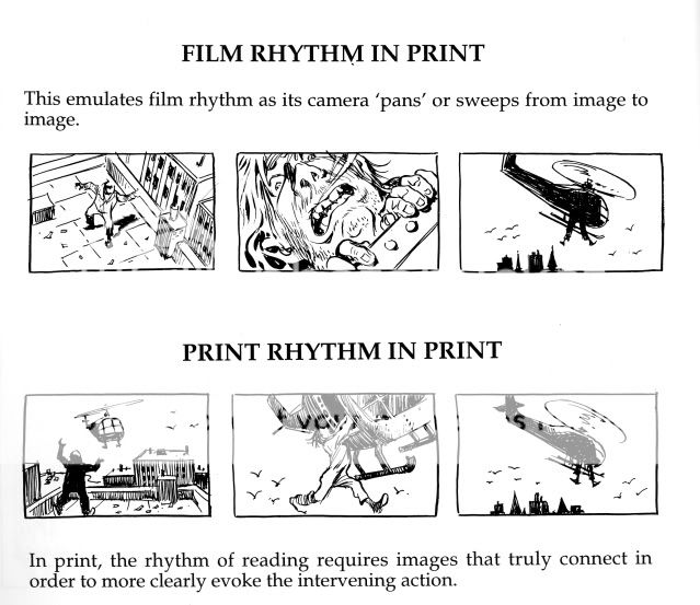
The key is context. Film transitions provide cuts and movement and all of the context that a viewer needs in digesting a film. Part of my instinct has been to focus on isolated moments and close-ups as a film would. This is due in part to a desire to heighten emotion and, in part, to the feeling that my drawings would be too small and cluttered otherwise. But, the solutions of a comic artist require more context in each panel that ideally delivers on the information of the previous panel and points ahead to the next. A close-up of a gun may be an emotional beat that's not pulling it's weight on a given page.
Rather than go on in text I'd rather share some examples from Will Eisner's "Comics & Sequential Art" that continue to make an impression on me as I digest their craft and meaning. This and its companion book are essential reading for comic artists.


I will include more examples from my own work in future posts. Keep in mind that my sequence at the top of the post was intended to play out as staccato beats of accumulated information in order to intensify drama of that scene in Issue 2. Whether or not that succeeded is up to the reader...
Thursday, November 25, 2010
FEEDING GROUND _ Grassy Ass (Gracias)

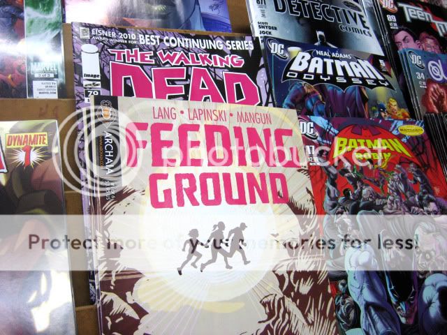
FEEDING GROUND #1 is officially in stores and I wanted the chance to acknowledge some people whose inspiration, talent, and support helped make this possible.
We've included a THANK YOU section at the back of the book. You can read the whole thing here, but this is my portion below:
As a group, we benefited greatly from the insight andAdditionally, I was remiss not to include John Siuntres and his Word Balloon podcast. His extensive and candid interviews with comic book professionals is the comic creator equivalent of a director's commentary on a DVD. This past year has been "comic book college" for me and John's podcast and the gracious information offered by guests provided me with the context to appreciate the craft, business, lifestyle, and shared enthusiasm of the comic industry.
experience of Thomas Peyton, the counsel of Suzana
Carlos, and the encouragement and camaraderie of artist
Juan Doe. Great thanks to everyone at Archaia not only
for taking a chance on us, but also offering advice and
support that recognized what we were doing and then
made it stronger.
MICHAEL LAPINSKI would like to thank the following
people: Cartoonists Rick Ritter, Mike Dawson, GB Tran and
the guys of MAMMAL, their art and dedication convinced
me to get back into making comics. Paul Zdanowicz,
horror guru and Lapinski-booster with a keen critical eye.
Klaus Janson, whose professional instruction came just at
the right time to bring structure and rules to what I had
been discovering on the page. Brian Michael Bendis for
providing the Jinxworld message board and its posters for
keeping me company in the solitude of my man cave. To
my parents and family, whose generous affection has
always allowed me to thrive. And, to Lindsay, thanks for
adding sweetness to my life and for riding this wolf with
me to Bayonne and beyond.
Big thanks to everyone we've met since starting down this path and to my co-conspirators Swifty Lang and Chris Mangun, buds and creative partners who've shared in every step.
And, here's a handy link on where you can find the series. I'm inking Issue 4 (of 6) and will post something crafty in my next blog post.
Thursday, January 21, 2010
COMIC INFLUENCES 01 _ Ed Hannigan

Creating comics can be a drawn out, time-consuming process. My mind wanders as I render for hours, understanding and illuminating aspects of the story that had not yet been apparent to me. But, there are moments when it is impossible for me not to weigh my work against all of the other comics produced before me as well as those of my contemporaries.
Do I tell a story that utilizes the economical realism of a Batman: Year One-era Dave Mazzucchelli or will the story be better served by the seemingly spontaneous and chaotic panel and character explorations of Bill Sienkiewicz? Even as my "style" and process have been regulated, there are lessons and challenges that all other art continually poses to keep me fresh and honest with each panel. It can also be daunting on a bad day.
I wanted to push some pixels here to honor an influence who was one of the forces that inspired my devotion to this medium but whose name I only recently discovered.
His name is Ed Hannigan and his was the silent hand drafting many concept sketches for Marvel covers during the formative years of my comic collecting.

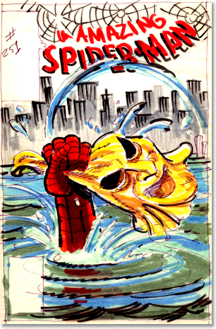
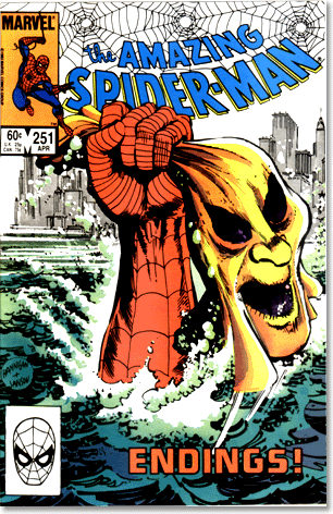
I'm almost positive there were other comics I bought and read before this Amazing Spider-Man #251. Up until this point I was a Spider-Man fan primarily because I met him at the Grand Opening of a local appliance store.

I was unaware of the Hobgoblin and the mystery surrounding him but this particular image screamed of such peril that I had to know what was happening. This was the image, a single image that is densely packed with story and drama, that told me that art could speak volumes and elicit intense emotions. And, it does so by illustrating a moment that doesn't even show the combatants. This was cover art as STORY, not pin-up.
Coincidentally, that cover was inked by Klaus Janson, who I now have the great honor and pleasure of calling a teacher.
Ed was schooled by some of the Marvel Masters like John Romita and Jack Kirby but I didn't grow up in that era. It was his play with type and illustration and design that contributed to my appreciation and professional/ playful relationship with those same elements to this day.
He has literally covered the entire Marvel Universe by serving as the designer and illustrator responsible for the character-packed covers to "The Official Handbook of the Marvel Universe." Each was its own design puzzle and then they all interlocked to form a poster the size of a small NYC apartment.

Unfortunately, the reason his name has come to my attention is because he is battling Multiple Sclerosis and The Hero Initiative is championing his work and seeking donations to defer some of his medical expenses. Comics don't have a retirement plan or union and The Hero Initiative has taken on the role of encouraging fans to provide a safety net for those in need.

I'm glad to know Ed's name to thank him for being one of those influences that encourage greatness. Also thanks to The Hero Initiative for collecting a comic of his work so that I may study it and produce work that may live up to his legacy.
You can donate on their website and buy the collection Ed Hannigan: Covered at your local comic shop. And, you can buy or commission art by Ed here.
Saturday, January 2, 2010
KLAUS CLASS CODA _ Rules and a Resolution

Of all of the "rules" and guidelines conveyed in Klaus Janson's Comic Storytelling class at MoCCA, the one he sought to impress on us the most was:
"Assume Responsibility for the Page"
There is nothing haphazard about the decisions that you make and each decision has meaning.
Similarly, a friend recently shared the list of rules he received in a screenwriting class which included:
9. WRITING SCREENPLAYS IS AN INTENSELY INTELLECTUAL PROCESS - THE IMPACT IS EMOTIONAL"

OK, so I've taken responsibility and now I'm doing it. From that point on, things get a little fuzzy.
Any list of rules has been codified from the actual, in-practice, experience of its creator. As a result, there can be as many contradictory guidelines as there are artists who lived them.
Within comics, there are two that readily come to mind.

One of the first choices a comic creator must make is: Do you use a grid or non-grid to tell the story?
Comic artist Eddie Campbell has his own set of rules on his blog "The Fate of the Artist," the first being:
RULE #1
The entire drama of a given situation must be contained within each panel of the sequence of that situation.
Get all those cameramen and equipment, and the director and the sound engineer and the continuity girl and the boy with the clapperboard, out of that tight space and focus on the humanity.
And yet many of today's most successful and popular comics employ the film language of cutting and camera angles and "widescreen" action to try and bring the reader into the moment. This is a technique that may feel natural to an audience and creator pool trained to see like a camera and yet it ignores qualities (panels are still images) that make comics unique as a medium.


The second point is a basic technical one that I'm wrestling with right now: Do you draw word balloons first and then design your page around them or draw a page with room for word balloons?
On this, Eddie is of the camp that endorses hand-drawn word balloons and lettering up front and digital lettering foundry Comicraft employs the latter method on many top-selling books.
So far, I'm in the precarious position of finding that ALL of these rules have truth to them.
Of course, there are some that shouldn't be broken. In the above lettered page, whether following the rule of left-right Western reading or basic proximity of balloons, I should have had the first balloon higher and further left than the rest so as not to confuse reading order.
Classes like Klaus' certainly helped in laying out some fundamentals of comic design and reading and listening to comic podcasts has enlightened me in the experiences of other artists.
But, none of it would make any sense if I weren't doing it myself.
And that's my simple resolution. To do it and keep doing it. To continue to make new discoveries and to use the "rules" of others where the story calls for them.
And, eventually, to come back with my own set of rules for someone else to use or cast aside at their discretion.
Friday, December 18, 2009
My Evenings with Klaus _ PART 3

And, here you have all three pages of my homework assignment for Klaus Janson at his MoCCA "Storytelling for Comic Artists" class.
The drawings are a little rough, especially as I got rushed for time towards the end, but the goal, implementing his lessons for clear storytelling, should be evidenced in these pages.


How did I do?Well, I picked up on a lot of fundamentals that seem inherent to concise storytelling and the class confirmed what I had already discovered on my own: comic art is equal parts drawing and problem solving.
Fortunately, Klaus has been teaching and plying his trade for some time and was able to break it down in handy lists and essential truths. I'll share some more observations next week, but, for now, some thoughts on his comments regarding my homework.
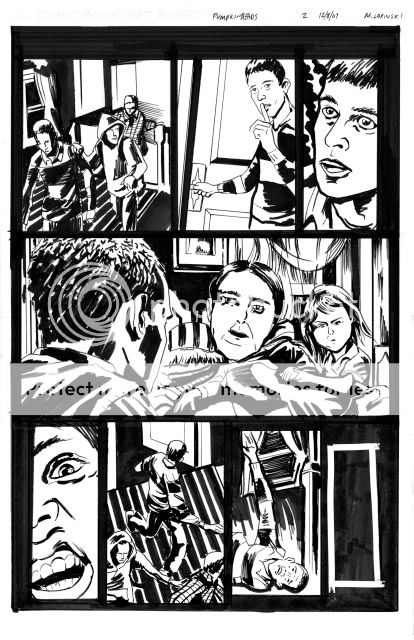
In general, he gave positive feedback to my spotting of blacks, cropping, and camera placement but pointed out where certain panels felt "flat" (ie. Page 1, Panel 2). In terms of storytelling, he rightully questioned the right to left direction of P2, PNL1 and pointed to the need to show the door in Panel 1 to set-up Panel 2.
He felt that the Pumpkinheads themselves should have been scarier, more shocking in appearance. I'm not satisfied with my rendering of them but pictured them to be more pitiful than scary to undercut the horror. Nonetheless, they needed to be freakier with a more apparent mutation.
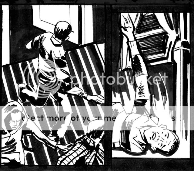
Finally, I needed to have set up the fall of the kid on P2, PNL 6. It's unclear what he trips over and violates one of those comic truisms - any new information (ie. the object he trips over) needs to be set up one to two panels before you use it. I tried to give him an off-balance posture in the previous panel but could have actually shown his foot getting snagged to clearer effect.

For me, I would re-board the last page. I definitely wanted to start this page with the kid waking but don't feel as if I properly balanced my shots. To do it again, I would start tighter on the kid's face and more clearly pull out with each panel, much wider on the two-shot with him and the girl to lead to the cut to the exterior. I would then NOT have the last panel bleed out and instead treat it as a smaller inset panel to give the suggestion of isolation and hopelessness.

One touch I added was to have vines already start to creep up the SUV to suggest a passage of time and a slightly supernatural force at work. It's something I'd confirm with the writer first but it was my way of having the art bring an additional layer to the story that wasn't overtly called for in the script.
Thanks to Klaus and Danny Fingeroth, comic writer and editor-emeritus and director of education at MoCCA, for setting this up and sharing their knowledge.
Thursday, December 10, 2009
My Evenings with Klaus _ PART 2
Last week I introduced you to some lessons and the assignment set forth by Klaus Janson in his MOCCA comic class. This week, I'll share my first page of the homework with a few quick observations about my process.I'm a nut for any instance in which several people, in this case comic artists, produce their unique personal responses to the same set problem. There's inherently so much to be learned in the comparison of approach and technique and greater insight into the subjectivity of experience in general.
As a reminder, here's the description we were given. We had to take this 18 point story and translate it into a 3 page wordless comic.
Some students intentionally set the story in the 50s, some had a multi-gendered cast, some had a definitively lighter or darker touch when it came to "horror." The overall effect was as many different stories as there are students, and all as jumping off points for further discussion that I'll get into next week.My friend and co-worker Rick Ritter happened to sign up for the same class. He's a storyboard artist by trade and he specifically challenged himself to break the static mold of a board page and tell this story utilizing varied panel sizes for greater impact. But, the mark of his boarding background can especially be seen in the way he logically transitions through the sequential details of a moment, particularly the kid tripping and falling. You can see his homework here.
Now, here's my first page (still need to scan the other two) and some of my thoughts on it. Please keep in mind that I was pressed for time, and, as a homework assignment, it's a little rough around the edges.
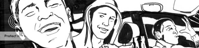
- Given the horror theme and the fact that we were going to be looking at these from across the room, I specifically decided to work with bold blacks and whites. This was also an opportunity to practice that particular skill, the alternating of black and white forms to illustrate space and volume, one that I had wrestled with in a previous assignment.- I wanted these kids to be recognizable but universal, so, I decided to cast them as Abercrombie-wearing teens in clothing as familiar today as it was 40 years ago. The bold patterns and hood would also allow for identifying them individually AND provide opportunity for cool graphic treatment. I put them in a conversion SUV to say TODAY but also suggest a first car or parent's car.
- One challenge everyone struggled with was how to casually let the reader know that it was Halloween. I decided to dress them in fall wear but also have a mask dangling from one kid's neck as if he had worn it on their previous jaunt. Also, a skull hanging from the mirror as a knick-knack.
- To communicate the Pumpkinhead legend, I tried to create as bold a gesture as possible with the the main guy mouthing the word "HUGE!" In general, I find photo reference indispensable at this stage in my ability for communicating these subtleties.
- I kept to wide panels for the first three to give a sense of travelling with this crew. They move from left to right and from IN the car, to OUT in the open, to IN the porch, enveloping them and the reader. I also tried to convey graphic lighting coming from the headlights out of frame in Panel 3.
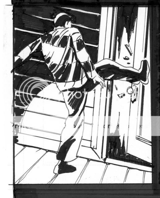
- The kick is the first dramatic moment and I hoped to set it up by showing the aggressive posture of the rugby teen in Panel 3 and deliver with a canted angle kick in Panel 4. I felt the angle gave extra thrust to his kick while planting his stable leg.

- In order to give character to the house, I decided to make it Gothic and ornamental like a classic haunted house. I think I could have done a better job in setting up the staircase in Panel 5, along with a wider view of the interior.
- Finally, Panel 6 was actually the first I drew because it had the most nuanced detail and because I don't want the first panel of a page to be the one to inadvertently look wonky if I'm not warmed up yet. I do think this last panel was pretty successful in setting up the space and forward motion/ impending doom. I decided that the transition to the second floor was the perfect place for a page turn and to leave the reader wanting more.
With that, more to come...
Thursday, December 3, 2009
My Evenings with Klaus _ PART 1
Last night I attended the first of three weekly comic art classes taught by veteran cartoonist Klaus Janson at The Museum of Comic and Cartoon Art in NYC. It could not have come at a better time. I found the lecture and discussion to compliment much of what I have been discovering while working on pages. For the next few posts I'll share my experience of the class and the assignments. It's been rewarding to get back into the mindset of a student of the arts, and if you are interested and have the means, I do suggest you check out Klaus' courses.There was a discussion already in progress when I entered the classroom, actually the main exhibition hall of the museum currently adorned with a chronology of original Archie Comics pages. One of the students had already offered up examples of his work and Klaus was being pointed but polite about asking him about the choices he made in the art of his story. In general, as a first class, Klaus presented us with Big Tent ideas to frame a way of understanding what we do as cartoonists. This student provided Klaus with what seemed to be his Golden Rule: As a cartoonist you must assume responsibility for every decision that is made on the page.
These decisions, big and small, all have meaning and must have intention behind them. The end goal then is to tell an entertaining story and to so with clarity. A cartoonist has to both be able to draw and also communicate visually. He or she must convey accurate emotion, setting, and identity and do so on every page without leaning on the dialogue as a crutch. It was reassuring how many times and variations of "This is not easy!" were uttered by Klaus. As such, our first assignment will be to illustrate a wordless story.
I'll offer up the details of the assignment at the end of this post and my take on the homework in the post next week. For now, I'll share a first draft of a page from my mini-series to illustrate some points.

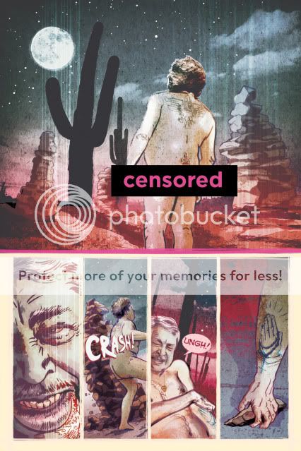
This was intended to be an opening page (Censored Bar courtesy of PhotoBucket image-hosting. What, no butts!?! This is Art, man.). There are a few things that the writers and I found confusing about it that caused us to re-work it and to re-think our opening sequence.
While we had wanted to create a sense of violence and mystery, there was some concern as to how well the page actually read. Is the character moving through a believable space? Is his action coherent?
It works in my mind's eye but some feedback caused us to wonder if I had unintentionally broken the 180 degree rule and marred the flow of action and if it was clear where the guy gets the rock from in panel 4.
In its re-working (can't share that art here right now) I believe we resolved the issue by including a wider establishing shot, another panel placing the character in the locale, and another setting up the rock debris so the reader can know it's there before its used in the final panel.
With my homework assignment, the goal is to communicate the actions of 3 characters based on 18 panel descriptions across 3 pages. Although I was never an Archie fan, those pieces hanging around us smiled effortlessly back at us with their lean, clean, choices and economic delineations of volume and space.
Take a look over these details and then check in next week for the results to see how I interpreted them.