Friday, January 29, 2010

COMIC PIN-UPS_ Indiana Jones and the Golden God


Here's a fan fic concept I developed and illustrated as a gift for my cousin.

For those of you that are unfamiliar with the Star Wars or Indiana Jones mythologies, just know that this is really cool.

But, if you'd like an explanation, just know that Indy is carrying the head of the golden robot C3-PO and that he is worshipped as a god by a race of primitive feral teddy bears. Indiana Jones is an adventurous archeologist known for stealing religious artifacts from such feisty zealots.

See?

Wednesday, January 27, 2010

FUN TO DRAW 01 _ Hair


As a new sub-set I'll occasionally post some details from the comic I'm working on.

Since I won't be able to post full panels or pages I thought it would be cool to highlight elements that I'm grooving on.

Right now, HAIR!

I can't say that I'm proficient at it but it's extremely gratifying to lay down some ink and achieve volume, texture, shine, and body. Luxuriant!


What say any other artists checking in? Hair it or Nair it? Do you wish all of your characters were bald? Am I going to detest inking hair by the end of Issue 2?

Thursday, January 21, 2010

COMIC INFLUENCES 01 _ Ed Hannigan


Creating comics can be a drawn out, time-consuming process. My mind wanders as I render for hours, understanding and illuminating aspects of the story that had not yet been apparent to me. But, there are moments when it is impossible for me not to weigh my work against all of the other comics produced before me as well as those of my contemporaries.

Do I tell a story that utilizes the economical realism of a Batman: Year One-era Dave Mazzucchelli or will the story be better served by the seemingly spontaneous and chaotic panel and character explorations of Bill Sienkiewicz? Even as my "style" and process have been regulated, there are lessons and challenges that all other art continually poses to keep me fresh and honest with each panel. It can also be daunting on a bad day.

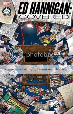
I wanted to push some pixels here to honor an influence who was one of the forces that inspired my devotion to this medium but whose name I only recently discovered.

His name is Ed Hannigan and his was the silent hand drafting many concept sketches for Marvel covers during the formative years of my comic collecting.


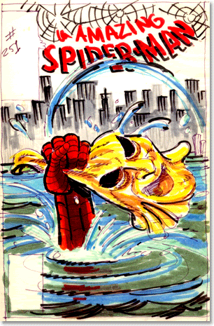
I'm almost positive there were other comics I bought and read before this Amazing Spider-Man #251. Up until this point I was a Spider-Man fan primarily because I met him at the Grand Opening of a local appliance store.


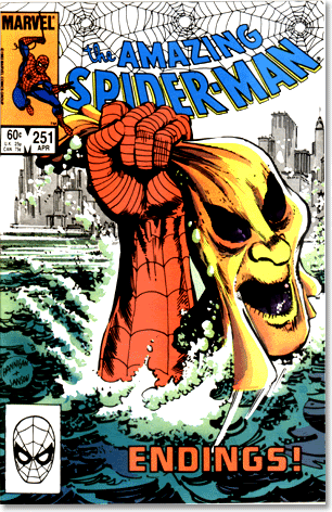
I was unaware of the Hobgoblin and the mystery surrounding him but this particular image screamed of such peril that I had to know what was happening. This was the image, a single image that is densely packed with story and drama, that told me that art could speak volumes and elicit intense emotions. And, it does so by illustrating a moment that doesn't even show the combatants. This was cover art as STORY, not pin-up.

Coincidentally, that cover was inked by Klaus Janson, who I now have the great honor and pleasure of calling a teacher.

Ed was schooled by some of the Marvel Masters like John Romita and Jack Kirby but I didn't grow up in that era. It was his play with type and illustration and design that contributed to my appreciation and professional/ playful relationship with those same elements to this day.

He has literally covered the entire Marvel Universe by serving as the designer and illustrator responsible for the character-packed covers to "The Official Handbook of the Marvel Universe." Each was its own design puzzle and then they all interlocked to form a poster the size of a small NYC apartment.


Unfortunately, the reason his name has come to my attention is because he is battling Multiple Sclerosis and The Hero Initiative is championing his work and seeking donations to defer some of his medical expenses. Comics don't have a retirement plan or union and The Hero Initiative has taken on the role of encouraging fans to provide a safety net for those in need.


I'm glad to know Ed's name to thank him for being one of those influences that encourage greatness. Also thanks to The Hero Initiative for collecting a comic of his work so that I may study it and produce work that may live up to his legacy.

You can donate on their website and buy the collection Ed Hannigan: Covered at your local comic shop. And, you can buy or commission art by Ed here.

Friday, January 15, 2010

CHARACTER DESIGN 03 _ Devil in the Details


Early in the process of pre-designing for our comic, I did a number of character studies to nail down the likenesses and proportions for our lead characters.


Here, I thought I'd share some of the details from those sheets in which I was trying to determine logos to be worn on character hats and shirts. This was all in service of giving the characters believable details to allow them to exist in a fictional world. Plus, they may not be superheroes in tights and capes and primary colors but I felt that our cast should look iconic in a visual medium.

For the hats, I had three directions in mind that would work in terms of the character of our lead male: sports teams, construction or work clothes (like Carhartt), or free telecom giveaways. We decided on one of them but, so as not to waste anything, I've used a number of the other designs for other supporting characters.


Our female lead goes through a few costume changes in the book.

I wanted to be sure that each character had a "costume" that was emblematic of their character or that would allow them to be easily identified even if my rendering was left wanting. But, this was no Scooby Doo adventure and costume changes were necessary at certain points in the story.


In this case, we'll be using numbers 3 and 9 in the final story.

It's true that few works of fiction take the time to allow their characters to take care of certain basic needs, like going to the bathroom or eating. But we found it important to focus on exactly those moments to reveal character from the situation.


The idea is to draw out iconic images and character designs from real-life observations.

And, once the book is a huge success, you can purchase the hats and T-shirts of your favorite character at your local comic shop.

Kidding, sort of.

Saturday, January 2, 2010

KLAUS CLASS CODA _ Rules and a Resolution


Of all of the "rules" and guidelines conveyed in Klaus Janson's Comic Storytelling class at MoCCA, the one he sought to impress on us the most was:

"Assume Responsibility for the Page"

There is nothing haphazard about the decisions that you make and each decision has meaning.

Similarly, a friend recently shared the list of rules he received in a screenwriting class which included:

9. WRITING SCREENPLAYS IS AN INTENSELY INTELLECTUAL PROCESS - THE IMPACT IS EMOTIONAL"


OK, so I've taken responsibility and now I'm doing it. From that point on, things get a little fuzzy.

Any list of rules has been codified from the actual, in-practice, experience of its creator. As a result, there can be as many contradictory guidelines as there are artists who lived them.

Within comics, there are two that readily come to mind.


One of the first choices a comic creator must make is: Do you use a grid or non-grid to tell the story?

Comic artist Eddie Campbell has his own set of rules on his blog "The Fate of the Artist," the first being:

RULE #1

The entire drama of a given situation must be contained within each panel of the sequence of that situation.
Get all those cameramen and equipment, and the director and the sound engineer and the continuity girl and the boy with the clapperboard, out of that tight space and focus on the humanity.

And yet many of today's most successful and popular comics employ the film language of cutting and camera angles and "widescreen" action to try and bring the reader into the moment. This is a technique that may feel natural to an audience and creator pool trained to see like a camera and yet it ignores qualities (panels are still images) that make comics unique as a medium.


The second point is a basic technical one that I'm wrestling with right now: Do you draw word balloons first and then design your page around them or draw a page with room for word balloons?

On this, Eddie is of the camp that endorses hand-drawn word balloons and lettering up front and digital lettering foundry Comicraft employs the latter method on many top-selling books.

So far, I'm in the precarious position of finding that ALL of these rules have truth to them.

Of course, there are some that shouldn't be broken. In the above lettered page, whether following the rule of left-right Western reading or basic proximity of balloons, I should have had the first balloon higher and further left than the rest so as not to confuse reading order.

Classes like Klaus' certainly helped in laying out some fundamentals of comic design and reading and listening to comic podcasts has enlightened me in the experiences of other artists.


But, none of it would make any sense if I weren't doing it myself.

And that's my simple resolution. To do it and keep doing it. To continue to make new discoveries and to use the "rules" of others where the story calls for them.

And, eventually, to come back with my own set of rules for someone else to use or cast aside at their discretion.