Early in the process of pre-designing for our comic, I did a number of character studies to nail down the likenesses and proportions for our lead characters.
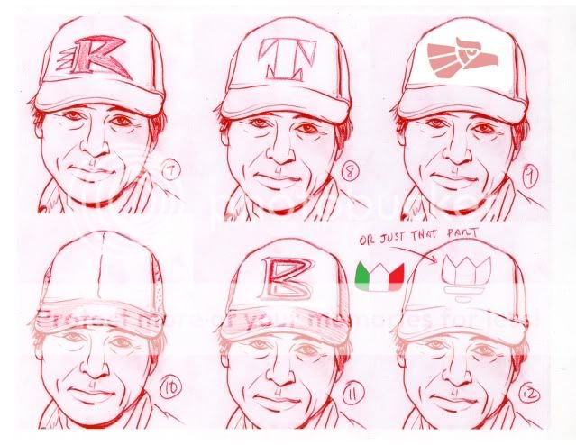
Here, I thought I'd share some of the details from those sheets in which I was trying to determine logos to be worn on character hats and shirts. This was all in service of giving the characters believable details to allow them to exist in a fictional world. Plus, they may not be superheroes in tights and capes and primary colors but I felt that our cast should look iconic in a visual medium.
For the hats, I had three directions in mind that would work in terms of the character of our lead male: sports teams, construction or work clothes (like Carhartt), or free telecom giveaways. We decided on one of them but, so as not to waste anything, I've used a number of the other designs for other supporting characters.


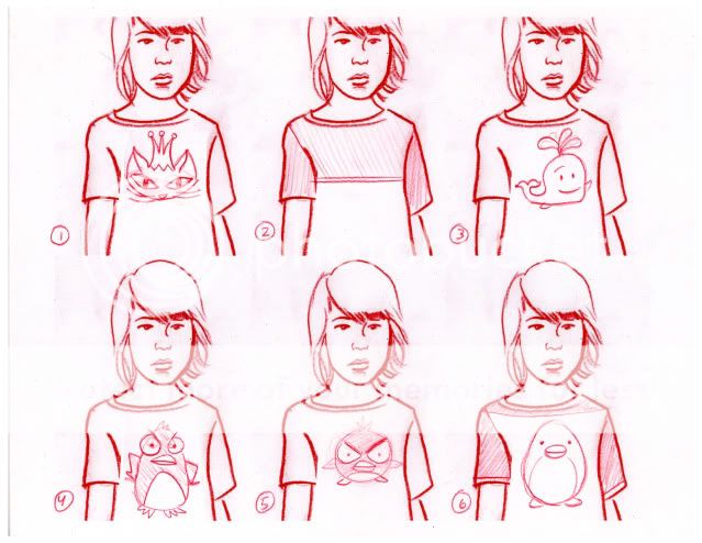
Our female lead goes through a few costume changes in the book.
I wanted to be sure that each character had a "costume" that was emblematic of their character or that would allow them to be easily identified even if my rendering was left wanting. But, this was no Scooby Doo adventure and costume changes were necessary at certain points in the story.


In this case, we'll be using numbers 3 and 9 in the final story.
It's true that few works of fiction take the time to allow their characters to take care of certain basic needs, like going to the bathroom or eating. But we found it important to focus on exactly those moments to reveal character from the situation.
The idea is to draw out iconic images and character designs from real-life observations.
And, once the book is a huge success, you can purchase the hats and T-shirts of your favorite character at your local comic shop.
Kidding, sort of.

No comments:
Post a Comment