Showing posts with label Logo Design. Show all posts

Monday, April 23, 2012

LOGO DESIGN _ "Mind the Gap" Roughs

I recently had the chance to design the logo for Image Comics' preternatural thriller MIND THE GAP, in stores on Wednesday, May 2nd. Here's a Robot 6 interview with writer Jim McCann about the series and I shared the final logo design on my blog here. Thought it might be cool to go through the options that led us there.

During an extremely productive brainstorming call with Jim, we developed some governing principals and descriptive adjectives of a design that would communicate the story and compliment the art by artist Rodin Esquejo and colorist Sonia Oback. We arrived at three potential directions to take.

They were:

ETHEREAL
The story focuses on a woman, Elle, who is caught in the gap between life and death after an attempt on her life. Jim felt that the logo should use color to have an out-of-focus, shifting, ethereal quality to reflect the mental state. The blurring also suggests the movement of a train, recalling the platform on which she was shot. 


FRAGMENTED
The details surrounding Elle's shooting are a mystery and she is working to piece together the clues to identify her shooter and return to the land of the living. As such, I wanted to use utilitarian stencils, like those of subway notices, to create a logo like puzzle pieces that might take a moment to assemble at first glance.


WORLD-WORN
As a pulpy thriller, we also thought to try something that pulled directly from the grit of subway signage, literally the edge of the platform and figuratively at the edge of Elle's consciousness.


BUT

Although these were the three options we discussed, working on the mock-ups compelled me to try a fourth riskier approach that I internally labelled simply as "BIG." By blowing up the stencil as large as possible I wanted the gaps, the negative spaces, to be nearly as prominent as the letter forms. Then, by splitting the title on the top and bottom of the cover we were able to frame and compliment Rodin's art in unique manner and provide an inherent gap or pause in its reading.

I threw this option out there as a bonus, and, after some reflection and minor tweaks, it's the one that the MtG creative team ended up choosing.


Wednesday, March 14, 2012

LOGO DESIGN _ Mind the Gap


I recently had the opportunity to design the logo for the upcoming Image Comics series MIND THE GAP (USA Today preview HERE), developed by Jim McCann. Had the pleasure to meet Jim at my first convention when I was pitching FEEDING GROUND. Jim has written for Marvel (the characters of Hawkeye, Mockingbird, and Dazzler shined under his pen) and we eventually wound up at the same publisher, Archaia. where he created the extraordinary Eisner-winning THE RETURN OF THE DAPPER MEN with artist, and fellow Nashvillian, Janet Lee. As Jim was creating this new series with artist Rodin Esquejo and colorist Sonia Oback he found my post on FEEDING GROUND logo designs and added me to the team. I'm proud to have done my part in working with them and think we've concocted something unique in the logo/cover design.

I'll post more thoughts and a process piece closer to the May 2nd release date. For now, you can see the covers and solicitation below. You can read the full press release HERE. Be sure to support creator-owned comics and reserve your copy with your local comic retailer! 


MIND THE GAP #1
story JIM McCANN
art / cover RODIN ESQUEJO & SONIA OBACK
variant cover RODIN ESQUEJO & SONIA OBACK
MAY 2
48 PAGES / FC / T+ 
$2.99
After Elle Peterssen is mysteriously attacked on a Manhattan subway platform, she is left in a coma, the only clues to her attacker trapped inside her mind. No one knows the identity of the person behind this brutal beating or where they will strike next. In this ALL-NEW ONGOING series, everyone is suspect, and no one is innocent. USAToday calls it an “anxiously anticipated modern thriller…Whodunit? McCann's done it again.”
Eisner-winning writer JIM McCANN joins RODIN ESQUEJO (MORNING GLORIES) and SONIA OBACK (S.H.I.E.L.D., The Defenders) unite for a psychological thriller that will leave you guessing at every turn!

Diamond order numbers: (cover A: MAR120401, cover B: MAR120402)


Friday, January 15, 2010

CHARACTER DESIGN 03 _ Devil in the Details


Early in the process of pre-designing for our comic, I did a number of character studies to nail down the likenesses and proportions for our lead characters.


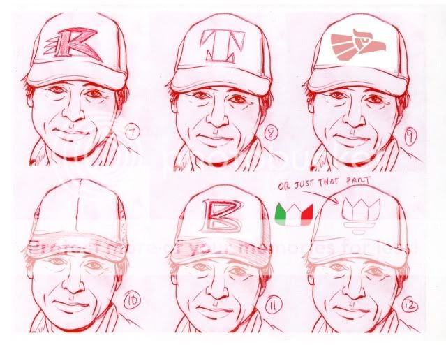
Here, I thought I'd share some of the details from those sheets in which I was trying to determine logos to be worn on character hats and shirts. This was all in service of giving the characters believable details to allow them to exist in a fictional world. Plus, they may not be superheroes in tights and capes and primary colors but I felt that our cast should look iconic in a visual medium.

For the hats, I had three directions in mind that would work in terms of the character of our lead male: sports teams, construction or work clothes (like Carhartt), or free telecom giveaways. We decided on one of them but, so as not to waste anything, I've used a number of the other designs for other supporting characters.


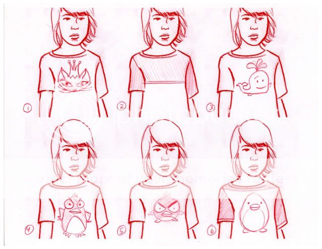
Our female lead goes through a few costume changes in the book.

I wanted to be sure that each character had a "costume" that was emblematic of their character or that would allow them to be easily identified even if my rendering was left wanting. But, this was no Scooby Doo adventure and costume changes were necessary at certain points in the story.


In this case, we'll be using numbers 3 and 9 in the final story.

It's true that few works of fiction take the time to allow their characters to take care of certain basic needs, like going to the bathroom or eating. But we found it important to focus on exactly those moments to reveal character from the situation.


The idea is to draw out iconic images and character designs from real-life observations.

And, once the book is a huge success, you can purchase the hats and T-shirts of your favorite character at your local comic shop.

Kidding, sort of.

Wednesday, October 28, 2009

LOGO DESIGN 01 _ Feeding Ground Part 1


The full package of a comic book is a big marriage between art, story, and design. As much as it is said that making a comic is akin to making a movie, it is also a regular design journal utilizing the trades of poster art composition, font treatment, and logo design. The letterer is typically the invisible hand among already unsung heroes and I don't have enough experience to weigh in on their craft. But, as a freelance designer, I've done my share of logo designs and I've had to bring those skills to branding my own book. Among the professionals plying this trade for comics, it was letterer Todd Klein and his blog Todd's Blog (natch) that proved to be an invaluable resource as I researched the field.

A prodigious talent in his own right, Todd is able to field his work in concert with an encyclopedic survey of its comic ancestors, particularly though his Logo Studies link. His site is not only a catalog of the changing styles and tastes of decades of type design but also of the influence of technology in their creation from the hand drawn through the digital age. Todd is often able to tease the genesis of a design from the working files and feedback from their creators as well as glean their fine art and design influences. It's exciting stuff for anyone who appreciates the craft and energy that define much of comic art.

The logos I've designed in the past usually consisted of a primary image with no text, limited text, or an even integration of the two. Here are some designs I executed for the online shop The Angry Robot, our own Blacklight Comics logo, and the logo for Nickelodeon's "Random! Cartoons."


But, for the title design of a comic book, the "story" needs to be told through the text itself and in a way that compliments the cover art. The logo also normally needs to perform this function from its allocated perch on the top third of the cover because of the way that most comics are displayed in stores; racked so that overlapping books only allow the tops of the rear books to remain visible. Ideally the title would be an integrated part of the composition but the masthead approach dominates for ease of use.

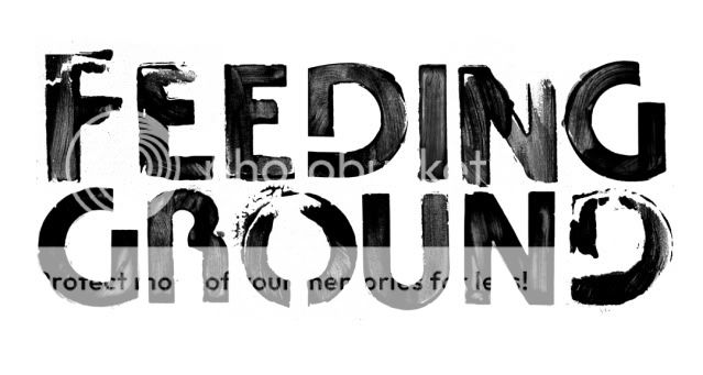
Our upcoming mini-series, Feeding Ground, is a present-day horror story situated in the desert. It's visceral and desperate and infuses some nasty creatures into a politically charged environment. The challenge in creating this design has been the need to communicate real world horror without resorting to spooky or gory font treatments. On top of that, there are a whole lot of letters in the title. Over the next few thumbnails, you'll be able to see some of the relationships I've tried to reinforce among the different letterforms.

In my first attempt, I went for communicating a regional identity with the use of a western font. And, well, it seems to Western-y.

Pulling a 180, I abandoned the use of a decorative font for the more industrial forms you would see on a road sign, communicating travel. Here, I enjoy the interplay between the rounded and edged corners, clean silhouette, and cold uniform spacing. I also roughed it up a bit digitally to distress the outline and give it a pixelated tooth. Here it is in three size variations.

Building off of the existing flows of curve and point, I printed this design and then extended some of the ends by hand. This one is starting to feel more self-contained to me, more like a logo than a series of letters. The exaggerated points also add a more sinister intent. The slightest additions changed the overall feel and I found that it helped to look at the reduced thumbnail in my browser rather than get caught up in a 400% magnification of one serif.

Check out the subtle change in the anatomy of the F in these two versions, one in which the top arm ends to allow the mind to fill the gap and the second in which I added a point to close off the form and mirror the G. Which do you prefer?

For the last series in this installment, I wanted to craft a title by hand in order to suggest the self-sustaining, hardscrabble, world our characters inhabit. In general, I prefer it whenever I can craft something outside of the computer as a starting point for any digital manipulation. (I drew the letters on actual ping pong balls for the Random! logo) The subtle fluctuations tend to give any design more life.

As an artmaking packrat, I still have stencils from a little set I received as a kid in the 80s. With a liberal application of fingerpaint, both red paint on a white surface and also white paint on a dark surface, I globbed it up to varying degrees. Here you have a few final thumbnails from clean to jacked to a combination of the two.

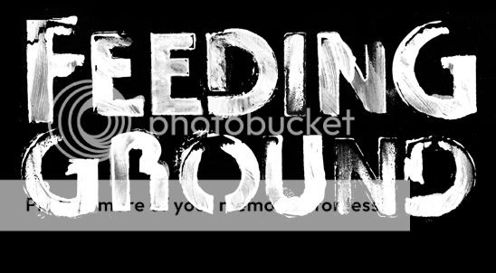
In this case, I discovered that there is an inherent mirroring of the Gs and Ds that I can choose to exploit as well as the prominence of the O and double EEs. Unfortunately, the font itself has a rounded Bauhaus feel that makes the overall design seem "retro" to me.

Some of these are still viable candidates but I've already moved on to a few more approaches to make sure that I've done due diligence to our book. Let me know what's working for you and I'll be updating the process in future installments.