 Last night I attended the first of three weekly comic art classes taught by veteran cartoonist Klaus Janson at The Museum of Comic and Cartoon Art in NYC. It could not have come at a better time. I found the lecture and discussion to compliment much of what I have been discovering while working on pages. For the next few posts I'll share my experience of the class and the assignments. It's been rewarding to get back into the mindset of a student of the arts, and if you are interested and have the means, I do suggest you check out Klaus' courses.
There was a discussion already in progress when I entered the classroom, actually the main exhibition hall of the museum currently adorned with a chronology of original Archie Comics pages. One of the students had already offered up examples of his work and Klaus was being pointed but polite about asking him about the choices he made in the art of his story. In general, as a first class, Klaus presented us with Big Tent ideas to frame a way of understanding what we do as cartoonists. This student provided Klaus with what seemed to be his Golden Rule: As a cartoonist you must assume responsibility for every decision that is made on the page.
These decisions, big and small, all have meaning and must have intention behind them. The end goal then is to tell an entertaining story and to so with clarity. A cartoonist has to both be able to draw and also communicate visually. He or she must convey accurate emotion, setting, and identity and do so on every page without leaning on the dialogue as a crutch. It was reassuring how many times and variations of "This is not easy!" were uttered by Klaus. As such, our first assignment will be to illustrate a wordless story.
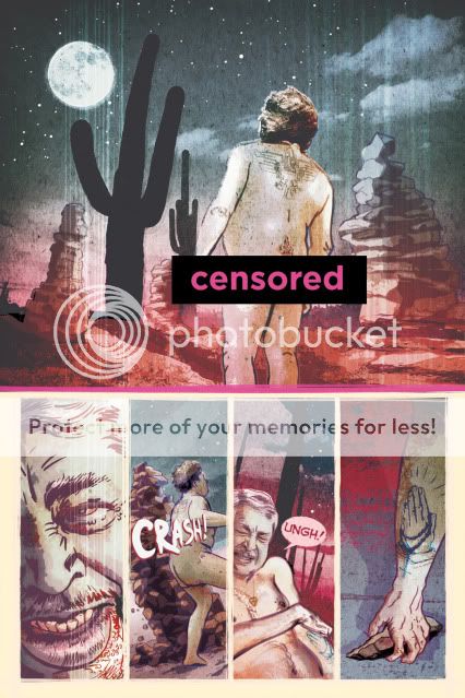
I'll offer up the details of the assignment at the end of this post and my take on the homework in the post next week. For now, I'll share a first draft of a page from my mini-series to illustrate some points.

This was intended to be an opening page (Censored Bar courtesy of PhotoBucket image-hosting. What, no butts!?! This is Art, man.). There are a few things that the writers and I found confusing about it that caused us to re-work it and to re-think our opening sequence.
While we had wanted to create a sense of violence and mystery, there was some concern as to how well the page actually read. Is the character moving through a believable space? Is his action coherent?
It works in my mind's eye but some feedback caused us to wonder if I had unintentionally broken the 180 degree rule and marred the flow of action and if it was clear where the guy gets the rock from in panel 4.
In its re-working (can't share that art here right now) I believe we resolved the issue by including a wider establishing shot, another panel placing the character in the locale, and another setting up the rock debris so the reader can know it's there before its used in the final panel.
With my homework assignment, the goal is to communicate the actions of 3 characters based on 18 panel descriptions across 3 pages. Although I was never an Archie fan, those pieces hanging around us smiled effortlessly back at us with their lean, clean, choices and economic delineations of volume and space.
Take a look over these details and then check in next week for the results to see how I interpreted them.


No comments:
Post a Comment