I got a nice surprise last week when the cover to FEEDING GROUND #2 was included on the list of the Top 50 covers of 2010 on the Robot 6 blog of COMIC BOOK RESOURCES. I still have last year's list bookmarked and I share the list with many of my favorite artists and images.
A child of the 80s, my taste in cover art/ design straddles the line between the narrative and iconic. To my mind, the best evidence of this is the Marvel work of Ed Hannigan. He was schooled by the greats but rather than lift a full scene from an issue (Spider-Man fights the Hobgoblin) he would choose the key moment that would make for the most iconic cover design (Spider-Man's fist raising Hobgoblin's mask out of the East River).
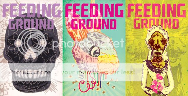
Speaking for myself, I arrived at a design scheme for the FEEDING GROUND mini-series that intentionally employs symmetry, bold color fields, and an isolated element to help distinguish the cover from the overall noise of the comic wall. Additionally, each cover is both a perversion of familiar Mexican iconography and a poetic counterpoint to the content of the issue. For Issue #2, the image is a visceral version of the Sacred Heart but also a comment on both the virus/ curse coursing through Flaca's veins and the act of her mother, Bea, burning down their home.
Whether or not I was successful is up to the reader, but, I at least wanted to give a sense of the thought process that goes into making these things.
Here are some of my favorites from the BEST OF list:
Amazing Spider-Man by Paolo Rivera

Batwoman by JH Williams III

CHEW by Rob Guillory

And, here's another peek at covers for upcoming Issues. Next time out, on a different story, I'd like to play with asymmetry and narrative as the covers demand it.

Whether or not I was successful is up to the reader, but, I at least wanted to give a sense of the thought process that goes into making these things.
Here are some of my favorites from the BEST OF list:
Amazing Spider-Man by Paolo Rivera

Batwoman by JH Williams III

CHEW by Rob Guillory

And, here's another peek at covers for upcoming Issues. Next time out, on a different story, I'd like to play with asymmetry and narrative as the covers demand it.


No comments:
Post a Comment