Got jolted today when I was scrolling down Robot 6's alphabetical list of BEST COMIC COVERS of 2011 and found my cover to FEEDING GROUND #4 after the Batmens and Daredevils. Still a shock to recognize that our creation as first-time creators shares a shelf with all of comic history and even more humbling to be included among artists that I admire.
Issue #2 was honored on the 2010 list (link HERE) and here's what I had to say about my FEEDING GROUND covers then:
I arrived at a design scheme for the FEEDING GROUND mini-series that intentionally employs symmetry, bold color fields, and an isolated element to help distinguish the covers from the overall noise of the comic wall. Additionally, each cover is both a perversion of familiar Mexican iconography and a poetic counterpoint to the content of the issue.
For Issue #4, "Severed Ties," our lead werewolf makes her first kill and, with flies swarming confetti entrails, the cover is meant to convey the dark side of child's play.
While I still appreciate the thought process behind these covers, especially the brainstorming with co-creators Swifty Lang and Chris Mangun, I can't help but be critical of my still-developing craft/execution (especially seen alongside other covers on the list). If I were to do them again, I'd probably create a more consistent style across the 6 issues that is somewhere between their current state and the simplified versions (below) I designed as endpapers for the collected edition (and as posters, HERE).
COVER AS STORY
Locke & Key by GABRIEL RODRIGUEZ
Not on the the Robot 6 list but I wanted to start with this image as the alternative approach to my own FG#4 cover. Here, the gore is lushly illustrated in vivid detail and I was transfixed by the pooling blood in the paw print when this was first released. Notice too how the blood smear drags off the right side of the page begging you to open it and follow the trail. Bonus points for how the motif was revisited over the subsequent issues of this mini-series.
Heart by KEVIN MELLON
I cited Heart (by Kevin & writer Blair Butler) as my comic discovery of NYCC this year. The cover to #1 is one of the most iconic of 2011 but it succeeds on another level. The cover can also be read as the first panel of the comic followed by the closed fist of the first interior panel. Story first.
COVERS THAT APPROPRIATE OTHER AESTHETICS (and make Comics better for it)
Red Skull: Incarnate by David Aja
As recounted in his blog, smart move on the part of Aja and editor Alejandro Arbona to promote this Red Skull origin AS Nazi propaganda. The attention to detail, especially the different typefaces, sells it and the German text-heavy newspaper cover is about the ballsiest cover I've seen this year from the Big 2.
Secret Avengers by David Aja
Frozen like two stray frames from a grindhouse kung-fu flick, this cover doesn't work 100% for me (the palette feels too austere for the reference point) but it does evoke something I'd like to see more of; sequential art on covers.
Punisher: Max by Dave Johnson
While Johnson's work occasionally approximates the designs of propaganda posters and pulp covers, his Punisher Max covers have felt like he's digested those references with a Saul Bass chaser and created an aesthetic that's all his own.
COVERS BY PAOLO RIVERA
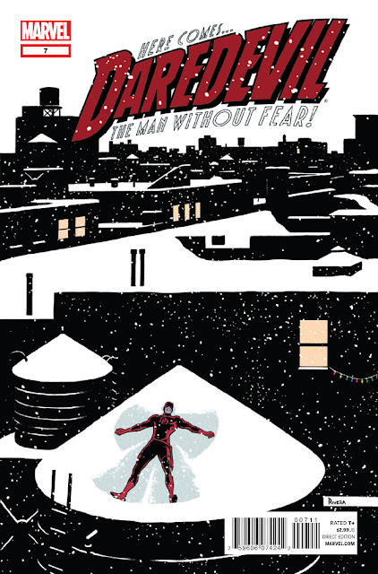
Yeah, he gets his own category. Paolo is one of the very few artists working today whose work makes me react like a fanboy. His art is steeped in Marvel DNA (a Spider-Man with Romita's musculature and Ditko's creepy/goofy deadpan) but with strong influences from fine art and classic illustrators. For me, the work of a comic artist is half craft and half making the right choices and Paolo is both crafty and clever without ever losing touch of the humanity and humor of his subjects. He also achieves the great challenge every mainstream artist faces; how to depict 50 year-old characters in a way that is refreshing and yet respects their history. His Spidey evokes every incarnation of the character for me, including The Electric Company. And now, he's in the process of re-inventing Daredevil with writer Mark Waid. Solicited in 2011, his yin yang fire escape of my two favorite superheroes captures both, and their relationship, in one essential image. You can buy Paolo's original art HERE.
COVERS I CAN'T STOP STARING AT
Loose Ends by Chris Brunner & Rico Renzi
One of my favorite comics of the last few years, each dressed in a package that speaks directly to my design tastes. Chris Brunner's pencils move and breathe and Rico Renzi's got a palette that shames rainbows. You can almost hear music and sound effects in their work. The Kickstand Kids should run all of Comics.
Spaceman by Dave Johnson
Boom.
(be sure to check out Dave's Cover Critique Blog)
COVER THAT DID ITS JOB
Never had much interest in the character of X23 but the pairing here is so charming and the rendering so poppy that the cover is the one this year that did what it's supposed to: get me to buy it.


