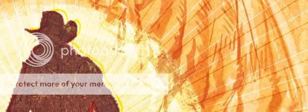
 Early in the process of designing our graphic novel, I became hooked on the idea of using skulls to illustrate the theme or plot of each issue in Dia de los Muertos-styled vignettes. With the desert as a setting, hunger as a motivating concept, and with tough men and beasts as key players in our tale, an inverted take on the classic Jaws poster seemed like a good fit.
The intention was for the skull to be a heatstroke hallucination of a wolf going in for the kill. Since we're so accustomed to seeing dinosaur skeletons, and with predators like T-Rexes attacking from above, we instead got a lot of questions about having a dinosaur on the cover.

Here are some examples of the evolution of the cover from what now seems like a stiff, but anatomically correct, rendering of the wolf skull and an ill-defined silhouette in the first rendition to what I think are more effective apparitions in the third.

In the end, we scrapped the idea entirely but it made me push for clearer solutions and hopefully a better concept.
(NOTE: I'm posting tonight, and no new post this Thursday, because I'm heading away for a week to go swim with my dog)

No comments:
Post a Comment