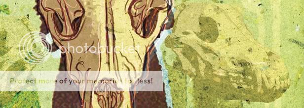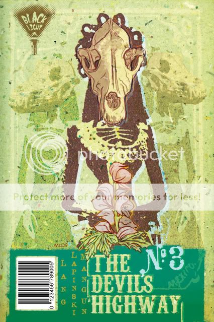
Here you have some more artwork from the pitch book I shopped around at NYC Comic Con 2009. In addition to sample pages and a full script for issue one, we decided to include cover comps for three issues. This seemed like the best way to communicate our mini-series as a fully fleshed out entity with an overarching design concept. It's one thing to have passion and a great concept, but, I've found that providing at least a taste of each aspect of your work helps in getting a complete stranger to see the big picture.
These are still raw, but, the final versions will continue to draw from Mexican Day of the Dead iconography and both woodcut printing and silkscreen processes for their aesthetic. An early decision was to try to avoid literal images and to instead create allegorical vignettes with skeletal actors to portray the theme of each particular issue.
I discovered the art of Polish Poster designs a few years ago and, with these covers, I threw down the personal challenge to meet their standard of bringing more mysterious, poetic, and outright nutso imagery into the world.
I've changed the cover to issue 1 pretty drastically since then because of one recurring comment: "Is that a dinosaur?" As cool as gunslingers fighting T-Rexes might be, they unfortunately do not appear in our story. I'll re-visit the evolution of that cover in the next post...


No comments:
Post a Comment