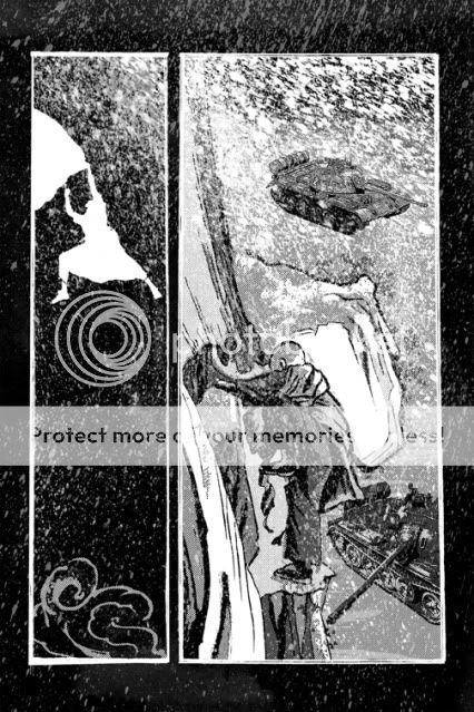
 The art of making comics essentially exists in act of laying out your panels. There are much better resources out there that will help you understand this skill but I thought I'd share a few examples where I tried tackling the grid head on.
It was Scott McCloud in his seminal text book "Understanding Comics" that first identified comics to me as "sequential art." Comics as a medium is defined by the use of a series of static images that when read together represent a relationship according to time, space, or concept. I started reading comics at the age of 6 but the mechanism for reading them, the synthesis of word and image following a flow of panels from left to right, was unconscious and innate.
Hard to believe, but there are plenty of people who still do not "know" how to read comics and get confused by what to read first. That said, the 6-panel grid is the most effective and elegant way to break down the page for easy reading. As pointed out in Gary Spencer Millidge's "Comic Book Design" it also follows the Golden Ratio in the way it sub-divides information according to Classical composition.
For an example of an excellent use of the 6-panel grid, check out Chapter 1 in Tim Hamilton's "Floating Elephant" strip at Act-i-vate. He's created a surreal suburban world and the grid is an unobtrusive window into it. It feel ordinary while the content is anything but.
For my own work, here's an example of how a 9-panel grid can set up a sense of time that is like a metronome. Ticking down and alternating between scenes, and finally ending with a bang. The 9-panel format was utilized with an world's worth of information and skill by Alan Moore and Dave Gibbons in "Watchmen."

What happens when you break the grid? First, you can run the risk of confusing the reader and drawing too much attention to the frame instead of the content. But, here is an example of me trying to use the layout to create a mood that feels claustrophobic and draws all attention to the goal of the scene, the door to the outside world.

As a final example, this page was a way for me to release the grid by using the full length of the page to hopefully create that sense of falling for the reader. Ideally, the slight rotation I gave to the image in the first panel helped to undercut any sense of the border as safety net.

So, there's a ton to consider in constructing a comic all in the hopes that it will be invisible to the reader. I'm only scratching the surface here and there are new tools and tricks to pick up with every new page.

congrats for you artworks!
ReplyDeleteI have a deep passion for the sandard 6 panels grid, if combined with a good script it drives the reader through an endless range of emotions, atmosphere, rythms and at the same time it's always a challenge to the artist. But it's a matter of taste, of course.
I do like the floating elephant pages, thanks for the info.
Thanks Roberto - I'm a little torn because as much as I agree about the effectiveness of the 6-panel grid, I'm also compelled to experiment with and exploit the page as much as the material requires and will allow.
ReplyDeleteThe 6-panel grid can be undervalued as a default setting but I do see it for all of the qualities you mentioned. I plan on romancing it for a full story someday soon.