Showing posts with label Tim Hamilton. Show all posts

Tuesday, August 2, 2011

FEEDING GROUND #6 _ Pin-Ups!


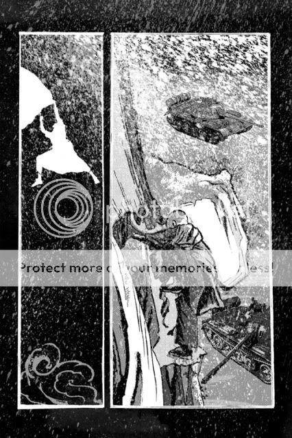
Today, after 2+ years of gestation and creation, the sixth and final issue of FEEDING GROUND goes on sale.  Along the way, we've had the great boon of meeting so many other talented comic people, some of whom were cool enough to contribute art based on our creation.  Pin-ups and articles can be found throughout the mini-series (5, 4, 3) and the floppy comics are the only way you'll be able to read/collect the story as a bi-lingual English/Spanish flip book.

Here's a look at some of the art and artists in this issue.

I first discovered Tim's artwork hanging on the walls of Bergen Street Comics in Brooklyn; inked pages for his creator-owned work ADVENTURES OF THE FLOATING ELEPHANT and I was glued to them. Tim's inks are a daunting play of light and dark and he's equally adept at noodling gag strips as he is at lush illustrations.  Even his warm up sketches on Drawbridge so more smarts and style than many finished pieces.

NOTE: It was also Tim who suggested that I start a blog in the first place.


JAVIER HERNANDEZ http://javiersblog.blogspot.com/
Javier is one of those creators that I was able to meet due to the book.  Creator of El Muerto and Weapon Tex Mex, Javier is a comic creator and entrepreneur whose works have the crackling innovation and energy of the Silver Age.  He also co-founded the first annual Latino Comics Expo this year.


GB TRAN http://gbtran.blogspot.com/
GB and I met years back through mutual friends and he was one of a few guys who I knew to be doing comics for real and who inspired me to give it a shot myself.  An accomplished illustrator, designer, and cartoonist, GB's talents and voice all came together in his beautifully observed and rendered autobiographical graphic novel VIETNAMERICA. For FEEDING GROUND, he went much lighter and actually contributed the one humorous pin-up for the book and we're glad to have him close things out.  Bonus: HERE are his process pics for the illustration.


And, double bonus, here's a rough pin-up/ cover concept by yours truly that never found its way into the series.


Wednesday, October 7, 2009

COMIC BOOK LAYOUT 01 _ Consider the Grid

The art of making comics essentially exists in act of laying out your panels. There are much better resources out there that will help you understand this skill but I thought I'd share a few examples where I tried tackling the grid head on.

It was Scott McCloud in his seminal text book "Understanding Comics" that first identified comics to me as "sequential art." Comics as a medium is defined by the use of a series of static images that when read together represent a relationship according to time, space, or concept. I started reading comics at the age of 6 but the mechanism for reading them, the synthesis of word and image following a flow of panels from left to right, was unconscious and innate.

Hard to believe, but there are plenty of people who still do not "know" how to read comics and get confused by what to read first. That said, the 6-panel grid is the most effective and elegant way to break down the page for easy reading. As pointed out in Gary Spencer Millidge's "Comic Book Design" it also follows the Golden Ratio in the way it sub-divides information according to Classical composition.

For an example of an excellent use of the 6-panel grid, check out Chapter 1 in Tim Hamilton's "Floating Elephant" strip at Act-i-vate. He's created a surreal suburban world and the grid is an unobtrusive window into it. It feel ordinary while the content is anything but.

For my own work, here's an example of how a 9-panel grid can set up a sense of time that is like a metronome. Ticking down and alternating between scenes, and finally ending with a bang. The 9-panel format was utilized with an world's worth of information and skill by Alan Moore and Dave Gibbons in "Watchmen."


What happens when you break the grid? First, you can run the risk of confusing the reader and drawing too much attention to the frame instead of the content. But, here is an example of me trying to use the layout to create a mood that feels claustrophobic and draws all attention to the goal of the scene, the door to the outside world.


As a final example, this page was a way for me to release the grid by using the full length of the page to hopefully create that sense of falling for the reader. Ideally, the slight rotation I gave to the image in the first panel helped to undercut any sense of the border as safety net.


So, there's a ton to consider in constructing a comic all in the hopes that it will be invisible to the reader. I'm only scratching the surface here and there are new tools and tricks to pick up with every new page.