In the early days of the Marvel Universe, Stan Lee turned to Norse Mythology as a source for creating a heroes that were literal gods among men. Thor is their champion, the God of Thunder and son of the all-powerful Odin. He was cast down to Earth to learn humility in the guise of a human.
The incredible design challenge here was for Jack Kirby to incorporate the trapping of Viking culture and translate them using the bold four-color designs of the Marvel Universe. The result is a graphic "techno-Viking" language that was utterly unique and lent itself to baroque adventures.

In 2011, Thor may become a household name with the release of Kenneth Branagh's film adaptation as part of the growing Marvel Universe on film.
Since his creation Thor's design has undergone many iterations. The current fashion is for our heroes to be dressed in outfits that fit and "work" as battle garments. The realism of seams and layers trumps geometric idealism.
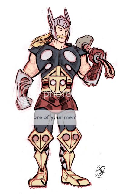
As part of my morning warm-up and the Bendis Boards "Artists/ Non-Artists" challenges, I took a stab at re-imagining a new version of the costume for the post-film era.
 Some thoughts:
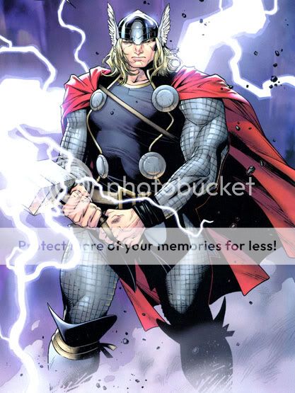
- One thing that really bugs me about the current Olivier Coipel Thor design is that he seems squat and husky. I feel like this guy needs to tower over other heroes like a professional wrestler. In person, you would be shocked by how tall and massive he really it. The chain mail also seems fussy and unnecessary for the arms of a god.

But, check out this room-sized Thor poster that Coipel illustrated as covers to the Tales of Asgard re-prints. Awesome!
- I'm duly impressed with Kirby's visual language for Asgard and it would take some serious effort to come up with an entirely new iconography. The six circles mean little in terms of Norse Myth but are essential to identifying Marvel's Thor. Here, I tried to vary them up and also use circles to create abstract "T"s on the belt buckle and knee pads.
- So, I tried to evolve the basic elements with features I liked about Ultimate Thor, Beta Ray Bill (the alien Thor created by Walt Simonson, the incomparable Thor artist/ writer of the 1980s - see my sketch of the character below), and the Thor of Myth (big belt and gloves, the sense of a bound tunic around his waist). Lose the cape - his hair is active enough for a flowy element.
- One of the most iconic "superhero as god" images in recent memory is Frank Quietly's "All-Star Superman" cover image of Superman chilling on a cloud. Unlike Quietly's AS Superman smile, Thor should have a bemused smirk. He's lived life as a champion and his exile on Earth has humbled him only to the degree of seeming like a really cool big brother.
- Oh, and he needs a sweet, sexy mustache.
And here's my take on Beta Ray Bill:


Young man! There's no need to feel down.
ReplyDeleteI said Young Man! Throw Mjolnir to get you off the ground!
'nuff said about the handlebar mustache.
Seriously though, there's things that work about the design and stuff that really doesn't.
What would you change besides the "Valkyries Ride for Free" mustache?
ReplyDeleteI dig your cocky looking/wrestler Thor. That Beat Ray Bill is great, too!
ReplyDeleteTo me, Kirby got it right all the time. Simonson comes in second, especially for his awesome design of Beta Ray Bill.
Thanks for the comment Michel.
ReplyDeleteAt the risk of sounding cheesy, I always understood it that Kirby brought the thunder while Walt cued the lightning.
Kirby's visual language was Baroque, voluminous, and grotesque while Walt Simonson's was Mannerist, abstract, and kinetic.
Both are prime examples of how much an artist can bring to a work when he or she isn't content with drafting "reality."