Wednesday, June 30, 2010

CHICKIEPOO & FLUFF _ Background Design

Here you have some more production art from the Nick Jr. Pilot/ Animated Short CHICKIEPOO & FLUFF: BARNYARD DETECTIVES.

In this case, the master shots of three prominent backgrounds that I designed and/or art directed.

Their bedroom in the peak of a chicken coop. This never actually made it on air but it was the mood piece that I designed for the pitch book that really helped set the tone. The creators, sisters Amy and Liza Steinberg, had contrasting and yet complimentary tastes in that they wanted something that was pastoral and flat, super cute and lived in. In general, we employed a Photoshop collage style that had been honed on other Nick Jr. shows like "Blue's Clues." The magic hour lighting was a must.

Their secret headquarters was located in a bush near the coop. Nibbles, the bunny, was their first client. For me, it was a chance to go all "Secret of Nihm" and if the show went to series, I would have wanted to push the shadows and add more nooks and crannies. Astrid Riemer did an incredible job crafting the props (all those leaves!) and setting the stage.
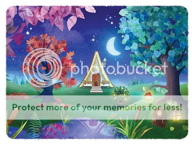
The farm at night. I appreciate this one for its moonlit glow and the combination of geometric and organic shapes. Astrid did the Photoshop honors on most of this one.

Need more Chickiepoo in your life? Take to the streets and let your voices be heard.

Thursday, June 24, 2010

FEEDING GROUND _ Solicitation Update

Some additional backstory: initially, the Archaia website listed the book a 48 pages (accounting for a flip book in which the book is reprinted in Spanish) for $3.95. One problem, our first issue has 28 pages of content (x 2 = not gonna fit). Then, I went to the Previews site (the distribution catalog for comic sales) and discovered that the book was listed at $5.95 (!) and my jaw dropped. After a fitful night's sleep and some phone calls, Archaia is more than on top of resolving Diamond's typo.

In fact, the book will be 64 pages at $3.95. Holeee Mackerel! We were already planning on including some extra content (pin-ups and articles a la Ed Brubaker's incredible Criminal) but I could not hope for a better package for this book. Thanks and cheers to Archaia for taking a chance on us.

One artist that we already have lined up to do some additional art is friend Tom Forget. His work is the best kind of lurid pulp and a great match to the heat of our material. Warning, most of his images are Not Safe For Work but are perfect for your basement office.

Monday, June 21, 2010

FEEDING GROUND ISSUE 01 _ Solicitation

HERE IT IS!

Conceived in the summer of 2008 by Swifty Lang and Chris Mangun, pitched at NYC Comic Con 2009, this puppy has been in production all last year and now has a release date of the last week in September 2010, published by the good people at Archaia (home of "Mouse Guard" and "Fraggle Rock" and some of the highest quality comics of all genres).

Flip the book over, and it's such an amazing decision on their part to include the entire issue in Spanish!

Thanks for your support - please tell your local comic shop to order you a copy today!


FEEDING GROUND #1 (of 6)

Retail Price: $3.95 U.S.
Page Count: 48 pages
Format: saddle bound, 6.625” x 10.25”, full color
Written by Swifty Lang
Illustrated by Michael Lapinski
Cover by Michael Lapinski

This new series is ripped right out of the real-life drama unfolding on the Mexico-Arizona border. FEEDING GROUND reaches a large and diverse audience no matter your personal point of view on the issue. In this factious story, a famine caused by Blackwell Industries drives Diego Busqueda, a noble “coyote,” to lead a band of Mexican border crossers across the unforgiving Devil’s Highway, a desert cursed with blistering days and deadly nights. Back home, Diego’s daughter Flaca discovers that something hungrier prowls the factory fields. Stalked and persecuted, can the Busqueda family maintain their dreams of immigration or will the horrors of the desert tear them apart? Also included is 24 pages of bonus content in Spanish!

T +13 (Contains material suitable for teen readers age 13 and above)

Friday, June 18, 2010

THE GATHERING _ Comic Anthology


A few months ago, I participated in illustrating a story for an anthology called The Gathering: The Thing with Feathers that will be released next month.


Edited and published by Andrew Goletz, the book is a collection of two-page shorts, tied arounf the theme of "hope," for which Andrew paired aspiring writers and artists on the Jinxworld message board. In my case, I was worked with Andrew's two sons, Ethan and Liam, who both wrote separate pages that we then joined to create a single story called "Better Days." The boys are internet celebrities in their own right for their online comic reviews here: http://kidscomicbooks.blogspot.com/.

It was a fun project bringing their words to life and a chance to try out new cartooning techniques. It's a very talented group involved with the book and I'm looking forward to checking out the other stories.

You can order and read more about the project here and help Andrew out with his Kickstarter Campaign to fund more volumes in the future.

Cover below by mucho skilled cartoonist Aaron Bir.

Friday, June 11, 2010

COVER DESIGN 03 _ Unused Issue 1 Covers


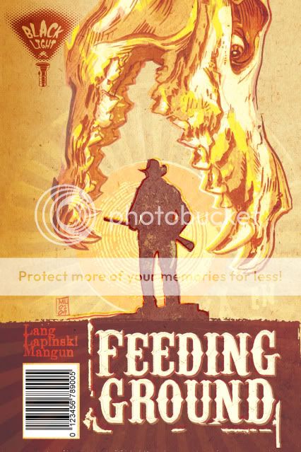
Early on, I became fixated on an image for the series that would have its own iconic weight worthy of images like those used for Jurassic Park and Jaws. What I wanted was a Dia de los Muertos animal skull devouring the sun and a silhouette of one of our lead characters. Not surprisingly, people mistook the skull for that of a dinosaur.


I tried a fix in which I altered the skull to seem more like a spectral image, some heatstroke nightmare.


Ultimately, we decided to continue to work the image and communicate the following qualities: horror, Mexico, family, border crossers (our family starring as the silhouettes in the Border Crossing road signs), and unbearable heat.

The following two covers seem a little too much like old Del Rey paperbacks in their layout but pointed us in the right direction. The skull from below may seem a little literal as a "feeding ground" but still appealed to me too much to abandon. Also lost the "Western" treatment of the title in favor of something more industrial.


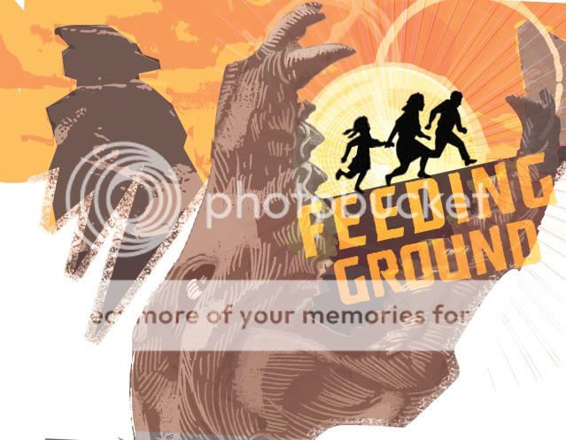
And this last rough was a bolder departure in which I mined the design elements for a full cover spread.


The final version will be publicized shortly and I think it hits the right balance of what we're going for and will hopefully stand out on the racks. We've also struck on an overall treatment that is more like a woodcut print that, along with the skull motif, should carry over to all six issues of the mini.

Thursday, June 3, 2010

CHARACTER DESIGN 07 _ Chickiepoo & Fluff


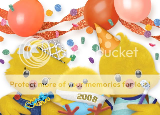
To counteract last week's gore. Here are some glamour shots of designs I did for a pre-school pilot for Nick Jr back in 2008. It was called "Chickiepoo & Fluff: Barnyard Detectives." It starred Chickiepoo (the girl), her brother Fluff, and their baby brother Fuzzworth. With the help of the home viewer, they solved mysteries on the farm.

I'll show some production files in the future but overall these were originally designed by hand, and then rendered through a process that involved hand-drawn Flash animation as a guide that was then textured and layered in Photoshop. Animation Director Elana Allen was instrumental in fleshing out these chicks and making them more three dimensional and animation-ready. Additional animation was done by puppetting parts in After Effects and the backgrounds were designed in Photoshop with original elements handcrafted by artist Astrid Riemer.

All said, what a talented team and adorable concept for a show that won it's Pilot Season but never quite found its niche on the network.

Side note: Fluff has my cow lick and I'll never stop enjoying the "Feathers Erupting from a Diaper" design of Fuzzworth.