
On the topic of "Narrative Color" be sure to check out this post on cartoonist GB Tran's blog. It's the master palettes for his upcoming book Vietnamerica and I think they do an excellent job in evoking much more than local color or resorting to sepia tones for flashbacks/ memories. And go on and peek at more of the posted pages, it's going to be something special.
In this post, I'll show a page taken through the color stage. It's not a full-on tutorial and I'll definitely answer any questions it raises. For the particulars of digital coloring and the history of comic coloring in general, I found DC Comics' art director Mark Chiarello's section of DC Comics Guide to Coloring and Lettering Comics to be a useful resource. Otherwise, I hope readers can speak to the effectiveness of my process and comment on the results. As an additive process, there's always the fear that I've overdone it or undermined the initial integrity of the page.
Here goes:
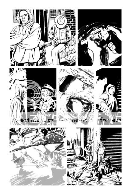
INKS
Establish the positive and negative shapes on the page in a way that frames the action and leads the eye from panel to panel. In this book I'm looking to tie the negatives of the gutter to the negative of the panel where appropriate rather than automatically wall off all of the art in bounding boxes.
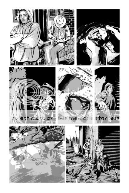
 TONE
TONEBuilding off of the blacks to define the light source and continue to delineate details and space. I want the boot to look like printed material and feel fairly flat while maintaining some sense of form. Not always an easy compromise, especially at different times of day and with different light sources. Realism is a challenge of skill but creating a consistent unique style is a highwire act. I sometimes wish I gone more stylized overall.
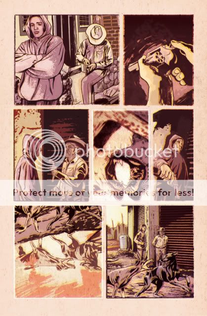
 FLATS/ UNDERPAINTING
Here's a process pic where I start to establish the color relationships of the page in broad strokes. The center panel is the "hottest" moment on the page and the bar I'm working from in finishing the other panels. You can also see where I start to shift the tone layers to a hue (here a purple) and choose the base ink color in place of the black.

FINISHES/ EFFECTS
I come from more of a Photoshop-based digital art background as opposed to a traditional painting or drawing skill set. My goal is to use Photoshop blending layers to create a digital print, creating happy accidents and layers of treatment to keep the color alive and give the page a degree of raw spontaneity.
So, any feedback would be greatly appreciated. I'm already concerned/ looking forward to seeing how this prints on professional printers and high grade paper. How will this "feel" on glossy stock? If it was possible to print with oversaturated colors on old newsprint I would have. I hope that I've been able to arrive at a compromise that feels fresh to modern readers.
Wow - this stuff looks fantastic! I am so looking forward to seeing the final product.
ReplyDelete