Showing posts with label Cover Design. Show all posts

Tuesday, May 1, 2012

DESIGN _ Fake Criterion Covers

The Criterion Collection is known not only for their deep and lovingly restored film library but also for elevating the level of design with their DVD covers. Forgoing close-up photos of movie stars, the Criterion aesthetic instead incorporates illustration, typography, and/or unique film stills. Design as story. Check the 2011 portfolio by real deal Criterion designer and art director Eric Skillman to see what I mean.

Just for fun, I mocked up some Criterion covers of my own a little while back as part of a message board challenge "Design a Criterion Cover for a Non-Criterion Film." Some examples below:

GLENGARRY GLEN ROSS (1992)
Art: A photocopy from an art book on Robert Longo's famous "Men in the Cities" series


AN AMERICAN WEREWOLF IN LONDON (1981)
Art: A "smiling" bust of Griffin Dunne's decomposing character, Jack


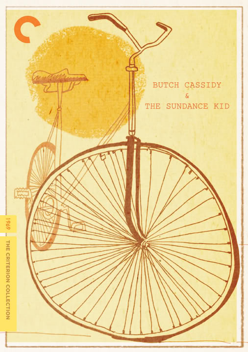
BUTCH CASSIDY & THE SUNDANCE KID (1969)
Art: My Illustration


POPEYE (1980)
Art: Top, an EC Segar "Popeye" comic strip. Bottom, movie Colorforms that were licensed with the actors' likenesses.


RAIDERS OF THE LOST ARK (1981)
Art: Production painting and title treatment from the "making of" book


RAIDERS OF THE LOST ARK (1981)
Art: Production design of the relief on the side of the Ark of the Covenant


THE TEXAS CHAINSAW MASSACRE (1974)
Art: A digital collage I did in the spirit of the Surrealism of Polish movie poster art



Side note: only after seeing these together do I see that I must have been going through a "yellow" period

Tuesday, March 27, 2012

FEEDING GROUND _ For Your Consideration...


Comic Book award season is upon us, particularly the nominations for the 2012 Harvey Awards which are due by April 16th. The Harveys are exclusively selected by other comic creators and you can learn more and fill out the ballot HERE.

Below is a list of categories that our book FEEDING GROUND, published by Archaia Entertainment, is eligible for. Links to reviews for FEEDING GROUND are available HERE.

I personally find it difficult to put FEEDING GROUND up on a pedestal, or even to see it on the rack, next to other work I admire. But, I recognize it as a solid first comic for us as a group and I'm proud of the dense and complex story we crafted. Of my own contributions, I think I was at least able to bring something to the table in terms of my approach to color art and cover design.

Thanks for reading and please let us, and the Harveys, know what you think.

BEST LETTERER
Christopher Mangun, “FEEDING GROUND”, Archaia
BEST COLORIST
Micahel Lapinski, “FEEDING GROUND”, Archaia
BEST INKER
Michael Lapinski, “FEEDING GROUND”, Archaia
BEST GRAPHIC ALBUM PREVIOUSLY PUBLISHED MATERIAL
“FEEDING GROUND”, Swifty Lang, Michael Lapinski, Chris Mangun, Archaia
BEST COVER ARTIST
Michael Lapinski
BEST WRITER
Swifty Lang, “FEEDING GROUND”, Archaia
BEST NEW TALENT
Michael Lapinski, “FEEDING GROUND”, Archaia
BEST CONTINUING OR LIMITED SERIES
“FEEDING GROUND”, Archaia


Tuesday, January 3, 2012

FEEDING GROUND & The Best Covers of 2011


Got jolted today when I was scrolling down Robot 6's alphabetical list of BEST COMIC COVERS of 2011 and found my cover to FEEDING GROUND #4 after the Batmens and Daredevils. Still a shock to recognize that our creation as first-time creators shares a shelf with all of comic history and even more humbling to be included among artists that I admire.


Issue #2 was honored on the 2010 list (link HERE) and here's what I had to say about my FEEDING GROUND covers then:


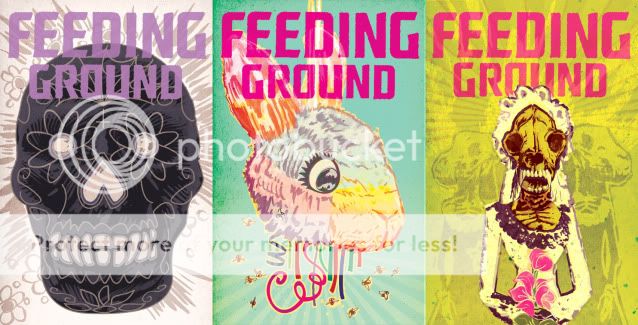
I arrived at a design scheme for the FEEDING GROUND mini-series that intentionally employs symmetry, bold color fields, and an isolated element to help distinguish the covers from the overall noise of the comic wall. Additionally, each cover is both a perversion of familiar Mexican iconography and a poetic counterpoint to the content of the issue.


For Issue #4, "Severed Ties," our lead werewolf makes her first kill and, with flies swarming confetti entrails, the cover is meant to convey the dark side of child's play.


While I still appreciate the thought process behind these covers, especially the brainstorming with co-creators Swifty Lang and Chris Mangun, I can't help but be critical of my still-developing craft/execution (especially seen alongside other covers on the list). If I were to do them again, I'd probably create a more consistent style across the 6 issues that is somewhere between their current state and the simplified versions (below) I designed as endpapers for the collected edition (and as posters, HERE).


Be sure to check out Kevin Melrose's commentary on Robot 6 as to what makes a good cover for him. Here are some of my favorites from the list (grouped in topics) along with a few list omissions:


COVER AS STORY

Locke & Key by GABRIEL RODRIGUEZ
Not on the the Robot 6 list but I wanted to start with this image as the alternative approach to my own FG#4 cover. Here, the gore is lushly illustrated in vivid detail and I was transfixed by the pooling blood in the paw print when this was first released. Notice too how the blood smear drags off the right side of the page begging you to open it and follow the trail. Bonus points for how the motif was revisited over the subsequent issues of this mini-series.


Heart by KEVIN MELLON
I cited Heart (by Kevin & writer Blair Butler) as my comic discovery of NYCC this year. The cover to #1 is one of the most iconic of 2011 but it succeeds on another level. The cover can also be read as the first panel of the comic followed by the closed fist of the first interior panel. Story first.


COVERS THAT APPROPRIATE OTHER AESTHETICS (and make Comics better for it)

Red Skull: Incarnate by David Aja
As recounted in his blog, smart move on the part of Aja and editor Alejandro Arbona to promote this Red Skull origin AS Nazi propaganda. The attention to detail, especially the different typefaces, sells it and the German text-heavy newspaper cover is about the ballsiest cover I've seen this year from the Big 2.


Secret Avengers by David Aja
Frozen like two stray frames from a grindhouse kung-fu flick, this cover doesn't work 100% for me (the palette feels too austere for the reference point) but it does evoke something I'd like to see more of; sequential art on covers.


Punisher: Max by Dave Johnson
While Johnson's work occasionally approximates the designs of propaganda posters and pulp covers, his Punisher Max covers have felt like he's digested those references with a Saul Bass chaser and created an aesthetic that's all his own.


COVERS BY PAOLO RIVERA
Yeah, he gets his own category. Paolo is one of the very few artists working today whose work makes me react like a fanboy. His art is steeped in Marvel DNA (a Spider-Man with Romita's musculature and Ditko's creepy/goofy deadpan) but with strong influences from fine art and classic illustrators. For me, the work of a comic artist is half craft and half making the right choices and Paolo is both crafty and clever without ever losing touch of the humanity and humor of his subjects. He also achieves the great challenge every mainstream artist faces; how to depict 50 year-old characters in a way that is refreshing and yet respects their history. His Spidey evokes every incarnation of the character for me, including The Electric Company. And now, he's in the process of re-inventing Daredevil with writer Mark Waid. Solicited in 2011, his yin yang fire escape of my two favorite superheroes captures both, and their relationship, in one essential image. You can buy Paolo's original art HERE.


COVERS I CAN'T STOP STARING AT
Loose Ends by Chris Brunner & Rico Renzi
One of my favorite comics of the last few years, each dressed in a package that speaks directly to my design tastes. Chris Brunner's pencils move and breathe and Rico Renzi's got a palette that shames rainbows. You can almost hear music and sound effects in their work. The Kickstand Kids should run all of Comics.


Spaceman by Dave Johnson
Boom.
(be sure to check out Dave's Cover Critique Blog)


COVER THAT DID ITS JOB
X23 by Kalman Andrasofszky
Never had much interest in the character of X23 but the pairing here is so charming and the rendering so poppy that the cover is the one this year that did what it's supposed to: get me to buy it.


Wednesday, June 1, 2011

FEEDING GROUND _ Hardcover Cover

Although issues 5 & 6 of FEEDING GROUND have yet to hit the stands, we've been busy making revisions to the material and I've been working on book designs for the collected edition(s).  There will be two separate volumes, one English and one Spanish, collecting all six issues and due out this Fall.


All said, I'm pretty proud of what I was able to accomplish with the covers for the mini-series.  My draftsmanship on the interiors evolved over the course of six issues but the covers came out pretty much as I conceived of them and (I think) added something new to the comic wall.


That's why it's all the more consternating to find that I'm not 100% sold on my own image and design for the collected edition.  As with the mini, I needed an image that conveyed: Mexico, The Desert, Horror, and the general plot of the book.  What I arrived at is a vision of Santa Muerte, an iconic representation of the Virgin Mary as the saint of death, crying tears of blood that are being lapped up by a stray wolf.


Some moments this feels on the money, and others it feels forced and convoluted.


So, what say you, FEEDING GROUND fan?  Below, you can see the close to final art for the covers of the English (day) and Spanish (night) editions of the book.  Would you know or have a good idea of what this is about if you saw it on the shelf?  It is cool enough to tempt you to open it up?


I'm still feeling this out and exploring other options so any feedback is cool with me.


Friday, January 14, 2011

COVER DESIGN _ Best of 2010


I got a nice surprise last week when the cover to FEEDING GROUND #2 was included on the list of the Top 50 covers of 2010 on the Robot 6 blog of COMIC BOOK RESOURCES. I still have last year's list bookmarked and I share the list with many of my favorite artists and images.

A child of the 80s, my taste in cover art/ design straddles the line between the narrative and iconic. To my mind, the best evidence of this is the Marvel work of Ed Hannigan. He was schooled by the greats but rather than lift a full scene from an issue (Spider-Man fights the Hobgoblin) he would choose the key moment that would make for the most iconic cover design (Spider-Man's fist raising Hobgoblin's mask out of the East River).

Speaking for myself, I arrived at a design scheme for the FEEDING GROUND mini-series that intentionally employs symmetry, bold color fields, and an isolated element to help distinguish the cover from the overall noise of the comic wall. Additionally, each cover is both a perversion of familiar Mexican iconography and a poetic counterpoint to the content of the issue. For Issue #2, the image is a visceral version of the Sacred Heart but also a comment on both the virus/ curse coursing through Flaca's veins and the act of her mother, Bea, burning down their home.

Whether or not I was successful is up to the reader, but, I at least wanted to give a sense of the thought process that goes into making these things.


Here are some of my favorites from the BEST OF list:

Amazing Spider-Man by Paolo Rivera


Batwoman by JH Williams III


CHEW by Rob Guillory


And, here's another peek at covers for upcoming Issues. Next time out, on a different story, I'd like to play with asymmetry and narrative as the covers demand it.


Thursday, September 2, 2010

FEEDING GROUND_Cover and Solicitation Update


You may have noticed that FEEDING GROUND #3 is not on the roster for Archaia's November solicitations. Instead, our editor, Paul Morrissey, has created a release schedule that better reflects our 2 month-per-issue production schedule but avoids going bi-monthly.

Issues 1 & 2 will still be released in Sept and Oct and then Issues 3 & 4 will come out in December and January. February will be another break month and you can get the final two issues in March and April, respectively.

In the meantime, here's a sneak peek at the cover to Issue 3. As an inverted version of the traditional Mexican "Sugar Skull," it speaks to the true nature of one of our principal characters.


Friday, June 11, 2010

COVER DESIGN 03 _ Unused Issue 1 Covers


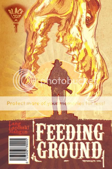
Early on, I became fixated on an image for the series that would have its own iconic weight worthy of images like those used for Jurassic Park and Jaws. What I wanted was a Dia de los Muertos animal skull devouring the sun and a silhouette of one of our lead characters. Not surprisingly, people mistook the skull for that of a dinosaur.


I tried a fix in which I altered the skull to seem more like a spectral image, some heatstroke nightmare.


Ultimately, we decided to continue to work the image and communicate the following qualities: horror, Mexico, family, border crossers (our family starring as the silhouettes in the Border Crossing road signs), and unbearable heat.

The following two covers seem a little too much like old Del Rey paperbacks in their layout but pointed us in the right direction. The skull from below may seem a little literal as a "feeding ground" but still appealed to me too much to abandon. Also lost the "Western" treatment of the title in favor of something more industrial.


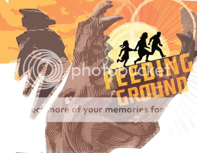
And this last rough was a bolder departure in which I mined the design elements for a full cover spread.


The final version will be publicized shortly and I think it hits the right balance of what we're going for and will hopefully stand out on the racks. We've also struck on an overall treatment that is more like a woodcut print that, along with the skull motif, should carry over to all six issues of the mini.

Thursday, February 18, 2010

COVER CHALLENGE 02 _ Hellblazer


A little whiles back, I shared my thoughts and samples on what I might do if I were given the chance to design covers for a book like DMZ.

In this post, I thought I'd share some roughs I did around the same time if I had to re-imagine covers for the Vertigo book Hellblazer.

Hellblazer features English occult investigator/ magician John Constantine, a character created by Alan Moore in his seminal 80s horror comic Swamp Thing. He's a blonde former punk rocker in a raincoat whose look was supposedly initially modeled after Sting.

The series is the longest-running Vertigo comic and has had storied runs by such creators as Jamie Delano, Garth Ennis and Mike Carey, Sean Phillips, Lee Bermejo, and, more recently, Peter Milligan, Jason Aaron, Sean Murphy, and Giuseppe Camuncoli.

Covers, by the likes of Dave McKean (who designed the first run of the series' covers), Tim Bradstreet (who designed the most), and Glenn Fabry tend to use photo reference or elements, are highly rendered, and are generally muddy or muted in their palette.

The reason I was inspired to try this image is that, although I was never a fan of the book, it became clearer that a long run of covers simply depicting Constantine looking too-cool at the reader did nothing to convince me that there was anything of interest going on behind the cover. Hellblazer has a devout following and these covers are the Vertigo version of simply having a superhero strike a dramatic pose on every cover they appear on. There is no narrative.

So, I gave myself three challenges:
- Look back to the original run of covers and try to emulate how they evoked a sense of the occult in new and unusual ways
- Develop a narrative that suited what I knew of the characters and employed a fairly well-known occult landmark
- Wipe that smarmy grin off of our hero's face. If he's so darn cool, then how exciting it would be to make him suffer!

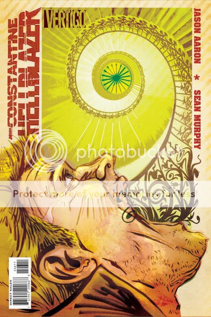
For the purposes of the illustration, I concocted a story in which all of the spirits that follow John want to finally reach their resting place and use and abuse Constantine to do so. The Tulip Staircase in Greenwich is a beautiful and eerie structure featured in a classic ghost photo that always freaked me out. Combining the two, I developed the visual metaphor of Constantine literally vomiting this stairway to heaven.

Here you have a digital collage I did for layout.


And an illustration in progress. I don't consider this art to be final but I do think it hits on all of the goals I set for myself (in addition to an acid green I hoped would cleanse the muddy palette and jump off of the stands).


Monday, September 14, 2009

COVER CHALLENGE 01 _ DMZ

In my COVER CHALLENGE posts, I'll be illustrating a mock comic book cover in the prevailing style of a popular series and then illustrate a second design that proposes an alternate art direction.

For my first entry, I'm tackling Brian Wood's Vertigo Series DMZ.

An accomplished designer and artist in his own right, Brian immediately distinguished his series from other books on the rack by eschewing bright figurative action shots for rough-hewn graphic explorations in a limited palette and with a lot of negative space. DMZ is set in a fictional post-war New York and the covers initially incorporated the local flavor of NYC iconography and signage with the visual immediacy of agit-prop fliers. The book seemed to be an artifact of the world he created.

While I always appreciated the bold choices and execution of these designs, I always felt slightly removed from covers that sold the world of the book but often excluded the central character and my sympathy.

Here's my stab at a DMZ design in the original vein but re-imagining the logo as a subway scratch tag, swapping the prevalence of white for black, and creating an interior mental space for protagonist Matthew Roth with the subway signage.


More recently, John Paul Leon has taken over as regular cover artist. His tenure has brought more, but muted, color and more figures to the cover design. But, often portrayed in silhouette, the people are still unknowable and become part of the artfully broken landscape. His work is tasteful and takes unexpected chances with composition.

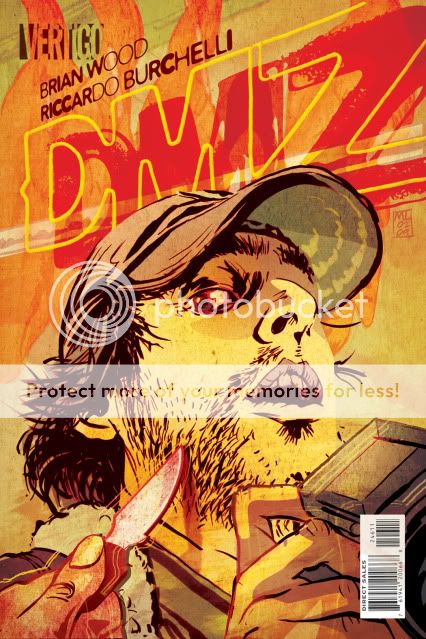
For my second take, I decided to go HOT. I wanted to create an image with real sense of risk and blood in it. Something that communicated the daily, almost routine, peril Matt finds himself in and that still felt like New York. DMZ has never used an extreme close-up for a cover and this is my snapshot right in the sweaty face of our terrorized photojournalist.