Showing posts with label Paolo Rivera. Show all posts

Tuesday, January 3, 2012

FEEDING GROUND & The Best Covers of 2011


Got jolted today when I was scrolling down Robot 6's alphabetical list of BEST COMIC COVERS of 2011 and found my cover to FEEDING GROUND #4 after the Batmens and Daredevils. Still a shock to recognize that our creation as first-time creators shares a shelf with all of comic history and even more humbling to be included among artists that I admire.


Issue #2 was honored on the 2010 list (link HERE) and here's what I had to say about my FEEDING GROUND covers then:


I arrived at a design scheme for the FEEDING GROUND mini-series that intentionally employs symmetry, bold color fields, and an isolated element to help distinguish the covers from the overall noise of the comic wall. Additionally, each cover is both a perversion of familiar Mexican iconography and a poetic counterpoint to the content of the issue.


For Issue #4, "Severed Ties," our lead werewolf makes her first kill and, with flies swarming confetti entrails, the cover is meant to convey the dark side of child's play.


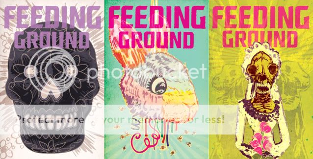
While I still appreciate the thought process behind these covers, especially the brainstorming with co-creators Swifty Lang and Chris Mangun, I can't help but be critical of my still-developing craft/execution (especially seen alongside other covers on the list). If I were to do them again, I'd probably create a more consistent style across the 6 issues that is somewhere between their current state and the simplified versions (below) I designed as endpapers for the collected edition (and as posters, HERE).


Be sure to check out Kevin Melrose's commentary on Robot 6 as to what makes a good cover for him. Here are some of my favorites from the list (grouped in topics) along with a few list omissions:


COVER AS STORY

Locke & Key by GABRIEL RODRIGUEZ
Not on the the Robot 6 list but I wanted to start with this image as the alternative approach to my own FG#4 cover. Here, the gore is lushly illustrated in vivid detail and I was transfixed by the pooling blood in the paw print when this was first released. Notice too how the blood smear drags off the right side of the page begging you to open it and follow the trail. Bonus points for how the motif was revisited over the subsequent issues of this mini-series.


Heart by KEVIN MELLON
I cited Heart (by Kevin & writer Blair Butler) as my comic discovery of NYCC this year. The cover to #1 is one of the most iconic of 2011 but it succeeds on another level. The cover can also be read as the first panel of the comic followed by the closed fist of the first interior panel. Story first.


COVERS THAT APPROPRIATE OTHER AESTHETICS (and make Comics better for it)

Red Skull: Incarnate by David Aja
As recounted in his blog, smart move on the part of Aja and editor Alejandro Arbona to promote this Red Skull origin AS Nazi propaganda. The attention to detail, especially the different typefaces, sells it and the German text-heavy newspaper cover is about the ballsiest cover I've seen this year from the Big 2.


Secret Avengers by David Aja
Frozen like two stray frames from a grindhouse kung-fu flick, this cover doesn't work 100% for me (the palette feels too austere for the reference point) but it does evoke something I'd like to see more of; sequential art on covers.


Punisher: Max by Dave Johnson
While Johnson's work occasionally approximates the designs of propaganda posters and pulp covers, his Punisher Max covers have felt like he's digested those references with a Saul Bass chaser and created an aesthetic that's all his own.


COVERS BY PAOLO RIVERA
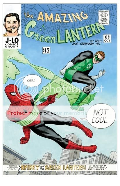
Yeah, he gets his own category. Paolo is one of the very few artists working today whose work makes me react like a fanboy. His art is steeped in Marvel DNA (a Spider-Man with Romita's musculature and Ditko's creepy/goofy deadpan) but with strong influences from fine art and classic illustrators. For me, the work of a comic artist is half craft and half making the right choices and Paolo is both crafty and clever without ever losing touch of the humanity and humor of his subjects. He also achieves the great challenge every mainstream artist faces; how to depict 50 year-old characters in a way that is refreshing and yet respects their history. His Spidey evokes every incarnation of the character for me, including The Electric Company. And now, he's in the process of re-inventing Daredevil with writer Mark Waid. Solicited in 2011, his yin yang fire escape of my two favorite superheroes captures both, and their relationship, in one essential image. You can buy Paolo's original art HERE.


COVERS I CAN'T STOP STARING AT
Loose Ends by Chris Brunner & Rico Renzi
One of my favorite comics of the last few years, each dressed in a package that speaks directly to my design tastes. Chris Brunner's pencils move and breathe and Rico Renzi's got a palette that shames rainbows. You can almost hear music and sound effects in their work. The Kickstand Kids should run all of Comics.


Spaceman by Dave Johnson
Boom.
(be sure to check out Dave's Cover Critique Blog)


COVER THAT DID ITS JOB
X23 by Kalman Andrasofszky
Never had much interest in the character of X23 but the pairing here is so charming and the rendering so poppy that the cover is the one this year that did what it's supposed to: get me to buy it.


Monday, August 22, 2011

THE COMIC FIX _ While I was gone

Just got back from a paradise vacation of beaches and scuba diving (see my sea turtle video HERE) and did my best to totally unplug and ignore social media. But, I'm new to Twitter ( @m_lapinski ) and most of my feed is filled with comic pros and updates that are a fix for the often addictive personality that comic fans like myself exhibit. I've wanted to start including more of the work of others on this blog and figured I'd use the occasion to kick it off with news of books that hit the Twitterverse while I was gone.

A TALE OF JIM HENSON


There isn't a single book that I'm more excited about than the FALL 2011 release of the Graphic Novel adaptation of A TALE OF SAND, an unpublished screenplay by Jim Henson and collaborator Jerry Juhl. Jim and his works have been a great influence on my creativity and personality, recently rekindled by the exhibit at the Museum of the Moving Image in Queens. Published by Archaia Entertainment, our publisher for FEEDING GROUND, this book and much of the Henson library is under the great curatorial care and vision of Archaia Editor-in-Chief Stephen Christy. As illustrated by cartoonist Ramón Pérez, the story is conveyed with an elastic realism that evokes both a dream logic and earthy performances like those that populate the works of Will Eisner.

You can see an interview with Stephen about the project HERE.

Last week, Stephen continued to elaborate on the care and attention to detail being brought to this book in the following Tweets:
For TALE OF SAND we are going through old films that Jim Henson made in the 1960s and pulling colors from the footage to inform our coloring

The font that we're creating for TALE OF SAND is based on Jim Henson's handwriting, so the book will look like Jim lettered it himself!

You know a book is going to be crazy when you have to send 12 reference photos to printers to show them what it should look like
And, check out an interview with Ramón about the book HERE as well as a look at a fun earlier comic KUKUBURI.

---------------------------------------------------------------------------------------------------

PAOLO'S PROCESS
As far as comic process blogs go, THE SELF-ABSORBING MAN by Marvel artist Paolo Rivera is a must-read resource for tips, tricks, tools and an overall appreciation of what it takes to be a professional artist working at the top of his game.  Paolo is smart about his work and, whether it is his fully painted art or pencil and ink cartoons, there is a plan and playfulness under his polished execution.  He is currently a part of the genre re-defining run on the Marvel superhero comic DAREDEVIL and I can, and will, dedicate an entire post on what makes that book tick. But, the first thing that ever caught my attention about Paolo was how, on top of photo reference, he has often sculpted reference maquettes of his lead characters in clay prior to illustrating a book.

More recently, Paolo discovered the free CG sculpting program SCULPTRIS and Tweeted the results:
I think this is gonna be Matt Murdock:
That's more like it:
I was able to pick this program up immediately, and I'm already making digital maquettes for myself.


Yep. It's crazy easy to use. I downloaded it yesterday, but just started using it an hour ago.
---------------------------------------------------------------------------------------------------

BOOKS YOU CAN'T MISS!

ZEGAS by Michel Fiffe


OK, I missed the book launch party at Bergen Street Comics in Brooklyn but I read the strip when it first appeared on Act-i-vate and now the book is available on ETSY.  "Abstract" or "Surreal" don't do justice to describe a work in which every line and mark and color choice is as engrossing as a full narrative.

TROOP 142 by Mike Dawson


I WILL be in town for the book launch party of this one at Bergen Street comics on Sept 2.  I also followed this one when Mike was publishing it as an online comic and it has a supremely honest ear for the awkwardness and malevolence of boys and men trying to wear the too big suit of "masculinity."  His essential cartooning is punctuated by finely rendered moments of nature, a dichotomy often employed in the best of Manga.

Plus, a troop badge!


LOOSE ENDS written by Jason Latour, drawn by Chris Brunner, and color by Rico Renzi


I've been crowing about this book since I fist saw the preview for FREE COMIC DAY but it was Axel Alonso, the new Editor-in-Chief of Marvel who Tweeted:
Do yourself a favor & read "Loose Ends," by @jasonlatour, Chris Brunner & @whoisrico. What a page-turner! Updates at jasonlatour.com
The creative team seems to be working from a single mind and spirit and evokes a dangerous southern-fried world that is as fully-formed and specific as it is evocative as a work of art. Renzi's color is particularly exciting to me and is right in line with my own thoughts and approach to color. Check his blog HERE and more LOOSE ENDS art by the Comic Twarters HERE.

Friday, January 14, 2011

COVER DESIGN _ Best of 2010


I got a nice surprise last week when the cover to FEEDING GROUND #2 was included on the list of the Top 50 covers of 2010 on the Robot 6 blog of COMIC BOOK RESOURCES. I still have last year's list bookmarked and I share the list with many of my favorite artists and images.

A child of the 80s, my taste in cover art/ design straddles the line between the narrative and iconic. To my mind, the best evidence of this is the Marvel work of Ed Hannigan. He was schooled by the greats but rather than lift a full scene from an issue (Spider-Man fights the Hobgoblin) he would choose the key moment that would make for the most iconic cover design (Spider-Man's fist raising Hobgoblin's mask out of the East River).

Speaking for myself, I arrived at a design scheme for the FEEDING GROUND mini-series that intentionally employs symmetry, bold color fields, and an isolated element to help distinguish the cover from the overall noise of the comic wall. Additionally, each cover is both a perversion of familiar Mexican iconography and a poetic counterpoint to the content of the issue. For Issue #2, the image is a visceral version of the Sacred Heart but also a comment on both the virus/ curse coursing through Flaca's veins and the act of her mother, Bea, burning down their home.

Whether or not I was successful is up to the reader, but, I at least wanted to give a sense of the thought process that goes into making these things.


Here are some of my favorites from the BEST OF list:

Amazing Spider-Man by Paolo Rivera


Batwoman by JH Williams III


CHEW by Rob Guillory


And, here's another peek at covers for upcoming Issues. Next time out, on a different story, I'd like to play with asymmetry and narrative as the covers demand it.


Wednesday, October 21, 2009

Big Apple Comic Con 02 _ WRAP UP

Thanks to those of you who stopped by and visited our little piece of Real Estate at the Big Apple Comic Con (adorned by placards produced by the lovely Chris Mangun). It was my first time behind the table at a con and it was extremely rewarding to witness the enthusiasm of fans and the talent and generosity of creators from that vantage point. The community around comics is definitely part of what makes me appreciate the medium.

I want to take the time to reach out and thank a number of creators who I had the great fortune to meet at this con. I don't feel comfortable posting their art on this blog but I'll include some of their self-promotion work. Please follow the links to their respective home bases.


First off, much respect to artist Juan Doe for inviting us to share his Artist's Alley table. I met Juan at NYC Comic Con back in February and we hit it off across a Marvel signing. His work is next generation cool. Juan's love and understanding of both classic Marvel and European comics are processed through a style that is distinctly his. When I first saw his work, I was struck by how fully envisioned and executed it was. His covers and interiors are complete pieces, not colored drawings, and have a graphic energy that is exciting amidst Marvel's current "realistic" house style. He finishes his work digitially as if it were any manual tool and, man, the guy can draw! He's the full package and, along with his Fine Art and children's stories, someone who is not content to sit still. Plus, I had to admire how laid back he is for the amount of work he takes on.

We were seated next to Tim Bradstreet whose work has set the tone for noir-fueled cover art of the last two decades. As is often the case, it was incredible to see his work in person. His pieces are extremely time-intensive, utilizing photo-reference with a command of mark-making that should be studied under a loop. His heavy blacks are bottomless and bleed out into fine detailing. Check out an interview about his work here. He couldn't have been nicer with fans and I was excited to hear that he's been extending his talents to film along with Punisher conspirator Thomas Jane.

Spider-Man artist Alex Saviuk shared essential advice on the business of being a professional artist (among other things, save those receipts!). He's a pro and I absolutely need to track down his team-up with Will Wisner on The Escapist, Eisner's last work.

Art school friends Paolo Rivera and Joe Quinones made for a pair of today's top artists. They both posesss and exhibit a fundemental understanding of the artform without leaning too heavily on style or cutting corners. In particular, Paolo poses for and sculpts (!) his own reference and posts often about his process. They are young guns with a master's work ethic. Plus, there's this really funny Jam Cover they did for the show (available as a print).

David Mack
is someone whose image-making has always stood out for it's use of collage and mixed media alongside traditionally produced books. But, now that I'm working on my own books, my brain is firing over the way he uses these techniques at the service of story. He's got a much-deserved fan base and a necessary voice in the field.


I also had the chance to catch up with two guys that I've had the chance to work with in the NYC animation industry, Emilio Lopez and Robert Crump. It was crazy to see how much their work has evolved and continues to evolve. Their stuff is fresh and explodes off the page. Catch up with them now because they're about to break out.


Finally, it was critical that I had the opportunity to meet up with the publisher and development team of Archaia. They are producing books, like Mouse Guard, The Killer, and Awakening, that meet and exceed the expanding tastes of the comic market and general public. Publisher Mark Smylie is a self-made man with a ballroom in Kearny NJ as his studio (true). His Artesia is classically illustrated Byzantine beauty. Along with Mel Caylo and Stephen Christy, I was impressed with how much these guys know comics. Stephen had constructive criticism of my work that was the panel to panel analysis I needed. He's enthusiastic about the medium with the big picture in mind - they're the first publisher to issue a Kindle-only release with the crime drama Tumor. Cheers to more great comics in 2010.