Tuesday, May 1, 2012

DESIGN _ Fake Criterion Covers

The Criterion Collection is known not only for their deep and lovingly restored film library but also for elevating the level of design with their DVD covers. Forgoing close-up photos of movie stars, the Criterion aesthetic instead incorporates illustration, typography, and/or unique film stills. Design as story. Check the 2011 portfolio by real deal Criterion designer and art director Eric Skillman to see what I mean.

Just for fun, I mocked up some Criterion covers of my own a little while back as part of a message board challenge "Design a Criterion Cover for a Non-Criterion Film." Some examples below:

GLENGARRY GLEN ROSS (1992)
Art: A photocopy from an art book on Robert Longo's famous "Men in the Cities" series


AN AMERICAN WEREWOLF IN LONDON (1981)
Art: A "smiling" bust of Griffin Dunne's decomposing character, Jack


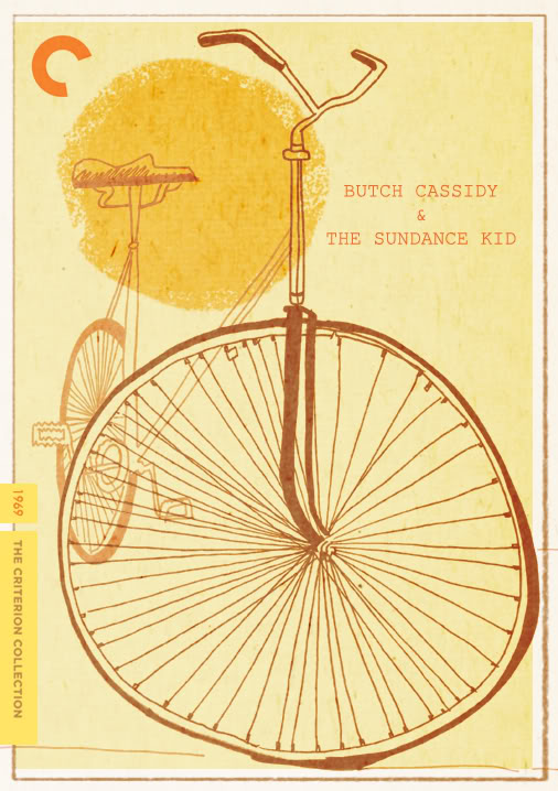
BUTCH CASSIDY & THE SUNDANCE KID (1969)
Art: My Illustration


POPEYE (1980)
Art: Top, an EC Segar "Popeye" comic strip. Bottom, movie Colorforms that were licensed with the actors' likenesses.


RAIDERS OF THE LOST ARK (1981)
Art: Production painting and title treatment from the "making of" book


RAIDERS OF THE LOST ARK (1981)
Art: Production design of the relief on the side of the Ark of the Covenant


THE TEXAS CHAINSAW MASSACRE (1974)
Art: A digital collage I did in the spirit of the Surrealism of Polish movie poster art
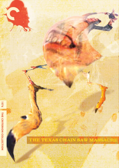


Side note: only after seeing these together do I see that I must have been going through a "yellow" period

Monday, April 23, 2012

LOGO DESIGN _ "Mind the Gap" Roughs

I recently had the chance to design the logo for Image Comics' preternatural thriller MIND THE GAP, in stores on Wednesday, May 2nd. Here's a Robot 6 interview with writer Jim McCann about the series and I shared the final logo design on my blog hereThought it might be cool to go through the options that led us there.

During an extremely productive brainstorming call with Jim, we developed some governing principals and descriptive adjectives of a design that would communicate the story and compliment the art by artist Rodin Esquejo and colorist Sonia Oback. We arrived at three potential directions to take.

They were:

ETHEREAL
The story focuses on a woman, Elle, who is caught in the gap between life and death after an attempt on her life. Jim felt that the logo should use color to have an out-of-focus, shifting, ethereal quality to reflect the mental state. The blurring also suggests the movement of a train, recalling the platform on which she was shot. 


FRAGMENTED
The details surrounding Elle's shooting are a mystery and she is working to piece together the clues to identify her shooter and return to the land of the living. As such, I wanted to use utilitarian stencils, like those of subway notices, to create a logo like puzzle pieces that might take a moment to assemble at first glance.


WORLD-WORN
As a pulpy thriller, we also thought to try something that pulled directly from the grit of subway signage, literally the edge of the platform and figuratively at the edge of Elle's consciousness.


BUT

Although these were the three options we discussed, working on the mock-ups compelled me to try a fourth riskier approach that I internally labelled simply as "BIG." By blowing up the stencil as large as possible I wanted the gaps, the negative spaces, to be nearly as prominent as the letter forms. Then, by splitting the title on the top and bottom of the cover we were able to frame and compliment Rodin's art in unique manner and provide an inherent gap or pause in its reading.

I threw this option out there as a bonus, and, after some reflection and minor tweaks, it's the one that the MtG creative team ended up choosing.


Thursday, April 12, 2012

TMNT _ Background Painting for Animation

With the Teenage Mutant Ninja Turtles back in the news due to the Michael Bay movie in development I thought I'd share some work from my days as Color Supervisor on the 4Kids Ninja Turtle cartoon. I just posted PART II HERE.


The palette for the show was established by Beatriz Ramos, owner of DANCING DIABLO studio and visionary artist in her own right. She was a thoughtful instructor and runs her business with a conscience and artistic integrity. My predecessor was Liz Artinian, one of the best animation painters in NYC. I came on at the start of Season 3 through the FAST FORWARD re-launch and I worked alongside crazy-skilled painters like Reginald Butler and Emilio Lopez.

Over the course of a few seasons, the director, Roy Burdine, and I kept pushing the cinematic potential for color, including the addition of special color treatments for characters and props for situations like Night, Underwater, and Firelight. Looked good, but a load to keep track of for production.

Below are some examples of color model coverage for certain scenes. These are the style sheets we'd send as reference to Don Woo Studios in Korea. We tried to communicate as much as possible in a few images. I also included video to show a comparison with the final on-air product.

DERELICT TRICERATON SHIP from "New Blood"


You can see this environment starting at the 40 second mark.


BISHOP'S AREA 51 LAB from "Aliens Among Us"


You can see this environment starting at the 57 second mark.


AIRBORNE CITY at Night from "Mission of Gravity"


You can see this environment starting at the 35 second mark.


PART II

Tuesday, March 27, 2012

FEEDING GROUND _ For Your Consideration...


Comic Book award season is upon us, particularly the nominations for the 2012 Harvey Awards which are due by April 16th. The Harveys are exclusively selected by other comic creators and you can learn more and fill out the ballot HERE.

Below is a list of categories that our book FEEDING GROUND, published by Archaia Entertainment, is eligible for. Links to reviews for FEEDING GROUND are available HERE.

I personally find it difficult to put FEEDING GROUND up on a pedestal, or even to see it on the rack, next to other work I admire. But, I recognize it as a solid first comic for us as a group and I'm proud of the dense and complex story we crafted. Of my own contributions, I think I was at least able to bring something to the table in terms of my approach to color art and cover design.

Thanks for reading and please let us, and the Harveys, know what you think.

BEST LETTERER
Christopher Mangun, “FEEDING GROUND”, Archaia
BEST COLORIST
Micahel Lapinski, “FEEDING GROUND”, Archaia
BEST INKER
Michael Lapinski, “FEEDING GROUND”, Archaia
BEST GRAPHIC ALBUM PREVIOUSLY PUBLISHED MATERIAL
“FEEDING GROUND”, Swifty Lang, Michael Lapinski, Chris Mangun, Archaia
BEST COVER ARTIST
Michael Lapinski
BEST WRITER
Swifty Lang, “FEEDING GROUND”, Archaia
BEST NEW TALENT
Michael Lapinski, “FEEDING GROUND”, Archaia
BEST CONTINUING OR LIMITED SERIES
“FEEDING GROUND”, Archaia


Monday, March 26, 2012

ANIMATION _ Character Design

Here are a few character designs I did for an animated series pitch. Not much I can say about it since the pitch pilot is still making the rounds at different studios and networks but the creators gave the OK to share the designs here.

Each character is derived from a different genre of "bad" Americana folk art. An intentional combination of high detail and relatively stiff puppeted After Effects animation added a layer of awkward charm to the proceedings.


Tuesday, March 20, 2012

COMICS _ The Gathering #8

(COVER ART by John M. Coker)


GrayHaven Comics (visit their recently revamped websiteis a comic company specializing in up and coming creators looking to get published. THE GATHERING is GHC’s ongoing self-published anthology with each issue organized around a specific theme or genre. I met this crew as a member of the JINXWORLD message boards and I'm continually impressed with their diligence and talent and simply for just doing it.


I contribute when I can (Issues 1 & 4) and it was very cool to return with the Sci-Fi issue in a collaboration with writers TM Haley and renowned STAR WARS author John Jackson Miller. In John's words, our short "Immune" is "a silent-movie style story of a world not quite right."


Without dialogue, I needed to be especially clear in my "acting" and panel-to-panel storytelling. I also used the opportunity to experiment with an open line style complimented with halftones to help recall 50s sci-fi. The cover by John M. Coker does a great job of evoking the mod cool side of sci-fi, looking back to look forward.


You can pick up the issue HERE


And here's a "Not Quite 20 Questions" interview I did with GrayHaven back in Nov 2011.

Wednesday, March 14, 2012

LOGO DESIGN _ Mind the Gap


I recently had the opportunity to design the logo for the upcoming Image Comics series MIND THE GAP (USA Today preview HERE), developed by Jim McCann. Had the pleasure to meet Jim at my first convention when I was pitching FEEDING GROUND. Jim has written for Marvel (the characters of Hawkeye, Mockingbird, and Dazzler shined under his pen) and we eventually wound up at the same publisher, Archaia. where he created the extraordinary Eisner-winning THE RETURN OF THE DAPPER MEN with artist, and fellow Nashvillian, Janet Lee. As Jim was creating this new series with artist Rodin Esquejo and colorist Sonia Oback he found my post on FEEDING GROUND logo designs and added me to the team. I'm proud to have done my part in working with them and think we've concocted something unique in the logo/cover design.

I'll post more thoughts and a process piece closer to the May 2nd release date. For now, you can see the covers and solicitation below. You can read the full press release HEREBe sure to support creator-owned comics and reserve your copy with your local comic retailer


MIND THE GAP #1
story JIM McCANN
art / cover RODIN ESQUEJO & SONIA OBACK
variant cover RODIN ESQUEJO & SONIA OBACK
MAY 2
48 PAGES / FC / T+ 
$2.99
After Elle Peterssen is mysteriously attacked on a Manhattan subway platform, she is left in a coma, the only clues to her attacker trapped inside her mind. No one knows the identity of the person behind this brutal beating or where they will strike next. In this ALL-NEW ONGOING series, everyone is suspect, and no one is innocent. USAToday calls it an “anxiously anticipated modern thriller…Whodunit? McCann's done it again.”
Eisner-winning writer JIM McCANN joins RODIN ESQUEJO (MORNING GLORIES) and SONIA OBACK (S.H.I.E.L.D., The Defenders) unite for a psychological thriller that will leave you guessing at every turn!

Diamond order numbers: (cover A: MAR120401, cover B: MAR120402)