Showing posts with label Michael Lapinski. Show all posts
Wednesday, April 13, 2011
FEEDING GROUND _ MoCCA 2011 Wrap-up
Swifty, Chris, and I had ourselves a table at our first Museum of Comic and Cartoon Art Festival in NYC this past weekend. It was a spacious and good-spirited event but I didn't have much of a chance to walk around to see what other creators were bringing to the table. Really cool though to introduce new readers to FEEDING GROUND and to hear back from fans who have been reading along. Below are a few other personal highlights from the weekend:
THE GATHERING
I had contributed art for a 2-page story in the premiere issue of this GrayHaven Comics anthology and Swifty and I are going to have another one in their upcoming Issue #4. So, it was a sweet surprise to have been situated as neighbors right next to their table. Led by Andrew Goletz, the anthology started as a forum for pairing first-time artists and writers from the Jinxworld message boards. Wrapped with covers and art direction by the talented Aaron Bir, the collection is a fresh voice of dedication and enthusiasm. Writer Doug Hahner was also on hand. He wrote one of my favorite stories in Issue 1 and a nicer guy you never did meet.
THE INK PANTHERS SHOW
I devour podcasts as I work and this is the only one that disrupts my inking with laughter. Ostensibly a comic podcast, the real attraction for me is the banter between friends Mike Dawson and Alex Robinson. I was a cartoonist in college along with Mike and his professional work is one of the factors that encouraged me to get back into comics. They've had me on the show in the past and this weekend I got to sub in for a stricken panelist at a live recording of the show at MoCCA, sharing convention stories with cartoonists Daniel Spottswood and John Kerschbaum and regaling the audience with my tale of destroying Capt. Lou Albano's car. Also check out Mike's Pro T.I.P.S for more in-depth discussions with creators about the work and glamour of being a cartoonist.
MORE MoCCA BITS
- I didn't get to see much, but the book LIAR'S KISS by Top Shelf was one attractive number that I planned on picking up. Others agreed and it was sold out before I could grab it.
- I did get to buy GB Tran's VIETNAMERICA an incredible tome of personal journalism executed in a visual language that feels like memory to me. Bonus - it came with the special convention cover that is a folded copy of a poster design for the book.
- I met one of my comic icons, Bill Sienkiewicz, and didn't embarrass myself all that much. I first discovered his work as a child with the “Badlands” issue of the "Demon Bear" run of THE NEW MUTANTS sandwiched between two other books in a supermarket 3-pack. It was a disturbing, challenging, find that not only opened my eyes to comics as art but the power of art in general. It continues to affect me and my work to this day. Check out this article on CBR to see images of the run and give yourself an idea on what sort of influence he had on the industry at a particular point in time.
- Swifty and I had dinner with our Editor-in-Chief at Archaia, Stephen Christy. I am proud to be a part of a company that publishes important, attractive, work that is evolving our concept of what a comic book and comic book company can be in 2011. Their recent Wonder Con announcements have me stoked as a comic fan, none more so than the care and vision that Stephen is putting into the graphic novel adaptation of Jim Henson's unpublished screenplay A TALE OF SAND. Stephen is a guy who gets it, delivering quality packaging and promotion always in service of Story.
Tuesday, February 22, 2011
FEEDING GROUND #4 _ Archaia Pin-Ups
Issue 4 of FEEDING GROUND hits stores this week. Outside of a cool Busqueda Family/ Border Patrol/ Werewolf battle I was able to illustrate, I'm really proud that the issue contains pin-up art of our characters by a number of our fellow Archaia artists.
As a Publisher, Archaia Entertainment could not promote more diverse talents and subject matter. They consistently challenge the medium of comics and do so in some of the most attractive packages on the stands.
Here's a link to a 7-page preview of FEEDING GROUND #4 and here's a convenient link for locating it and other Archaia books.
And, here are some preview peeks at the pin-up art. Taken together, the full images actually happen to tell the first half of our FEEDING GROUND tale.
Illustrator, THE RETURN OF THE DAPPER MEN
Janet's a fine artist whose mixed media style brings a whole new voice to the world of comics. More than just the appealing and engaging design and surface, her art feels layered with meaning, a spell cast in every piece. For FEEDING GROUND she conjures a domestic moment that is tainted with the arcane.
KATE GLASHEEN
Illustrator, HYBRID BASTARDS
Kate's line is a live wire. In HYBRID BASTARDS every image feels animated and brimming with chaotic energy. I was hoping that someone would do a portrait of our guacho, Uncle Hector, and she nailed it by externalizing the violence under his gruff bravado.
CHANDRA FREE
Illustrator, THE GOD MACHINE
Chan's contribution gave me the chills. I'm already a fan of her work for blending of gothic charm and dreamy horror. But her illustration of Flaca in the shopping cart is so raw and desperate and reinforces that iconic moment we wanted it to be.
ALEX ECKMAN--LAWN
Illustrator, AWAKENING
Whether it's his comic, collage, or illustration work Alex's compositions are monumental and essential. Here, he's struck on the truth of our tale - the wolves are only a pinpoint of violence in a vast and punishing terrain. I also happened to score an illustration of Marvel Comics' IRON FIST off of him that is forever cool.
Friday, December 18, 2009
My Evenings with Klaus _ PART 3
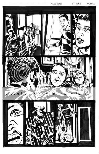
And, here you have all three pages of my homework assignment for Klaus Janson at his MoCCA "Storytelling for Comic Artists" class.
The drawings are a little rough, especially as I got rushed for time towards the end, but the goal, implementing his lessons for clear storytelling, should be evidenced in these pages.
Well, I picked up on a lot of fundamentals that seem inherent to concise storytelling and the class confirmed what I had already discovered on my own: comic art is equal parts drawing and problem solving.
Fortunately, Klaus has been teaching and plying his trade for some time and was able to break it down in handy lists and essential truths. I'll share some more observations next week, but, for now, some thoughts on his comments regarding my homework.
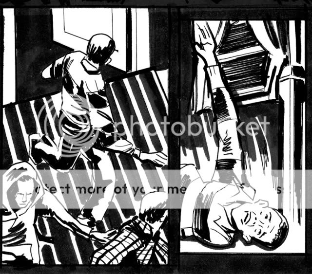
In general, he gave positive feedback to my spotting of blacks, cropping, and camera placement but pointed out where certain panels felt "flat" (ie. Page 1, Panel 2). In terms of storytelling, he rightully questioned the right to left direction of P2, PNL1 and pointed to the need to show the door in Panel 1 to set-up Panel 2.
He felt that the Pumpkinheads themselves should have been scarier, more shocking in appearance. I'm not satisfied with my rendering of them but pictured them to be more pitiful than scary to undercut the horror. Nonetheless, they needed to be freakier with a more apparent mutation.
Finally, I needed to have set up the fall of the kid on P2, PNL 6. It's unclear what he trips over and violates one of those comic truisms - any new information (ie. the object he trips over) needs to be set up one to two panels before you use it. I tried to give him an off-balance posture in the previous panel but could have actually shown his foot getting snagged to clearer effect.
For me, I would re-board the last page. I definitely wanted to start this page with the kid waking but don't feel as if I properly balanced my shots. To do it again, I would start tighter on the kid's face and more clearly pull out with each panel, much wider on the two-shot with him and the girl to lead to the cut to the exterior. I would then NOT have the last panel bleed out and instead treat it as a smaller inset panel to give the suggestion of isolation and hopelessness.
One touch I added was to have vines already start to creep up the SUV to suggest a passage of time and a slightly supernatural force at work. It's something I'd confirm with the writer first but it was my way of having the art bring an additional layer to the story that wasn't overtly called for in the script.
Thanks to Klaus and Danny Fingeroth, comic writer and editor-emeritus and director of education at MoCCA, for setting this up and sharing their knowledge.
Labels:
Danny Fingeroth,
Klaus Janson,
Michael Lapinski,
MOCCA Classes
Thursday, December 10, 2009
My Evenings with Klaus _ PART 2
I'm a nut for any instance in which several people, in this case comic artists, produce their unique personal responses to the same set problem. There's inherently so much to be learned in the comparison of approach and technique and greater insight into the subjectivity of experience in general.
As a reminder, here's the description we were given. We had to take this 18 point story and translate it into a 3 page wordless comic.
My friend and co-worker Rick Ritter happened to sign up for the same class. He's a storyboard artist by trade and he specifically challenged himself to break the static mold of a board page and tell this story utilizing varied panel sizes for greater impact. But, the mark of his boarding background can especially be seen in the way he logically transitions through the sequential details of a moment, particularly the kid tripping and falling. You can see his homework here.
Now, here's my first page (still need to scan the other two) and some of my thoughts on it. Please keep in mind that I was pressed for time, and, as a homework assignment, it's a little rough around the edges.
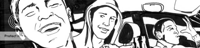
- I wanted these kids to be recognizable but universal, so, I decided to cast them as Abercrombie-wearing teens in clothing as familiar today as it was 40 years ago. The bold patterns and hood would also allow for identifying them individually AND provide opportunity for cool graphic treatment. I put them in a conversion SUV to say TODAY but also suggest a first car or parent's car.
- One challenge everyone struggled with was how to casually let the reader know that it was Halloween. I decided to dress them in fall wear but also have a mask dangling from one kid's neck as if he had worn it on their previous jaunt. Also, a skull hanging from the mirror as a knick-knack.
- To communicate the Pumpkinhead legend, I tried to create as bold a gesture as possible with the the main guy mouthing the word "HUGE!" In general, I find photo reference indispensable at this stage in my ability for communicating these subtleties.
- I kept to wide panels for the first three to give a sense of travelling with this crew. They move from left to right and from IN the car, to OUT in the open, to IN the porch, enveloping them and the reader. I also tried to convey graphic lighting coming from the headlights out of frame in Panel 3.
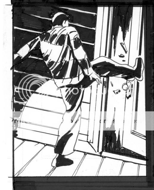
- The kick is the first dramatic moment and I hoped to set it up by showing the aggressive posture of the rugby teen in Panel 3 and deliver with a canted angle kick in Panel 4. I felt the angle gave extra thrust to his kick while planting his stable leg.
- In order to give character to the house, I decided to make it Gothic and ornamental like a classic haunted house. I think I could have done a better job in setting up the staircase in Panel 5, along with a wider view of the interior.
- Finally, Panel 6 was actually the first I drew because it had the most nuanced detail and because I don't want the first panel of a page to be the one to inadvertently look wonky if I'm not warmed up yet. I do think this last panel was pretty successful in setting up the space and forward motion/ impending doom. I decided that the transition to the second floor was the perfect place for a page turn and to leave the reader wanting more.
Labels:
canted angle,
Klaus Janson,
Michael Lapinski,
MOCCA Classes,
Rick Ritter
Subscribe to:
Posts (Atom)