Monday, June 21, 2010

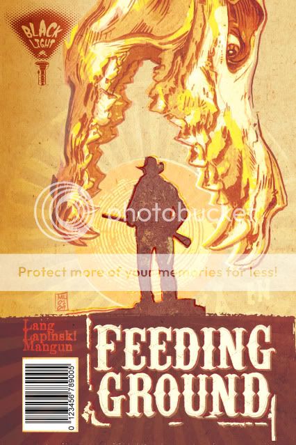
FEEDING GROUND ISSUE 01 _ Solicitation

HERE IT IS!

Conceived in the summer of 2008 by Swifty Lang and Chris Mangun, pitched at NYC Comic Con 2009, this puppy has been in production all last year and now has a release date of the last week in September 2010, published by the good people at Archaia (home of "Mouse Guard" and "Fraggle Rock" and some of the highest quality comics of all genres).

Flip the book over, and it's such an amazing decision on their part to include the entire issue in Spanish!

Thanks for your support - please tell your local comic shop to order you a copy today!


FEEDING GROUND #1 (of 6)

Retail Price: $3.95 U.S.
Page Count: 48 pages
Format: saddle bound, 6.625” x 10.25”, full color
Written by Swifty Lang
Illustrated by Michael Lapinski
Cover by Michael Lapinski

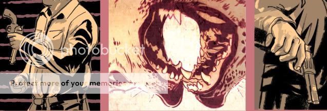
This new series is ripped right out of the real-life drama unfolding on the Mexico-Arizona border. FEEDING GROUND reaches a large and diverse audience no matter your personal point of view on the issue. In this factious story, a famine caused by Blackwell Industries drives Diego Busqueda, a noble “coyote,” to lead a band of Mexican border crossers across the unforgiving Devil’s Highway, a desert cursed with blistering days and deadly nights. Back home, Diego’s daughter Flaca discovers that something hungrier prowls the factory fields. Stalked and persecuted, can the Busqueda family maintain their dreams of immigration or will the horrors of the desert tear them apart? Also included is 24 pages of bonus content in Spanish!

T +13 (Contains material suitable for teen readers age 13 and above)

Friday, June 18, 2010

THE GATHERING _ Comic Anthology


A few months ago, I participated in illustrating a story for an anthology called The Gathering: The Thing with Feathers that will be released next month.


Edited and published by Andrew Goletz, the book is a collection of two-page shorts, tied arounf the theme of "hope," for which Andrew paired aspiring writers and artists on the Jinxworld message board. In my case, I was worked with Andrew's two sons, Ethan and Liam, who both wrote separate pages that we then joined to create a single story called "Better Days." The boys are internet celebrities in their own right for their online comic reviews here: http://kidscomicbooks.blogspot.com/.

It was a fun project bringing their words to life and a chance to try out new cartooning techniques. It's a very talented group involved with the book and I'm looking forward to checking out the other stories.

You can order and read more about the project here and help Andrew out with his Kickstarter Campaign to fund more volumes in the future.

Cover below by mucho skilled cartoonist Aaron Bir.

Friday, June 11, 2010

COVER DESIGN 03 _ Unused Issue 1 Covers


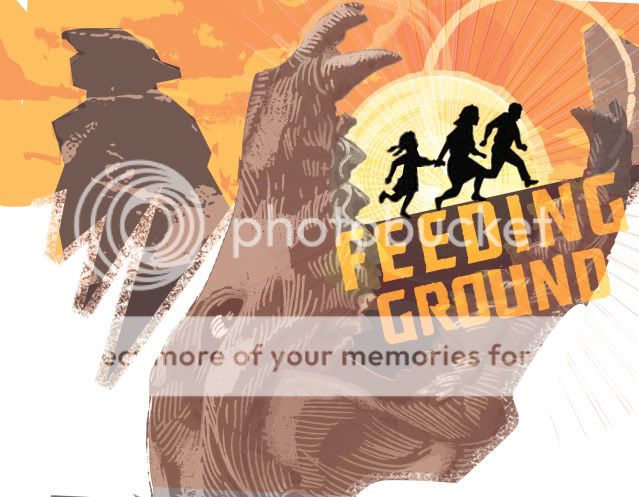
Early on, I became fixated on an image for the series that would have its own iconic weight worthy of images like those used for Jurassic Park and Jaws. What I wanted was a Dia de los Muertos animal skull devouring the sun and a silhouette of one of our lead characters. Not surprisingly, people mistook the skull for that of a dinosaur.


I tried a fix in which I altered the skull to seem more like a spectral image, some heatstroke nightmare.


Ultimately, we decided to continue to work the image and communicate the following qualities: horror, Mexico, family, border crossers (our family starring as the silhouettes in the Border Crossing road signs), and unbearable heat.

The following two covers seem a little too much like old Del Rey paperbacks in their layout but pointed us in the right direction. The skull from below may seem a little literal as a "feeding ground" but still appealed to me too much to abandon. Also lost the "Western" treatment of the title in favor of something more industrial.


And this last rough was a bolder departure in which I mined the design elements for a full cover spread.


The final version will be publicized shortly and I think it hits the right balance of what we're going for and will hopefully stand out on the racks. We've also struck on an overall treatment that is more like a woodcut print that, along with the skull motif, should carry over to all six issues of the mini.

Thursday, June 3, 2010

CHARACTER DESIGN 07 _ Chickiepoo & Fluff


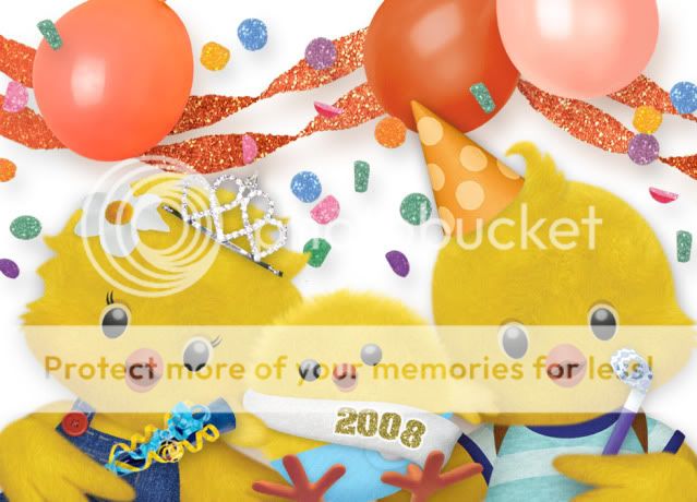
To counteract last week's gore. Here are some glamour shots of designs I did for a pre-school pilot for Nick Jr back in 2008. It was called "Chickiepoo & Fluff: Barnyard Detectives." It starred Chickiepoo (the girl), her brother Fluff, and their baby brother Fuzzworth. With the help of the home viewer, they solved mysteries on the farm.

I'll show some production files in the future but overall these were originally designed by hand, and then rendered through a process that involved hand-drawn Flash animation as a guide that was then textured and layered in Photoshop. Animation Director Elana Allen was instrumental in fleshing out these chicks and making them more three dimensional and animation-ready. Additional animation was done by puppetting parts in After Effects and the backgrounds were designed in Photoshop with original elements handcrafted by artist Astrid Riemer.

All said, what a talented team and adorable concept for a show that won it's Pilot Season but never quite found its niche on the network.

Side note: Fluff has my cow lick and I'll never stop enjoying the "Feathers Erupting from a Diaper" design of Fuzzworth.


Thursday, May 27, 2010

FUN TO DRAW 02 _Viscera and Gore


As a horror comic, Feeding Ground has its fair share of bloodletting and the desecration of the human form. At times, it can be unsettling to draw, especially as we try to ground it somewhat in the real world with real people with lives and families.

But, with varied textures and surfaces, it's hella fun to ink.

Below you'll find the remains of one of the victims in our Pitch Book. Since then, his fate has taken on more significance with an even more grisly demise.


Thanks to the ever-informative and enjoyable Word Balloon Podcast by John Siuntres and his ongoing Q&A with comic creator Brain Michael Bendis on "The Bendis Tapes." Working alone in my studio, the show is excellent company and a friendly reminder of the industry and lives of the comic world at large as I redraw intestines for 40 minutes.

Friday, May 14, 2010

COMIC COLORING 03 _ Process


On the topic of "Narrative Color" be sure to check out this post on cartoonist GB Tran's blog. It's the master palettes for his upcoming book Vietnamerica and I think they do an excellent job in evoking much more than local color or resorting to sepia tones for flashbacks/ memories. And go on and peek at more of the posted pages, it's going to be something special.

In this post, I'll show a page taken through the color stage. It's not a full-on tutorial and I'll definitely answer any questions it raises. For the particulars of digital coloring and the history of comic coloring in general, I found DC Comics' art director Mark Chiarello's section of DC Comics Guide to Coloring and Lettering Comics to be a useful resource. Otherwise, I hope readers can speak to the effectiveness of my process and comment on the results. As an additive process, there's always the fear that I've overdone it or undermined the initial integrity of the page.

Here goes:

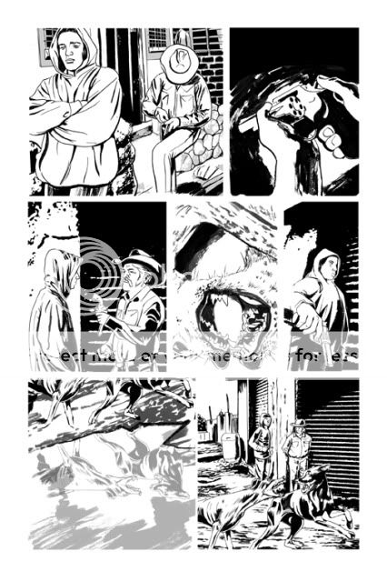
INKS
Establish the positive and negative shapes on the page in a way that frames the action and leads the eye from panel to panel. In this book I'm looking to tie the negatives of the gutter to the negative of the panel where appropriate rather than automatically wall off all of the art in bounding boxes.

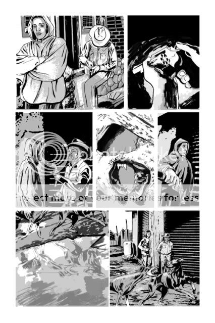
TONE
Building off of the blacks to define the light source and continue to delineate details and space. I want the boot to look like printed material and feel fairly flat while maintaining some sense of form. Not always an easy compromise, especially at different times of day and with different light sources. Realism is a challenge of skill but creating a consistent unique style is a highwire act. I sometimes wish I gone more stylized overall.

FLATS/ UNDERPAINTING
Here's a process pic where I start to establish the color relationships of the page in broad strokes. The center panel is the "hottest" moment on the page and the bar I'm working from in finishing the other panels. You can also see where I start to shift the tone layers to a hue (here a purple) and choose the base ink color in place of the black.


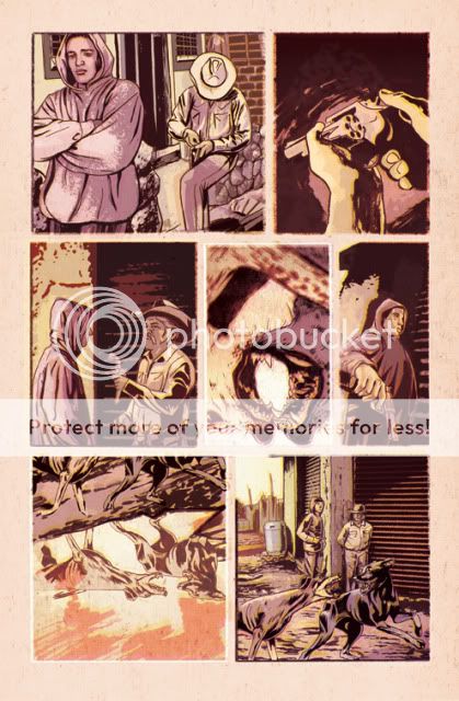
FINISHES/ EFFECTS
I come from more of a Photoshop-based digital art background as opposed to a traditional painting or drawing skill set. My goal is to use Photoshop blending layers to create a digital print, creating happy accidents and layers of treatment to keep the color alive and give the page a degree of raw spontaneity.


So, any feedback would be greatly appreciated. I'm already concerned/ looking forward to seeing how this prints on professional printers and high grade paper. How will this "feel" on glossy stock? If it was possible to print with oversaturated colors on old newsprint I would have. I hope that I've been able to arrive at a compromise that feels fresh to modern readers.