Monday, August 2, 2010

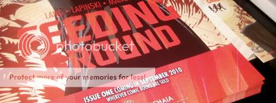
FEEDING GROUND _ Solicitation and Podcast

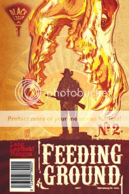
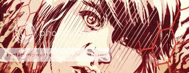
In case you missed it, here you have the solicitation for FEEDING GROUND Issue 2 and a link to my first Podcast appearance! With this cover image, I was trying to create a new doomed iconography based on the Christian symbol of the Sacred Heart as well as the Mexican lotería card for "Corazón" to communicate the cursed blood that flows within.


FEEDING GROUND #2 (of 6)
Retail Price: $3.95 U.S.
Page Count: 64 pages
Format: saddle bound, 6.625” x 10.25”, full color
Written by Chris Mangun and Swifty Lang
Illustrated by Michael Lapinski
Cover by Michael Lapinski

A local enforcer, Don Oso, terrorizes the Busqueda family as their father Diego makes a solitary trek home through the horrors of the Devil’s Highway. Meanwhile, US Border Patrol agents unearth a shocking discovery that threatens to reveal a secret buried in the desert for generations. Also included are 24 pages of bonus content in Spanish!

T +13 (Contains material suitable for teen readers age 13 and above)


I'm a regular listener to The Ink Panthers Show podcast (a "Fanther") and I was nervous and excited to be asked on as a guest star. Hosted by famed cartoonists Mike Dawson and Alex Robinson, the show is ostensibly a comic book podcast but the topics are all over the map and the main draw is the funny, familiar, conversation held between Mike and Alex.

On this episode, I reveal the details of that crucial moment when Archaia accepted my FEEDING GROUND pitch and then the conversation veers off into other bits ranging from Pixar to veganism and my love of cuttlefish.

You can listen off of their website or download and subscribe to the podcast for free through the iTunes store.

Ride the Panther!

Friday, July 30, 2010

San Diego COMIC CON 2010 _ The Big Wrap-up


Although FEEDING GROUND doesn't come out until September, writer Swifty Lang and I were invited out to San Diego Comic Con by Archaia to sign posters at their booth, participate in the Archaia: All-Access panel, and enjoy the big show.

There was much to get my inner fanboy excited (the Walking Dead booth, TOYS!, all things Thor) but it was a great occasion to meet the extended Archaia family and talk with some of my favorite creators. Everyone could not have been nicer or more down to earth.


Some other highlights below:

- The Silkscreen Poster Art of Gary Musgrave and Jordan Crane. If anyone is ever looking to get me a gift, simply add all of them to your shopping cart. Such a vibrant aesthetic and powerful images that inspired me to push my FEEDING GROUND work even further. There is always something out there to remind you that you can always do more.


- The "Quickie" postcard and order slip art of David Palumbo. Dave's a meticulously talented fantasy painter but his looser ink work and figure studies have real life to them and show off how much he just "gets it."


- Constructive criticism from artist Steve Lieber (Whiteout, Underground). Swift and I were honored to start our Con by chatting with Steve and receiving a critique of our work. A student of The Kubert School and great comics in general (check out Alberto Breccia) he is the consummate comic storyteller with a full command of the devices of the medium. Whether the frozen wasteland of Whiteout or the flooding cave system of Underground, his site-specific environments were a major influence on how I approached rendering the desert of FEEDING GROUND.

Some of his feedback:

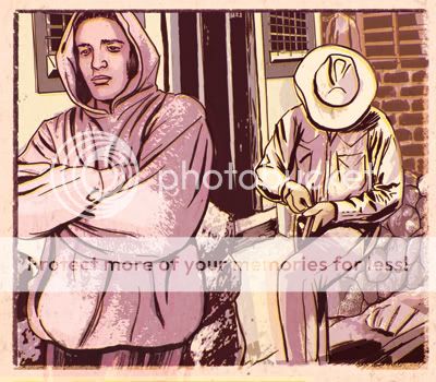
1) Always draw each figure in a pose that creates a clean and interesting silhouette with clear information. For example, although I wanted the man below to be hiding the fact that he is removing bullets from the gun, I should have rotated the figure or camera so that the gun was free from his body and created a distinct outline.


2) Be wary of placing figures with different horizon lines and creating a tilted stage. Staging figures in a believable space is definitely a craft I am trying to work on.

3) Feel free to occasionally drop background information from the panel. Although I have been diligent about rendering and establishing a real space around the figures, removing it also allows breathing room and encourages the reader to complete the scene in their mind.

In the end, much appreciated and Steve was also cool to give us a shout out on Twitter calling FEEDING GROUND an impressive debut.

All said, what an incredible professional and fan-lovin' experience that few media can foster.

And, Thor helmets!

Wednesday, July 21, 2010

FROZEN DARK _ The DON'T LOOK! Anthology


Faithful readers of this blog might remember mention of a horror short called FROZEN DARK.

Swifty, Chris, and I created it for a black and white horror anthology edited by friend and co-worker Rick Ritter. Based on a story by Chris, FROZEN DARK deals with that common childhood fear of having to make a midnight trip to the bathroom, except this tale is set in the frozen wasteland surrounding a Tibetan orphanage.


Now, Rick and cover artist David Palumbo are bringing a pitch book of the anthology (titled DON'T LOOK!) to San Diego in search of a publisher. The book also features stories from other NYC Animation heavyweights Bob Algeo, Paul Zdanowicz, and Scott Cooper.


Knock 'em dead, guys!

Sunday, July 18, 2010

FEEDING GROUND _ The Pitch


Now that the FEEDING GROUND release date is fast approaching (end of September) I thought I'd cover the structure of our initial pitch. You can go back to some of my earliest posts to take a look at some more of the content pages included in our Pitch Book.

The first thing we decided was to format the pitch as a comic with cover art and the same dimensions and binding as an ordinary floppy. Any tips we had researched always recommended the inclusion of 5 pages of comic content so this package seemed like a natural fit.

After a title page and table of contents, we immediately went into our proposal. It essentially starts with a two-sentence summary of the concept as a hook, then expands into a one-page description, and, finally an issue-by-issue breakdown on the next page.

We treated the text like any conversation with a stranger. Pique someone's interest at first, and then have the information to merit their attention. And, one important tip we were given was to tell your prospective publisher the ending. Mysteries are good for the reader but most publishers would want to know exactly what they're signing on for.

Also, mythology is not the story. While the story has a beginning, middle, and end, we chose to include a separate page about the overall mythology we were establishing because we felt it was a unique angle on a familiar topic.

From there, we had a page of character sketches and bios and a map to start to populate the world in the mind of the reader. That leads to the section that represents 5 pages of finished material. Of these pages, only one has made it into our final book relatively unchanged. However, an editor will be able to judge basic storytelling ability and execution based on these pages. Additionally, we included a few sample covers to communicate the identity of the series as it would appear on the racks.


Finally, we ended with the full Issue 1 script as well as some additional pin-up art. Unlike screenplays, comic scripts do not require particular formatting but Swifty followed a general screenwriting model. Not required, but we also chose to add panel breakdowns for each page.

There isn't any one correct way to present your ideas, but, this is the one that worked for us.

Wednesday, June 30, 2010

CHICKIEPOO & FLUFF _ Background Design

Here you have some more production art from the Nick Jr. Pilot/ Animated Short CHICKIEPOO & FLUFF: BARNYARD DETECTIVES.

In this case, the master shots of three prominent backgrounds that I designed and/or art directed.

Their bedroom in the peak of a chicken coop. This never actually made it on air but it was the mood piece that I designed for the pitch book that really helped set the tone. The creators, sisters Amy and Liza Steinberg, had contrasting and yet complimentary tastes in that they wanted something that was pastoral and flat, super cute and lived in. In general, we employed a Photoshop collage style that had been honed on other Nick Jr. shows like "Blue's Clues." The magic hour lighting was a must.

Their secret headquarters was located in a bush near the coop. Nibbles, the bunny, was their first client. For me, it was a chance to go all "Secret of Nihm" and if the show went to series, I would have wanted to push the shadows and add more nooks and crannies. Astrid Riemer did an incredible job crafting the props (all those leaves!) and setting the stage.

The farm at night. I appreciate this one for its moonlit glow and the combination of geometric and organic shapes. Astrid did the Photoshop honors on most of this one.

Need more Chickiepoo in your life? Take to the streets and let your voices be heard.

Thursday, June 24, 2010

FEEDING GROUND _ Solicitation Update

Some additional backstory: initially, the Archaia website listed the book a 48 pages (accounting for a flip book in which the book is reprinted in Spanish) for $3.95. One problem, our first issue has 28 pages of content (x 2 = not gonna fit). Then, I went to the Previews site (the distribution catalog for comic sales) and discovered that the book was listed at $5.95 (!) and my jaw dropped. After a fitful night's sleep and some phone calls, Archaia is more than on top of resolving Diamond's typo.

In fact, the book will be 64 pages at $3.95. Holeee Mackerel! We were already planning on including some extra content (pin-ups and articles a la Ed Brubaker's incredible Criminal) but I could not hope for a better package for this book. Thanks and cheers to Archaia for taking a chance on us.

One artist that we already have lined up to do some additional art is friend Tom Forget. His work is the best kind of lurid pulp and a great match to the heat of our material. Warning, most of his images are Not Safe For Work but are perfect for your basement office.