Friday, February 8, 2019

PASSION ROXX - Sizzle Pitch

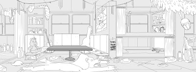
What happens when a hair metal band from 1986 is frozen by their hairspray and thawed out in 2019?


I directed this short pitch for series at Magnetic Dreams but it's very much the baby of creator John Compton, a former front man who lived the life and survived to tell about it (he died twice).

New for us to work on something Not Quite Safe For Work. I literally worked on this alongside projects for Sesame Street and a Christian curriculum but it felt our monitors were forever filled with assless chaps.

Below, some of the amazing and ridiculous artwork that went into making Passion Roxx possible.

It's rare that we already start a project with such strong art from the client. John arrived with two rounds of character designs by his artist friend Michael "Sheik" Tisdale. They already communicated so much about the look of the characters and the energy of the show.


We knew that we'd be animating this in After Effects with a Duik rig, like we did on "One Shot," and we needed to make the characters more animation friendly and, to my eye, cartoony. The guy for the job was Devin Clark, creator of "Ugly Americans." He offered two rounds and I immediately fell for the giant hair, doll-like proportion version of the guys. 


Along with final clean-up by Ashley Malone and what I crafted as an iconic "Scooby Doo" palette for the band, I felt like we arrived at a fun counterbalance to the crude humor and outsized personalities of glam metal.

To my mind, the band was 4 of the 7 Deadly Sins: Taz = Lust, Mike = Sloth, Vic = Pride, Pete = Gluttony. This schema helped me stage and direct the performances going forward.


Here are more designs from Ashley. We discovered that our Producer Randall Saba worked at Tower Records in the 80s and used to ride his Vespa on the Strip. With that in mind, I had to make him the inciting incident for their accident.


I also HAVE to share some of Kimberly Cranfield's secondary character designs. They are on screen for too fleeting moments to really show off how good they are.


I'm always grateful for the ways that board artists and animators plus up a shot and this was a spot of excess where I largely felt it was best to just keep saying "yes" and see what hits. Board artist John Fountain started us off right with a little gag of a coughing seagull that I think set the scene and tone of what's to come.


We all knew it was a shame when Magnetic animator and board artist Ben Fosselman recently moved to LA because he would have been perfect for the project. Luckily we got him for a few scenes that brought enough of the Ben we needed.


And, here's the finished shot by Ashley Malone and myself.


So many other key contributions from Tyler Goll on Edit (and utility on just about everything else), John Hill on EFX, and Abdel Pizarro on Comp.

I also wanted to shout out getting to work again with Keith Conroy. He headed up the Background department when I was at Ninja Turtles and he's always made a crazy amount of detail look easy. Below, some of his designs with color by me and Ashley Malone.


Wednesday, September 26, 2018

ONE SHOT _ Making Of & Creator Credits


In early June, musician Hunter Hayes got the idea that he wanted to be a cartoon and an animated video for his single "ONE SHOT" was the way to go. Just before Labor Day and 400 man hours later we delivered our shot at it, above.

From L to R: Lisa Halsey, Rickey Boyd, Trea Bailey, Ashley Malone, James Elston, Hunter Hayes, Tyler Goll, Abdel Pizarro, Michael Lapinski, Joel Gibbs

Hunter enthusiastically pitched the video to Magnetic Dreams Studio as starring a guy with "shot goggles" who thinks he's a superhero the more he drinks when the reality is far more mundane and messy. I fleshed out the concept from there with COO Jeff Galle and we tugged even more on visualizing those themes in the lyrics that yearned past the good times for another shot to get it right.

The story would be told from the perspective of a hungover Hunter rebuilding the night from false memories and embarrassing Instagram evidence to the contrary, each chorus a new bar and each verse a new reflection.

The first step would be to arrive at a caricature for Hunter (along with band and friends) and a look for the spot that communicated the spirit of "Hunter" and the song. It needed to have a little edge, like Family Guy meets Teen Titans, and a dose of superhero pop like Batman '66.


I have genuine affection for a number of the takes above and they would have resulted in a very different spot. But, the approved design by Ashley Malone, below, was that sweet spot that set us on our course. I knew she could cartoon but man it was also fun to find out how much fun she had drawing drunk Hunter's antics. With her design at the fore, Ashley became the lead designer, animator, and core of the project.


From there, a visual development team consisting of myself, Ashley, Trea Bailey, Eva Helwig, and Jasmine Soompholphakdy worked up the various gags and visuals that populated the story.

Various board panels from both Ashley and Trea that were later comped
together by Joel to create the opening montage.

One thing I couldn't shake was the need for both an unexpected element up front and a confidant to guide Hunter through his trough. I found both in the guise of a llama, llamas look inherently both comforting and condescending, that rode him home. I was prepared for everyone to shoot down the idea but it stuck.


Final boards were illustrated by Trea and Ashley and Trea was crucial in illustrating the gorgeous images that would become painted key art at climactic moments. Editor Tyler Goll cut the animatic and we were off and running!


The great thrill of this project was to get the right people on the job and let them do their thing, especially with a quick turn pressure cooker deadline. For example, as sort of an animated superhero parody, I thought to call in a reunion of some Teenage Mutant Ninja Turtle buds who I knew would knock it out of the park even after almost 2 decades apart.

Below, I'm looking to credit everyone involved, not only with their job title but also with some of my favorite bits they brought to the project. Any pink text are links to their sites.

Ashley Malone (lead character designer, lead animator, board artist) - so much of Ashley is in the sheer volume of work that comprises this video. But, I'll forever love the moment I saw her clean-up of that initial side glance that the llama gives Hunter upon waking. Some of her rough sketches of Hunter in action were so good that I couldn't bear to lose anything in cleaning them up so I used them outright.


Board panels and final characters by Ashley Malone, final background by Michael Lapinski

Trea Bailey (character designer, background designer, animator, board artist) - Trea was a font of ideas, visual solutions to thematic questions, and his innate grasp of composition and body language resulted in such beautiful key illustrations like the band performance and pedal tavern.

Line art by Trea Bailey, color art by Michael Lapinski

Jasmine Soompholphakdy (vis dev, sound effects designer and animator) - so glad to have Jasmine's sensibility on this project. I'm a fan of her personal work and just wanted her to be able to infuse it into her work with us, such as, the byzantine way she arrived at the brand for the cinnamon liquor AND THEN making it the sponsor of the race car.

Eva Helwig (vis dev) - Eva knows cartoons and she an her sister are starting their own cartoon empire. Her early takes on Hunter and the llama in particular were key to doing right by their relationship.

Kimberly Cranfield (character designer) - Kim was only able to be on for a brief while but she owned those hockey players.

James Elston (character clean-up) - Jim's a former Disney clean-up artist who we called onto the ice in overtime and delivered on finishes for hockey player key art.

Lisa Halsey (money lady, Predators fan) - a die-hard Predators fan, she refused to let me name our doppelgänger hockey team "The Nashville Noodlers" and instead christened them "The Smashville Catflingers."

Character art by Ashley Malone and James Elston, color art by Michael Lapinski

Rickey Boyd (character clean-up, animator) - a man of many talents, it was great to get Rickey on this one actually performing one of his early loves, animation. Quick with the pencil, I was also fortunate to get him to draft an expressive moment of the pedal tavern passengers behind Hunter.

Keith Conroy (background design) - the man drew some of the most complex, perspective-driven, cityscape backgrounds in my time at Ninja Turtles and made total sense out of them. Who better to do a comic version of the honkey tonks of Nashville's Broadway? No one.


Background design by Keith Conroy, color art by Michael Lapinski

Emilio Lopez (digital painting) - E-Mann has the touch. A painter for cartoons, comics, and video games he's got a style that is both dynamic and nuanced and very necessary for the key art here.

Jimmy Tran (digital painting) - I didn't have the chance to work with Jimmy at Turtles but he quickly became a go-to color guy, making sense out of complexity and, in this case, making pedal taverns soar.

Abdel Pizarro (animator) - I knew any of the action shots belonged in Abdel's hands as well as crafting all of the anime blurs. But, it's the addition of a little butt wiggle to "broken Hunter" that will forever be his mark on this piece. 

Shinichiro Matsuda (animator) - Shin has done great visual effects and comp work with Magnetic but it wasn't until "Doing It" that he cracked me up as a character animator. He's responsible for some of my favorite shots in both, the belt buckle slow dance in "Doing It" and Hunter stealing the drinks here.

Line art by Trea Bailey, color art by Emilio Lopez and Michael Lapinski

JoĂ«l Gibbs (comp artist) - already directing several other projects of his own, JoĂ«l jumped on here and brought above what was needed in turning each shot green and working with us through the 25th hour.

Tyler Goll (editor) - from literally start to finish, it's Tyler that got all our ideas to fit and hit. He also cut a perfect promo for the video using Jasmine's sound effects.

Beau Sherman (production Coordinator) - you want a calming presence to make sense of the chaos. That's Beau.

Randy Saba (producer) - beyond staffing this gig, the man has great taste in cartoons and I always knew I could trust his feedback.

Rhea Borzack (head of production) - the backbone of production/ comp, Rhea carries so much with grace, including a drunken Hunter.

Special thanks too for Jeff Galle and Mike Halsey for making this happen with Mike Dupree at Warner Music and being key sounding boards throughout the process.

Line art by Trea Bailey, color art by Emilio Lopez and Michael Lapinski

OK, if THAT wasn't enough for you, here's another 40 minutes below of me talking about creating the video with Hunter and Trea. Much respect for Hunter for not only wanting to do a project of this kind but also for launching from our studio in a total Made In Nashville fashion. It's rare to not only have this sort of creative freedom with his already cool creation but to also to be able to process it in public after it's all said and done.

Thursday, March 29, 2018

THE FRIST CENTER - Choose You Own Adventure...

At the beginning of the year, I had the great pleasure to team up with the Frist Center in Nashville to create a "Choose Your Own Adventure"-styled book to accompany their exhibit ROME: City & Empire.

The brainchild of curator Ginny Soenksen and with design by Phil El Rassi, "Fortune & Glory" offers a branching narrative and context to lead the viewer across time and dozens of artifacts in the gallery space. 
As the protagonist, our museum-goer steps into Rome in the role of merchant, soldier, or revolutionary, charting a fate that ends in acclaim or death.

For my part, I illustrated 20 images, including the cover, in a limited palette that evoked both art of the era and mid-century American prints on the subject.

The exhibit is up now and here are some examples:


Wednesday, November 15, 2017

SESAME STREET _ The Magical Wand Chase


I got to design a Muppet! Anyone that knows me knows that Sesame and Jim Henson were essential to my becoming an artist. After several years of Art Directing for Sesame at Magnetic Dreams, the opportunity arose to design the fully CG antagonist for the new TV special, THE MAGICAL WAND CHASE. The movie was a fantastic adventure for the Sesame characters to leave the Street and visit other diverse neighborhoods.


BIRD DESIGN
The character, voiced by Elizabeth Banks, was written as a hapless villain who mistakes Abby's wand for a stick and triggers magical mayhem as the Sesame friends attempt to retrieve it. She needed to have a distinguishable pink head feather, but, beyond that, the design parameters were fairly open. Here's the sketch that led to the final design, chosen particularly because of her small stature and innocent gaze.


Creative Director Rickey Boyd and I worked up a book of designs for Sesame to select from. I tried different varieties of Muppet anatomy and felt pretty strongly about making her a lavender that would find its place in the rainbow palette of her six Sesame pals. Here are some unused designs:


FRONT and SIDE reference for the modeler.


Unsurfaced model by Ryan Kittleson (he nailed this thing on the first try with minor tweaks)


Surfacing reference for texture artist Joe Jones, who did an amazing job feathering with Ornatrix and capturing the fine detail of foam and fur.


There she is!


Rickey's also a Muppeteer and, with rigger Steven Alley, donned a glove to create a mo-cap performance of the Bird with nuanced head and lip synch and with all of the immediacy of a puppet. Our animation team (Jamie Coakley, Beau Sherman, Ben Fosselmann) continued to bring her to life as scenic and comp were responsible for the hot air balloons and CG city. The focus of my role on the project ended up being primarily on logo and opening and closing credit design.

TITLE DESIGN

The working title for the special was "Get That Wand" which I liked for its call-to-action kinship with "Follow That Bird."


I was inspired both by the construction paper art of the reading nook on set and also the "Around the World in 80 Days" hot air balloon focus of the Special to arrive at this final design.


I have the artist pack rat tendency to not throw away anything and the construction paper in the background is actually aged and bleached almost 20 years in my art supplies from college.


After arriving at the cut paper look for the titles, I discovered that Sesame already had a similar style in their consumer products guides. I made sure a few fan-favorite characters found their way into the opening airplane.


Sesame requested that we include Penelope Penguin (hysterically performed by Leslie Carrara-Rudolph) from Elmo's "Airplane the Musical"


For the closing credits, I was inspired by Pixar to continue the story in the moments after the final frame. It was important to me to reunite the friends with Nina, introduce her to the Bird, and let the rest of the neighborhood have their own sunset balloon festival. Rickey lent his hand to a number of these designs and Ashley Malone was my right hand in finishing them off and animating these shots.


This last frame was a treat to design as a coda to the Special and, hopefully, a chance for us to get to revisit our new "Elizabird" friend on Sesame Street.