Friday, June 11, 2010

COVER DESIGN 03 _ Unused Issue 1 Covers


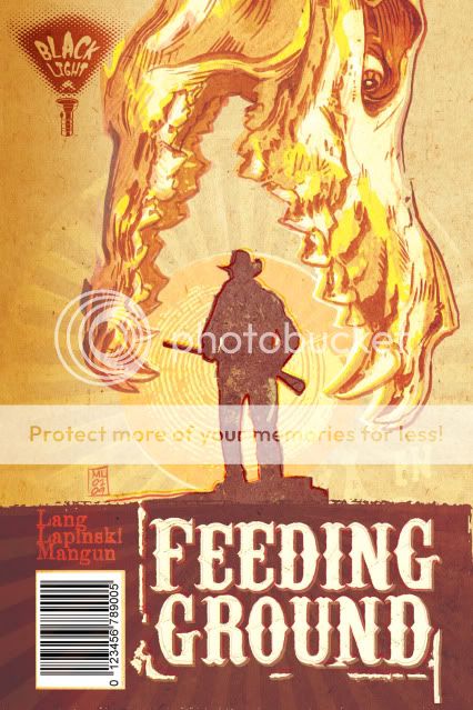
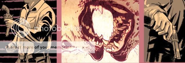
Early on, I became fixated on an image for the series that would have its own iconic weight worthy of images like those used for Jurassic Park and Jaws. What I wanted was a Dia de los Muertos animal skull devouring the sun and a silhouette of one of our lead characters. Not surprisingly, people mistook the skull for that of a dinosaur.


I tried a fix in which I altered the skull to seem more like a spectral image, some heatstroke nightmare.


Ultimately, we decided to continue to work the image and communicate the following qualities: horror, Mexico, family, border crossers (our family starring as the silhouettes in the Border Crossing road signs), and unbearable heat.

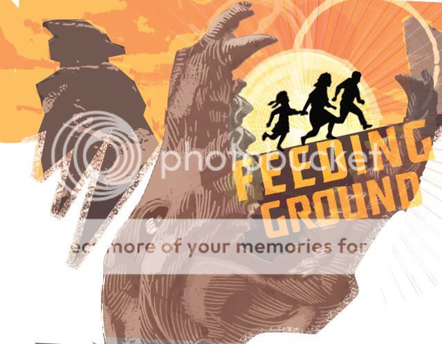
The following two covers seem a little too much like old Del Rey paperbacks in their layout but pointed us in the right direction. The skull from below may seem a little literal as a "feeding ground" but still appealed to me too much to abandon. Also lost the "Western" treatment of the title in favor of something more industrial.


And this last rough was a bolder departure in which I mined the design elements for a full cover spread.


The final version will be publicized shortly and I think it hits the right balance of what we're going for and will hopefully stand out on the racks. We've also struck on an overall treatment that is more like a woodcut print that, along with the skull motif, should carry over to all six issues of the mini.

Thursday, June 3, 2010

CHARACTER DESIGN 07 _ Chickiepoo & Fluff


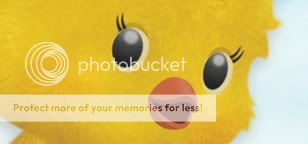
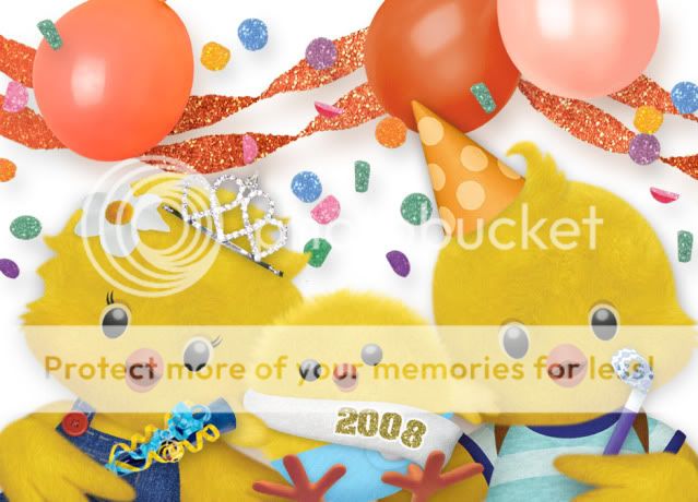
To counteract last week's gore. Here are some glamour shots of designs I did for a pre-school pilot for Nick Jr back in 2008. It was called "Chickiepoo & Fluff: Barnyard Detectives." It starred Chickiepoo (the girl), her brother Fluff, and their baby brother Fuzzworth. With the help of the home viewer, they solved mysteries on the farm.

I'll show some production files in the future but overall these were originally designed by hand, and then rendered through a process that involved hand-drawn Flash animation as a guide that was then textured and layered in Photoshop. Animation Director Elana Allen was instrumental in fleshing out these chicks and making them more three dimensional and animation-ready. Additional animation was done by puppetting parts in After Effects and the backgrounds were designed in Photoshop with original elements handcrafted by artist Astrid Riemer.

All said, what a talented team and adorable concept for a show that won it's Pilot Season but never quite found its niche on the network.

Side note: Fluff has my cow lick and I'll never stop enjoying the "Feathers Erupting from a Diaper" design of Fuzzworth.


Thursday, May 27, 2010

FUN TO DRAW 02 _Viscera and Gore


As a horror comic, Feeding Ground has its fair share of bloodletting and the desecration of the human form. At times, it can be unsettling to draw, especially as we try to ground it somewhat in the real world with real people with lives and families.

But, with varied textures and surfaces, it's hella fun to ink.

Below you'll find the remains of one of the victims in our Pitch Book. Since then, his fate has taken on more significance with an even more grisly demise.


Thanks to the ever-informative and enjoyable Word Balloon Podcast by John Siuntres and his ongoing Q&A with comic creator Brain Michael Bendis on "The Bendis Tapes." Working alone in my studio, the show is excellent company and a friendly reminder of the industry and lives of the comic world at large as I redraw intestines for 40 minutes.

Friday, May 14, 2010

COMIC COLORING 03 _ Process


On the topic of "Narrative Color" be sure to check out this post on cartoonist GB Tran's blog. It's the master palettes for his upcoming book Vietnamerica and I think they do an excellent job in evoking much more than local color or resorting to sepia tones for flashbacks/ memories. And go on and peek at more of the posted pages, it's going to be something special.

In this post, I'll show a page taken through the color stage. It's not a full-on tutorial and I'll definitely answer any questions it raises. For the particulars of digital coloring and the history of comic coloring in general, I found DC Comics' art director Mark Chiarello's section of DC Comics Guide to Coloring and Lettering Comics to be a useful resource. Otherwise, I hope readers can speak to the effectiveness of my process and comment on the results. As an additive process, there's always the fear that I've overdone it or undermined the initial integrity of the page.

Here goes:

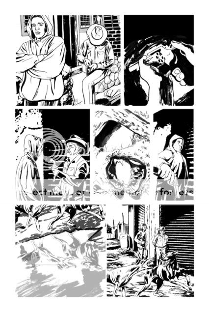
INKS
Establish the positive and negative shapes on the page in a way that frames the action and leads the eye from panel to panel. In this book I'm looking to tie the negatives of the gutter to the negative of the panel where appropriate rather than automatically wall off all of the art in bounding boxes.

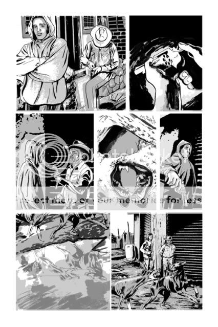
TONE
Building off of the blacks to define the light source and continue to delineate details and space. I want the boot to look like printed material and feel fairly flat while maintaining some sense of form. Not always an easy compromise, especially at different times of day and with different light sources. Realism is a challenge of skill but creating a consistent unique style is a highwire act. I sometimes wish I gone more stylized overall.

FLATS/ UNDERPAINTING
Here's a process pic where I start to establish the color relationships of the page in broad strokes. The center panel is the "hottest" moment on the page and the bar I'm working from in finishing the other panels. You can also see where I start to shift the tone layers to a hue (here a purple) and choose the base ink color in place of the black.


FINISHES/ EFFECTS
I come from more of a Photoshop-based digital art background as opposed to a traditional painting or drawing skill set. My goal is to use Photoshop blending layers to create a digital print, creating happy accidents and layers of treatment to keep the color alive and give the page a degree of raw spontaneity.


So, any feedback would be greatly appreciated. I'm already concerned/ looking forward to seeing how this prints on professional printers and high grade paper. How will this "feel" on glossy stock? If it was possible to print with oversaturated colors on old newsprint I would have. I hope that I've been able to arrive at a compromise that feels fresh to modern readers.

Friday, April 30, 2010

CHARACTER DESIGN 06 _ DC's B-List


A lot of jibber jabber in the last few posts so I thought I would just post some art as a send-off to a long week.

These are from the character re-design threads I participate in on the Bendis board. I was never much of a DC comics fan, partly because of their characters' cheery demeanor and what seemed like gimmick superpower-driven stories kept me at arm's length.

I definitely appreciate them as icons and the mythologies that have been built around them. Some of the designs are impossible to improve upon (it's like redesigning an Apple) but here are a few updates with the present stories in mind.

AQUAMAN

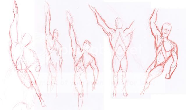
He's been a pirate, a king, and a squid-faced monster and recently returned from the dead. For all of the attempts to legitimize the character, none of them has really stuck and I always find myself drawn to the classic get-up as aquatic pop candy. I definitely looked to Michael Phelps for the swimmer's physique and Olympic spandex.


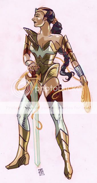
WONDER WOMAN

I get that she fought in WW2 but it didn't seem right to me that a Greek warrior princess would be decked out in the American flag. I tried to push the warrior aspect while swapping her eagle for a dove to point to the dichotomy of her mission (Warrior for Peace). I also tried to make her seem less Anglo and gave her a sentient lasso that has the hots for her. Oh yeah, and an Invisible Sword.


THE FLASH

There's more than one Flash populating the DC Universe right now and I wanted at least one to have a different color scheme and symbol. Red and a Lightning Bolt is about as iconic as it gets but here I tried for a design with a sense of motion already built into the positive and negative shapes. I feel like it's the least successful of these three re-designs but a decent jumping off point for further exploration.

Monday, April 19, 2010

COMIC COLORING 02 _ Color As Narrative

Color's a very powerful thing, and I hate to see it squandered. I think there should be more black-and-white books, not only because they can work very well, but if you don't use color for a purpose, why waste the ink?
- Frank Miller
I believe color is used essentially as a packaging device, rather than as an integral storytelling device.
- Will Eisner
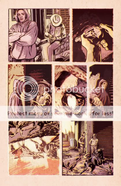
I'm not much of a draftsman. When it came time to design "Feeding Ground" I had to consider the tools in my belt and how I could best communicate the narrative visually. I've needed to hone my drawing ability to the task but the skill that came most naturally, the implement that I felt I could wield most expressively, was color.


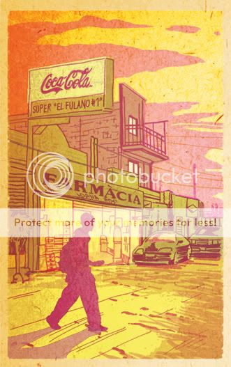
For a horror story taking place in the heart of the Mexican desert, I needed colors that would bleed and vibrate off of the page as if the ink had spoiled. Colors that are lurid and garish and feel a little sick. There are colors that describe what a thing is, be it skin, a sky, or hair. Then there are colors that convey a quality of light, from the artificial to the changing mood of the sun. Those are the colors of reality. My goal has been to combine those qualities with the emotional weight of color to create a world that feels simultaneously unreal and a more realized version of the place itself .

Coloring in mainstream comics has never looked more professional. Digital colorists can now create highly rendered forms and special effects akin to a summer blockbuster. But, at its best, this sort of coloring is an invisible art in that it conveys only what is on the surface.

Narrative color has been used recently by David Mazzuchelli in his Graphic Novel "Asterios Polyp." He follows a clinical formula with a limited palette of primaries and secondaries to convey emotions and mental states as directly as the time of day. He combines them to visualize invisible connections between characters in a visual language that is as stark as thought balloons or the written word.

For my tastes, Val Staples color work on "Criminal" by Ed Brubaker and Sean Phillips is even more inspiring for using bastard colors like mustard, mint green, and violet to elicit feelings from the reader. They aren't the "right" colors for, say, the restaurant setting of a scene, but they perfectly conjure the acrid ozone smell of electric violence in the air.


The color work in my book feels risky. I'm often doubting myself and arriving at solutions through accidents but that's what makes it art to me. The trick is that I need to know when to reign it in. I'm using color hold outlines, and overlays, and unnatural hues and it could all turn out to be a chore on the eyes if I'm not successful.

There was a point when my final black and white inked work looked like enough to me. With a little local color, it read fine and looked right. It was a safe option. But, we sold our pitch book with color that didn't compromise. I had to follow our initial impulse and chase colors that not only felt "right" but might cause the reader to see something new.


Note: the entire story is not told in silhouette. I had to pick images that didn't give up too much information and just noticed the common thread in all of these panels.

Thanks to cartoonist Donal Delay for bringing the featured quotes to my attention.

Monday, April 12, 2010

The MoCCA Festival 2010 _ Cartoonists in Search of a Living Wage


Apologies for the lack of more regular posting. I'm proud to say it was partly due to the time I've been dedicating to finishing the coloring and lettering of Issue 1 of my comic Feeding Ground. It's off of my plate and, this week, onto Issue 2...

I'll soon return to talking about the color of the book and please post any inquiries you may have.

Instead, I just came off a comics community weekend with a book launch party at Art Spiegelman's apartment (!?!) and the annual MoCCA festival and thought I'd give some insight into the logistics of making this comic happen.

Based on current reading and my experience at the MoCCA festival, the comics scene is more diverse that I've ever seen it. The tables and bookstores are populated with memoirs and historical work, the literary and the vulgar, art objects and genre fiction of all stripes. There were more women on both sides of the tables than at any comic event I've attended and the number of "fangirls" in the genre market also appears to be growing. All said, the comic community remains strong even as the economy wobbles. And yet, artists that make a grab at living on comics seem to face a low ceiling.

In terms of "Fine Cartoonists" just how much is a customer willing to spend on a photocopied zine or its more expensive cousin, the silkscreened art object, when book publishing has become glossier and more inclusive? Likewise, it was never easy to nail a full-time contract with one of the Big Two (Marvel and DC) but it's become even more difficult with the open pool of international talent now available an e-mail and file server away. And, what about me? What does it mean to work on a creator-owned comic in 2010?

In short, it pays nothing up front and every week is a balancing act of long hours of non-paying comic work alongside searching for and delivering on whatever freelance jobs I can acquire. I have cut my rent in half by moving from an apartment in Park Slope, Brooklyn to the first floor apartment in my family's two family New Jersey home. I've got my dog, cat, and lady but visiting friends has become the occasional outing.

Now, I'm happy with what I'm doing and appreciate the challenge. Comics have long been a love of mine and now I have the chance to develop that skill set and participate as a peer. But, at the end of the day, I can't say that this is a way to make a living.

As a career animation designer, I always looked for the opportunity to pitch my own ideas for series to different networks and studios. In part, I do feel like I have something unique to bring to the table but there's also that brass ring chance of escaping the freelance cycle and getting paid to work on something that is your own.

In the case of this comic, we could have gone the self-publishing route and we have enough faith in the material to do so. But, we were fortunate enough to partner with a publisher, Archaia, who believes in the medium and our work. I'm taking a chance that our book may sell enough to recoup some of my expenses but I also understand the time it will take to do so when divided up among all three creators. Comic purists also decry a perceived money grab at comics that are developed into other media like video games or film but I could only hope that our work is potent enough to capture broader attention.

There is the oft-repeated credo that cartoonists do the work they do out of the love for it and not out of a desire to get rich. But, what about basic compensation for the work done by comic illustrators on work that is not their own? Maybe someone else can shed more light on this, but, in an age when major book publishers all have a comic arm, are their cartoonists making enough to pay the bills? Anecdotally, I can tell you that it's not always the case.

I've had the pleasure to be able to meet with professional cartoonists whose work I admire. I won't pretend to understand the finances of book publishing but something seems to be amiss when these artists work for reputable houses for what amounts to less than a living wage. I'm not saying that there's necessarily anything underhanded at play. Comics are time-intensive, laborious work in which the "love of the game" is factored into the financial model.

In my case, I need to get back to working on Issue 2. And then, after that, along with the good people of Archaia, I'll also need to bust my butt to get out there and sell it.