Friday, February 4, 2011

SONS OF BA'AL_ It is Finished.


My 11-page comic adaptation of the Americans UK song "Sons of Ba'al" is done and delivered for their ROCKTRONIC MIX-TAPE VOL.2 anthology dropping this Spring.


I was also recently treated to the cover by one of my favorite new cartoonists Blake Sims. Blake's got a fully-formed style that could make him the next Matt Groening in terms of the way it transforms and interprets other characters as his own. It was so cool to see his version of my design for Demon Jef UK (below).

With this strip, I got the chance to experiment with layouts and blow things up. Really proud to be a part of it and I'll offer more thoughts and details as they come.


Monday, January 17, 2011

FEEDING GROUND Issue 3 _ Preview, Pin-Ups, and T-Shirts


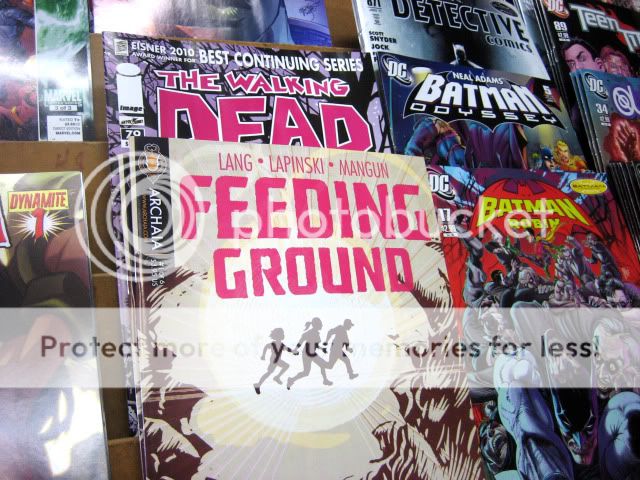
FEEDING GROUND #3 hits stores this week and Archaia has a Preview up on their website. The sequence offers a great glimpse of our re-imagined werewolf myth on the Arizona/ Mexico border.

This issue also features the first of many FEEDING GROUND pin-ups by guest artists. Below are peaks at work by:

Marvel Comics Illustrator and Cover Artist Juan Doe


MAMMAL
Artist and Freelance Illustrator Tom Forget


Juan is inspiring and endlessly innovative and Tom paints the pulp of a lost ark of seedy paperbacks. We're lucky to know these guys and for them to bring their crazy skill to our characters.

We also teamed with Fast Custom Shirts to create Tee and Long Sleeve shirts based on the cover to Issue 3. It's set up so that you can choose the flat fill or line art version of the Calavera Skull Image in your own combination of colors. Please spread the word and check out some possible variations below.

VERSION 1


VERSION 2

Friday, January 14, 2011

COVER DESIGN _ Best of 2010


I got a nice surprise last week when the cover to FEEDING GROUND #2 was included on the list of the Top 50 covers of 2010 on the Robot 6 blog of COMIC BOOK RESOURCES. I still have last year's list bookmarked and I share the list with many of my favorite artists and images.

A child of the 80s, my taste in cover art/ design straddles the line between the narrative and iconic. To my mind, the best evidence of this is the Marvel work of Ed Hannigan. He was schooled by the greats but rather than lift a full scene from an issue (Spider-Man fights the Hobgoblin) he would choose the key moment that would make for the most iconic cover design (Spider-Man's fist raising Hobgoblin's mask out of the East River).

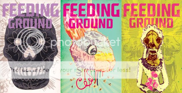
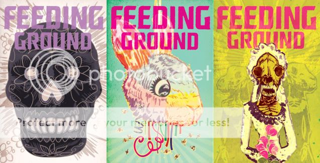
Speaking for myself, I arrived at a design scheme for the FEEDING GROUND mini-series that intentionally employs symmetry, bold color fields, and an isolated element to help distinguish the cover from the overall noise of the comic wall. Additionally, each cover is both a perversion of familiar Mexican iconography and a poetic counterpoint to the content of the issue. For Issue #2, the image is a visceral version of the Sacred Heart but also a comment on both the virus/ curse coursing through Flaca's veins and the act of her mother, Bea, burning down their home.

Whether or not I was successful is up to the reader, but, I at least wanted to give a sense of the thought process that goes into making these things.


Here are some of my favorites from the BEST OF list:

Amazing Spider-Man by Paolo Rivera


Batwoman by JH Williams III


CHEW by Rob Guillory


And, here's another peek at covers for upcoming Issues. Next time out, on a different story, I'd like to play with asymmetry and narrative as the covers demand it.


Friday, January 7, 2011

Character Design _ SONS OF BA'AL

For my latest freelance gig, I'm illustrating a comic adaptation of the AMERICANS UK's song "Sons of Ba'al" for their anthology ROCKTRONIC MIX TAPE #2 (now available for purchase online HERE!). Very cool to be a part of the 10th Anniversary of this band. It's my favorite song of theirs, mixing glammy Bowie swagger and Ramones goonish-ness at full throttle. Frontman/ writer Jef UK envisioned the comic as an epic biker battle.

Below you can see his descriptions of the characters along with my thoughts and initial concept sketches. I tried to subvert expectations and you can get a sense of how I tackled the assignment. Great collaboration and, like playing with action figures, it's the most "boy" thing I've ever illustrated.
SONS OF BA'AL: a rock n’ roll, demon, motorcycle gang.

Members:

Demon Jef UK – big horns, wicked grin, wears goggles and leather, carries a big knife strapped to his waist. He rides a cool bike with a sidecar.

My initial reaction was to undercut the badass by also making him seem a little goofy and laconic. A belly, biking spandex, and flip flops to enforce the idea that he doesn't give a meatball about what you think.


Cyborg Demon JTR3
—his motorcycle attaches to his torso, some sort of demon space gun replacing his right arm.


I think at the time I read the script I also I saw a documentary about killer wasps who were just brutal to their bumblebee prey. Rather than bulk him up I wanted JTR3 to be bug-like with slender arms. The visor is also taken from a robot that appears in Americans UK's ongoing comic series drawn by Paul Ciaravino.


Hot Demon Chick
—jet black hair, small horns, tall boots and small clothes. Tattoos galore. What a hottie. She rides in Jef UK’s sidecar, but usually by standing on top of it like she’s surfing, sorta. She uses a glowing laser Frisbee as a weapon, and has several hanging from her belt. I’ll call her Demona in the script.


I've never, ever, drawn "hot chicks" before. I plumped her up a little and drew the title as a tattoo instead of a leather jacket logo. The font is actually based on one my friend drew over and over in grammar school. At first I toyed with the idea of having her totally bottomless but the posing started to get weird when I had to be concerned about hiding her business.


THE GOD GANG
: the Sons of Ba’al’s mortal enemies.


Members:

God—Old man, bearded and burley God rides a Harley, wears a gold and white helmet of Roman design. Shirtless with a white fringe vest. Symmetrical gold eagle tattoo design on his chest.

I like Jef's description as containing conflicting imagery from different cultures. Rather than the white-bearded "God" I wanted him to have a dark, curly, Middle Eastern beard. He's equal parts Dr.Teeth and Brian Blessed from "Flash Gordon."


Death
—Death is sleek, like a Japanese rider on a Japanese bike, fully covered in high end racing gear, all black, wears a black helmet with a skull painted on the visor, red eyes glowing through. He uses a hand held scythe as a weapon.


Done. With a ridiculously large scythe. There's so much phallic imagery in this thing. One detail that gets lost is that I want to the painted skull to be specifically based on the dimensions of a baby skull. It's all about attention to detail.


The Sea
—the Sea is a woman. Her outfit and motorcycle should evoke the oceans somehow, sort of like a He-Man vehicle would. She has a trident strapped to her back.


Rather than a squid or mermaid sea monster, I drew inspiration from goblin sharks, deep sea anglers, shrimp, and eels. A few of my favorite things.


I should be wrapping up the strip next week and I'll give a holler when it's available.

Rawk!

Thursday, December 30, 2010

2010 _ The Year of the Wolf


Although FEEDING GROUND has been gestating for around 2 years, it was 2010 where it became a reality and an all-consuming part of my life. Below are some of the ways the book defined 2010 for me:

THE WORK ITSELF:

Given the nature of drawing comics, I have easily drawn more in this past year than I have in the previous 10 years combined. And, I don't love drawing. I like designing and the act of rendering surfaces and textures in ink but it's been a long while since I've doodled for pleasure.


That's the work of it but the real thrill for me has been arriving at color combinations to communicate the feel of our story. More than a single drawing or paint-by-numbers reality I'm looking to bring something new to the table and a finished product that is more evocative than illustrative.


And, even more than executing the art, I was stoked by the opportunity to collaborate with Swifty and Chris on creating the problems and solutions, the imagery and arcs, of our story. It has fired up another part of my brain that I need to keep exercising.


THE BOOK ON THE SHELF:


It's humbling to finally be on a shelf next to work by peers that I enjoy and influence me as well as those legendary creators that built the comic language. The medium is both young enough to see the beginning and small enough to gain a foothold and yet old enough to contain depth and broad enough to include an ever-widening expanse of talent and material.
Now, we're somewhere in that too.


The landmarks for me were our launch party at Bergen Comics in Brooklyn (a well-appointed and managed store/ salon I very much see as the future of comic retail), our release at Vector Books in Bayonne, NJ (my local comic shop of 20+ years), and the book selling out multiple times at Forbidden Planet in NYC (my first NY comic shop). Issue 3 should be out soon, and the rush of seeing our work in stores hasn't gotten tired yet.


THE OTHER SIDE OF THE TABLE:


The thought and time that we've put into every panel and every page has its own value but really pays off when strangers are reading it and offering their feedback. Of course, the most gratifying ones let us know that we've struck with the reader and our intent was communicated on multiple levels. Others have pushed us to work out kinks in our craft. Reactions take the form of comments on message boards to articles and blog posts and interviews but it's been the face-to-face conversations at Conventions like San Diego, NYCC, and King Con that stand out for me. I've always dug meeting strangers and it's been cool to connect with people if only for a few minutes.

As a fan and newbie, the Con moment that made the greatest impression on me was meeting SCALPED artist, RM Guera. He came off as a mellow guru when I showed him FEEDING GROUND and he encouraged me to loosen up and "Let it flow." His own linework is alive and his compositions are consistently inventive. When he penciled a sketch of one of the lead characters for me, it was so spontaneous and lively that I thought… "Don't ink it…don't ink it." As if on cue, he asked "Do you mind if I don't ink this? I like it as it is."


SOME LOWLIGHTS:


I can't leave the office without having to put a tissue box on my laptop to prevent my cat from turning it into a bed and overheating it… It's also been frustrating to not be able to trust release dates and the shipping schedule, mainly due to issues with the overseas printer although I suspect my cat is responsible for that too… I hunch when I'm on the computer and unless I start doing yoga or running again I'm sure my neck will disappear and I'll be a few inches shorter... All said, mostly positive although I definitely did not plan on spending my first year as a married man working with such an irregular lifestyle.


SOME INSPIRING COMICS OF 2010:

This is by no means a comprehensive list as I haven't even been able to pick up much of what has been topping other year-end picks. I just wanted the chance to shout out the work of artists who made me take note this year. I keep their work close by and they're my current yardstick of the level of quality and energy I need to be hitting.

- For big, bold, superheroics John Romita Jr./ Klaus Janson/ Dean White on Bendis' AVENGERS and Jerome OpeƱa and Dean White for their uncluttered detailing and fresh staging on UNCANNY X-FORCE. Archangel's knife wings never looked cooler, and, as knife wings, they were pretty cool to begin with. Notice Dean White as the equal collaborator and common denominator on both books as an action colorist that finishes the art with the right amount of texture and punch.


- I've admired the work of David Aja for a few years now and this year I discovered Jason Latour working in a similar school. Both use gestural brushwork to convey an impressionistic reality and make really strong choices in their page design and pure visual storytelling.


- Jaimie Hernandez on LOVE & ROCKETS New Stories #3. Never has such a raw story looked so pretty. His first tale in the book is one that hits you in the gut but then lingers and demands multiple readings to appreciate his pacing and structure. The ending tale then has an uplift that rewards both the lived years of the characters and the years spent reading them.


- Urasawa on PLUTO, can do it all. Massive battles, majestic architectural layouts, and intensely human moments portrayed by robots. I became invested in it this year and it's some of the best Comics have to offer.


2011:

We've delivered Issue 4 to the printer and I'll be wrapping up work on FEEDING GROUND in the Spring. From there, I look forward to the chance to experiment with new styles and tell new stories in 2011. There's still work to be done and skills to be learned but I aim to trust my instincts, doodle more, and "Let it flow." You'll see the first signs of this in Issue 4 whenever it finds its way to the shelf.


Thursday, December 23, 2010

FEEDING GROUND _ Reviews, Responsibility, and Reading the Comic Page


Since the first two issues of FEEDING GROUND have hit the stands we've have the great fortune of complete strangers reading our work and offering their feedback. In Generation "i" and especially in the comic field, there are many fan critics and criticism on every level. We've gotten glowing five star reviews like this one at COVERLESS, some constructive criticism like this one on THE OUTHOUSE, and some, who will remain nameless, that trashed us. Swifty has said, and I agree, that in reading every review there's the duel risk of inflating or crashing one's ego and that it's ultimately the doing of the work that matters. We just delivered Issue 4 to the printer (!) and we've already learned volumes since Issue 1. But, I'll detail below one area where the constructive criticism reflected our learning curve.

I'd be the first to say that we bit off a lot for our first long-form comic mini-series. We crafted a story that transitions between three related plot-lines, features a leading family of five characters, and walks a delicate balance between real-world horrors and myth. One common piece of feedback to the first two issues is the degree to which we reveal the goings on of our world - does our goal to build mystery and disorient the reader succeed or simply confuse? Now, a few responses showed some issues in reading comprehension on the part of the reader but the lesson that Klaus Janson drilled home for me was that as artist, I need to take full responsibility for the success or failure of a page. This leads me to the central issue in my education as a comic artist - film language vs. comic language in clear visual communication.

This means presenting visual information in each panel and in the transition between panels and pages in a way that is cognitively and emotionally resonant for the reader. Characters need to be staged in space and in relationship to each other and their actions need to proceed in a manner that is consistent with the understanding of the scene.

I mentioned in another post that comic artist Eddie Campbell has his own set of rules on his blog
"The Fate of the Artist," the first being:

The entire drama of a given situation must be contained within each panel of the sequence of that situation.

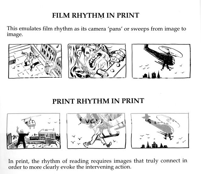
The key is context. Film transitions provide cuts and movement and all of the context that a viewer needs in digesting a film. Part of my instinct has been to focus on isolated moments and close-ups as a film would. This is due in part to a desire to heighten emotion and, in part, to the feeling that my drawings would be too small and cluttered otherwise. But, the solutions of a comic artist require more context in each panel that ideally delivers on the information of the previous panel and points ahead to the next. A close-up of a gun may be an emotional beat that's not pulling it's weight on a given page.

Rather than go on in text I'd rather share some examples from Will Eisner's "Comics & Sequential Art" that continue to make an impression on me as I digest their craft and meaning. This and its companion book are essential reading for comic artists.


I will include more examples from my own work in future posts. Keep in mind that my sequence at the top of the post was intended to play out as staccato beats of accumulated information in order to intensify drama of that scene in Issue 2. Whether or not that succeeded is up to the reader...

Thursday, November 25, 2010

FEEDING GROUND _ Grassy Ass (Gracias)


FEEDING GROUND #1 is officially in stores and I wanted the chance to acknowledge some people whose inspiration, talent, and support helped make this possible.

We've included a THANK YOU section at the back of the book. You can read the whole thing here, but this is my portion below:
As a group, we benefited greatly from the insight and
experience of Thomas Peyton, the counsel of Suzana
Carlos, and the encouragement and camaraderie of artist
Juan Doe. Great thanks to everyone at Archaia not only
for taking a chance on us, but also offering advice and
support that recognized what we were doing and then
made it stronger.

MICHAEL LAPINSKI would like to thank the following
people: Cartoonists Rick Ritter, Mike Dawson, GB Tran and
the guys of MAMMAL, their art and dedication convinced
me to get back into making comics. Paul Zdanowicz,
horror guru and Lapinski-booster with a keen critical eye.
Klaus Janson, whose professional instruction came just at
the right time to bring structure and rules to what I had
been discovering on the page. Brian Michael Bendis for
providing the Jinxworld message board and its posters for
keeping me company in the solitude of my man cave. To
my parents and family, whose generous affection has
always allowed me to thrive. And, to Lindsay, thanks for
adding sweetness to my life and for riding this wolf with
me to Bayonne and beyond.
Additionally, I was remiss not to include John Siuntres and his Word Balloon podcast. His extensive and candid interviews with comic book professionals is the comic creator equivalent of a director's commentary on a DVD. This past year has been "comic book college" for me and John's podcast and the gracious information offered by guests provided me with the context to appreciate the craft, business, lifestyle, and shared enthusiasm of the comic industry.

Big thanks to everyone we've met since starting down this path and to my co-conspirators Swifty Lang and Chris Mangun, buds and creative partners who've shared in every step.

And, here's a handy link on where you can find the series. I'm inking Issue 4 (of 6) and will post something crafty in my next blog post.