Wednesday, October 21, 2009

Big Apple Comic Con 02 _ WRAP UP

Thanks to those of you who stopped by and visited our little piece of Real Estate at the Big Apple Comic Con (adorned by placards produced by the lovely Chris Mangun). It was my first time behind the table at a con and it was extremely rewarding to witness the enthusiasm of fans and the talent and generosity of creators from that vantage point. The community around comics is definitely part of what makes me appreciate the medium.

I want to take the time to reach out and thank a number of creators who I had the great fortune to meet at this con. I don't feel comfortable posting their art on this blog but I'll include some of their self-promotion work. Please follow the links to their respective home bases.


First off, much respect to artist Juan Doe for inviting us to share his Artist's Alley table. I met Juan at NYC Comic Con back in February and we hit it off across a Marvel signing. His work is next generation cool. Juan's love and understanding of both classic Marvel and European comics are processed through a style that is distinctly his. When I first saw his work, I was struck by how fully envisioned and executed it was. His covers and interiors are complete pieces, not colored drawings, and have a graphic energy that is exciting amidst Marvel's current "realistic" house style. He finishes his work digitially as if it were any manual tool and, man, the guy can draw! He's the full package and, along with his Fine Art and children's stories, someone who is not content to sit still. Plus, I had to admire how laid back he is for the amount of work he takes on.

We were seated next to Tim Bradstreet whose work has set the tone for noir-fueled cover art of the last two decades. As is often the case, it was incredible to see his work in person. His pieces are extremely time-intensive, utilizing photo-reference with a command of mark-making that should be studied under a loop. His heavy blacks are bottomless and bleed out into fine detailing. Check out an interview about his work here. He couldn't have been nicer with fans and I was excited to hear that he's been extending his talents to film along with Punisher conspirator Thomas Jane.

Spider-Man artist Alex Saviuk shared essential advice on the business of being a professional artist (among other things, save those receipts!). He's a pro and I absolutely need to track down his team-up with Will Wisner on The Escapist, Eisner's last work.
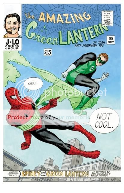
Art school friends Paolo Rivera and Joe Quinones made for a pair of today's top artists. They both posesss and exhibit a fundemental understanding of the artform without leaning too heavily on style or cutting corners. In particular, Paolo poses for and sculpts (!) his own reference and posts often about his process. They are young guns with a master's work ethic. Plus, there's this really funny Jam Cover they did for the show (available as a print).

David Mack
is someone whose image-making has always stood out for it's use of collage and mixed media alongside traditionally produced books. But, now that I'm working on my own books, my brain is firing over the way he uses these techniques at the service of story. He's got a much-deserved fan base and a necessary voice in the field.


I also had the chance to catch up with two guys that I've had the chance to work with in the NYC animation industry, Emilio Lopez and Robert Crump. It was crazy to see how much their work has evolved and continues to evolve. Their stuff is fresh and explodes off the page. Catch up with them now because they're about to break out.


Finally, it was critical that I had the opportunity to meet up with the publisher and development team of Archaia. They are producing books, like Mouse Guard, The Killer, and Awakening, that meet and exceed the expanding tastes of the comic market and general public. Publisher Mark Smylie is a self-made man with a ballroom in Kearny NJ as his studio (true). His Artesia is classically illustrated Byzantine beauty. Along with Mel Caylo and Stephen Christy, I was impressed with how much these guys know comics. Stephen had constructive criticism of my work that was the panel to panel analysis I needed. He's enthusiastic about the medium with the big picture in mind - they're the first publisher to issue a Kindle-only release with the crime drama Tumor. Cheers to more great comics in 2010.

Wednesday, October 14, 2009

Big Apple Comic Con 01 _ FROZEN DARK

On October 16 and 17 I will be sharing a table with Juan Doe at this year's Big Apple Comic Con in NYC. For the occasion, I will be handing out limited copies of Frozen Dark a horror short that I produced with Swifty Lang and Chris Mangun of Blacklight Comics. We created it as part of an anthology but Chris is printing an edition right now as a mini-comic for the show.

The story originated from an anecdote Chris told about his trip to China. He spun it like a campfire tale with an effective, familiar, hook: when you're a kid, it's really scary to have to go to the bathroom in the middle of the night. In this case, the bathroom is an outhouse, and the kid is an orphan residing in a Buddhist monastery.

From there, the three of us brought our abilities forward to make every line and panel matter. Swift added an underlying poetry and worldview to reflect the teachings and myths our hero was immersed in as he traveled his arc. At the same time, Chris pressed for the cruel social dynamics of boys of that age.

My goal was to make sure that, as a short story, there was a rhythm to the way the information unfolded and an interplay between word an image that was more evocative than literal.

All said, we hoped to elicit the chill of a good ghost story while delivering on a subtext worthy of The Twilight Zone.

Swing by my table for a copy if you are at the con. Otherwise, we'll look to post it as a PDF in the coming weeks.

Wednesday, October 7, 2009

COMIC BOOK LAYOUT 01 _ Consider the Grid

The art of making comics essentially exists in act of laying out your panels. There are much better resources out there that will help you understand this skill but I thought I'd share a few examples where I tried tackling the grid head on.

It was Scott McCloud in his seminal text book "Understanding Comics" that first identified comics to me as "sequential art." Comics as a medium is defined by the use of a series of static images that when read together represent a relationship according to time, space, or concept. I started reading comics at the age of 6 but the mechanism for reading them, the synthesis of word and image following a flow of panels from left to right, was unconscious and innate.

Hard to believe, but there are plenty of people who still do not "know" how to read comics and get confused by what to read first. That said, the 6-panel grid is the most effective and elegant way to break down the page for easy reading. As pointed out in Gary Spencer Millidge's "Comic Book Design" it also follows the Golden Ratio in the way it sub-divides information according to Classical composition.

For an example of an excellent use of the 6-panel grid, check out Chapter 1 in Tim Hamilton's "Floating Elephant" strip at Act-i-vate. He's created a surreal suburban world and the grid is an unobtrusive window into it. It feel ordinary while the content is anything but.

For my own work, here's an example of how a 9-panel grid can set up a sense of time that is like a metronome. Ticking down and alternating between scenes, and finally ending with a bang. The 9-panel format was utilized with an world's worth of information and skill by Alan Moore and Dave Gibbons in "Watchmen."


What happens when you break the grid? First, you can run the risk of confusing the reader and drawing too much attention to the frame instead of the content. But, here is an example of me trying to use the layout to create a mood that feels claustrophobic and draws all attention to the goal of the scene, the door to the outside world.


As a final example, this page was a way for me to release the grid by using the full length of the page to hopefully create that sense of falling for the reader. Ideally, the slight rotation I gave to the image in the first panel helped to undercut any sense of the border as safety net.


So, there's a ton to consider in constructing a comic all in the hopes that it will be invisible to the reader. I'm only scratching the surface here and there are new tools and tricks to pick up with every new page.

Wednesday, September 30, 2009

COMIC SHADING 01 _ A Confession

As a novice cartoonist, I've grown to appreciate the skill and sense of design it takes to render a book strictly in black and white. Using only the interplay of positive and negative shapes, hi-light and shadow, the goal is to build believable spaces and graphically interesting compositions. There are masters like Alex Toth who make it look natural and easy and modern talents like Mike Mignola and Eduardo Risso who make it look fun.

Me? I'm not quite there yet.

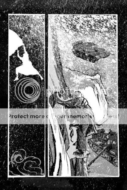
Of two of the longer stories I've illustrated in black and white, one takes place in a Himalayan Monastery and the other is a Glasnost-Era thriller. It seemed natural to render them both in deep blacks and frosty whites but as I began to illustrate I found that the planes of space were looking confused and faces muddied. I had been so accustomed to drawing with line, modulating thick and think outlines to suggest volume or space, that I needed more practice to "draw" with shadows.

While not as bold a treatment as I had wanted, I changed gears and approached the pages with another solution: zip-a-tones. The mechanical polka dot fields mythologized by Roy Lichtenstein, I had originally used zip-a-tone sheets in college in order to achieve pre-determined grey values printed on cheaper newsprint. This time, I created my own in Photoshop.

With examples below, you can see that besides helping to delineate space, I was able to employ the tones in achieving dramatic lighting effects to create tension.


In the case of using them to shade figures, I soon found that less was more. Here, Lorraine is questioned in a dimly lit interrogation room.

The cast shadows of the first two examples appeared too harsh to me. In the third, I treated the hi-lights instead, glinting on Lorraine's features and lofting the smoke, like there was ambient light in the room. This one captured that balance of reality and graphic pop I was going for and I followed the same general technique throughout the tale.

Monday, September 21, 2009

CHARACTER DESIGN 02 _ Kill your Darlings

As a novice comic creator, I'm finding one of the most basic challenges to be maintaining a consistent look for each character and to retain their likeness throughout the strip. Initially sketching up a character turnaround helps to solve the likeness issue but I feel like I broke the rule of style for one of the Cold City characters.

In the Oni Talent Search script, Antony Johnston describes the character of Waddel as such:

Waddel is middle-aged, balding and very overweight.


So, based on the style I established with Lorraine I set forth and drew the version on the left. English, oily, and a man with secrets.


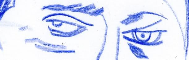
I wasn't satisfied and in my doodling I arrived at the more spontaneous version on the right. To me, he possesses more sinister charm, life in dead fish eyes, and the jowls of a leader.

I fell in love with a drawing (YES!). The problem is, he didn't fit the rest of the style. I may still want to revisit the strip in a more abstract line but he now sticks out like a sore thumb to me.


In writing, Faulkner advised to "kill your darlings." Eliminate any elements, possibly beautiful in their own right, that don't suit the whole. In the short turnaround to complete these pages, I opted to save old fish face and I think the cohesion of the world I created suffers a little for it.

Thursday, September 17, 2009

CHARACTER DESIGN 01 _ You'll Be a Woman Soon

When comic creators are asked about their chosen medium, a common reply is that creating comics is like making a movie with an infinite budget. That being the case, comic artists do not get enough credit from the general public for the way they must perform as casting director, cinematographer, set designer, costume designer, editor, and special effects supervisor for each and every panel.

In terms of casting, characters can be drawn somewhere on a scale from basic happy face dots and curves to something approaching photorealism. These comic players must communicate the story and connect emotionally with the reader. While the superheros of mainstream comics may be delineated by bold wardrobes, I've found it to be much more challenging and rewarding to bring an identity to an ordinary person.

In the case of the Oni Talent Search, writer Antony Johnston included detailed descriptions of his principal characters in the panel text of his sample script. Here's what he had to say about the lead female of the sequence:

This is LORRAINE BROUGHTON, also an MI6 officer. Lorraine is in
her late 30s, with long dark hair tied back in a ponytail. She's very average-looking, neither attractive nor unattractive; exactly the sort of nondescript features that suit a spy. Lorraine is dressed conservatively, in a below-the-knee skirt, blouse, overcoat and low-heeled shoes, with a scarf wrapped around her neck against the November chill. She carries a satchel-style shoulder bag.

Without ever having talked with Antony, that's all I had to go by.

Below, you can see the progression of some of my sketches that helped me arrive at the design I finally went with.


Drawing 1: There's a tip in the old "How To Draw Comics The Marvel Way" guide that the more lines you add to a woman's face, the older she will appear. This seems self-evident, but you can descend down that path pretty quickly as you try to add detail. Although I like how the first drawing seems hard and no-nonsense, she appeared to be too old and lean for Antony's description of Lorraine.

Drawing 2: I had experimented with the idea of drawing the test in a more graphic, geometric style. Like a Euro-Dick Tracy. Again, this did not feel like Lorraine to me with these teen model, spider monkey proportions. It's as if Jennifer Garner were playing the part. Nice, but no Lorraine.

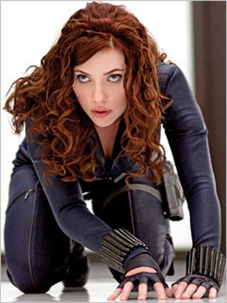
Drawing 3: The sample script clearly places the action in England and Berlin and I always thought it would be best if the characters actually looked English. Artist Alex Maleev was one of the first artists I saw capture the Russian ethnicity of Marvel's Cold War anti-heroine The Black Widow (now played by Scarlet Johansen). Alex often uses photo-reference for his characters. For Lorraine, I cast English actress Emily Mortimer. She's the right age and appearance.

I decided that this third drawing was the proper degree of likeness and abstraction and was "non-descript" enough but would be someone I'd want to look at over the course of an entire graphic novel.


Now, it's up to the reader (and Oni) to decide if it works for them and the story...


Monday, September 14, 2009

COVER CHALLENGE 01 _ DMZ

In my COVER CHALLENGE posts, I'll be illustrating a mock comic book cover in the prevailing style of a popular series and then illustrate a second design that proposes an alternate art direction.

For my first entry, I'm tackling Brian Wood's Vertigo Series DMZ.

An accomplished designer and artist in his own right, Brian immediately distinguished his series from other books on the rack by eschewing bright figurative action shots for rough-hewn graphic explorations in a limited palette and with a lot of negative space. DMZ is set in a fictional post-war New York and the covers initially incorporated the local flavor of NYC iconography and signage with the visual immediacy of agit-prop fliers. The book seemed to be an artifact of the world he created.

While I always appreciated the bold choices and execution of these designs, I always felt slightly removed from covers that sold the world of the book but often excluded the central character and my sympathy.

Here's my stab at a DMZ design in the original vein but re-imagining the logo as a subway scratch tag, swapping the prevalence of white for black, and creating an interior mental space for protagonist Matthew Roth with the subway signage.


More recently, John Paul Leon has taken over as regular cover artist. His tenure has brought more, but muted, color and more figures to the cover design. But, often portrayed in silhouette, the people are still unknowable and become part of the artfully broken landscape. His work is tasteful and takes unexpected chances with composition.

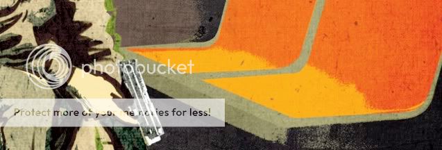
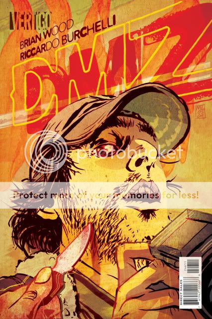
For my second take, I decided to go HOT. I wanted to create an image with real sense of risk and blood in it. Something that communicated the daily, almost routine, peril Matt finds himself in and that still felt like New York. DMZ has never used an extreme close-up for a cover and this is my snapshot right in the sweaty face of our terrorized photojournalist.